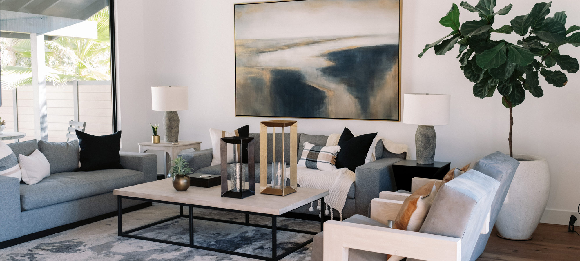
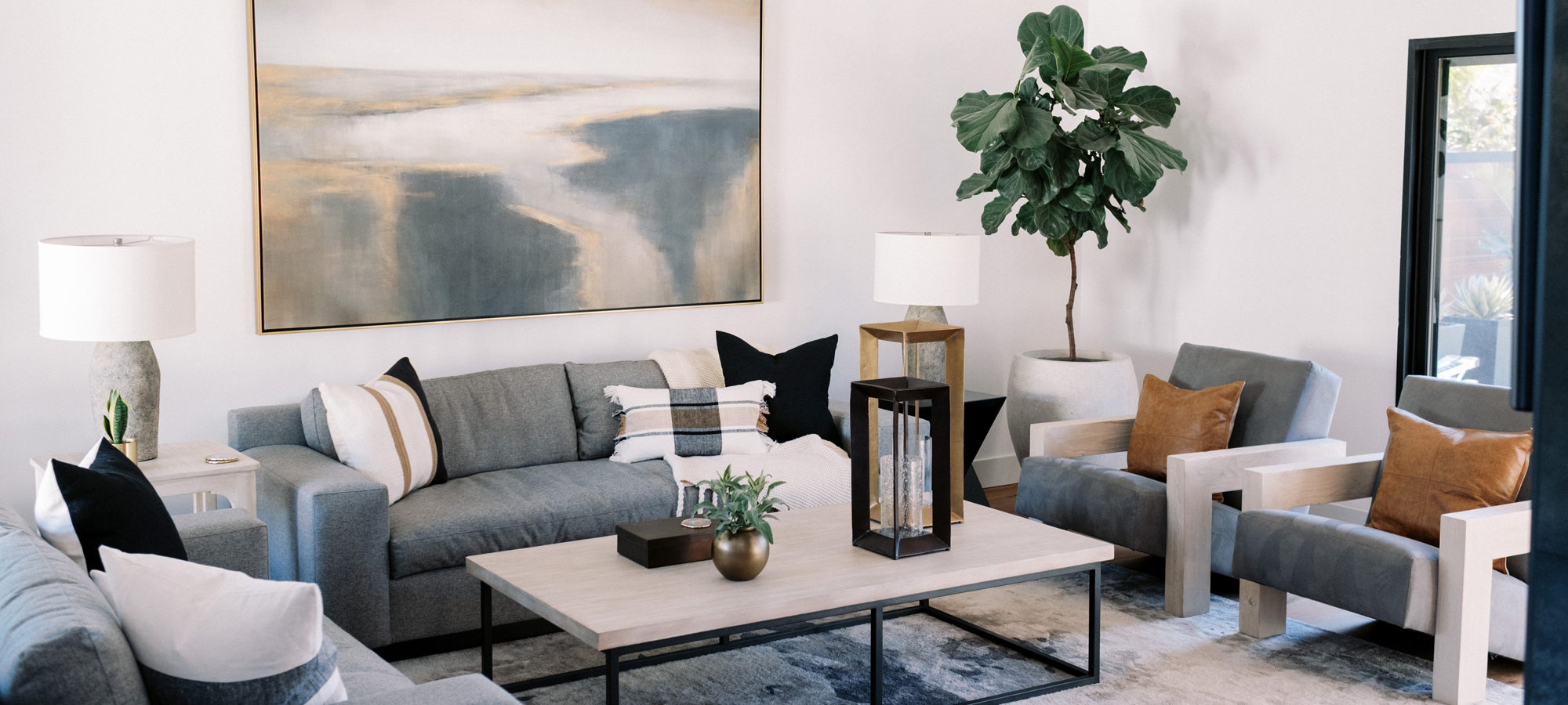
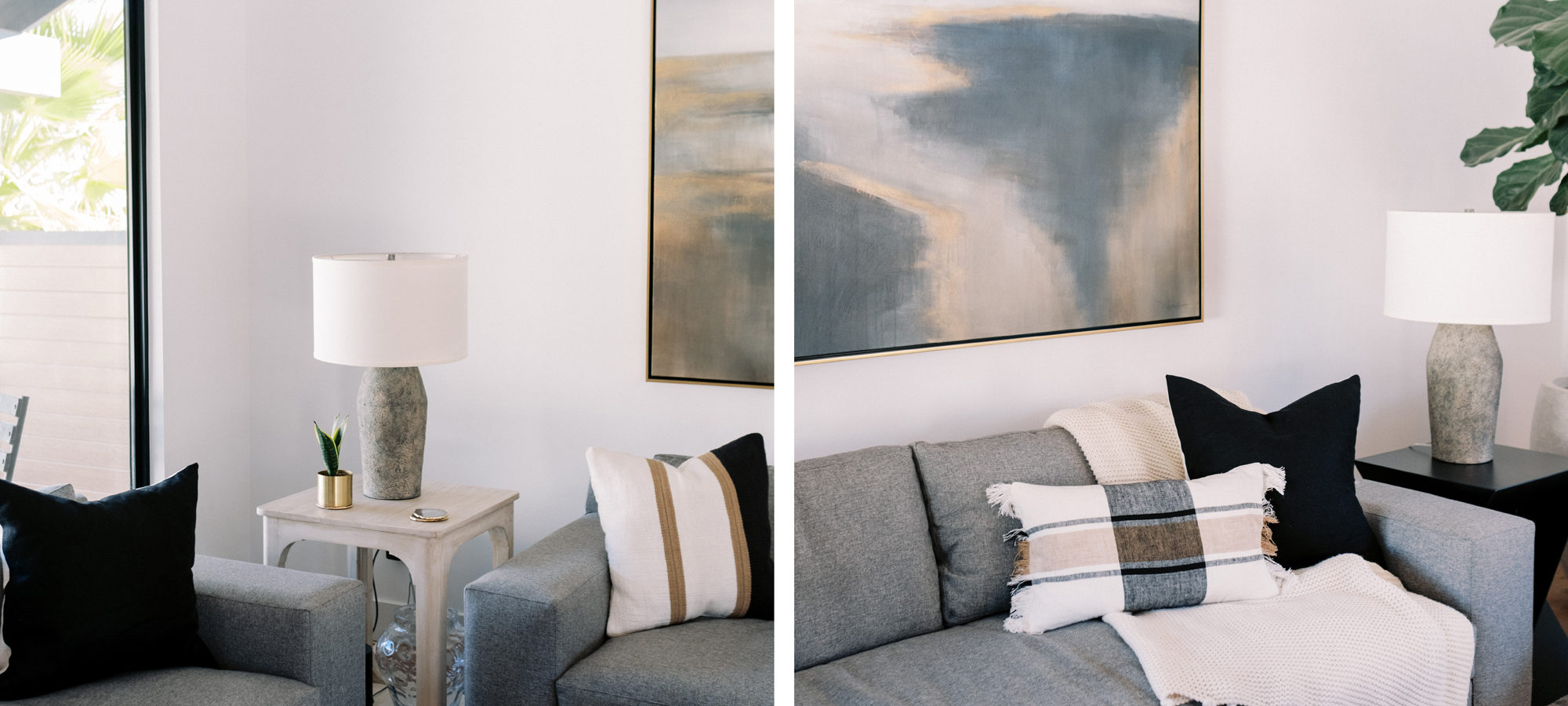
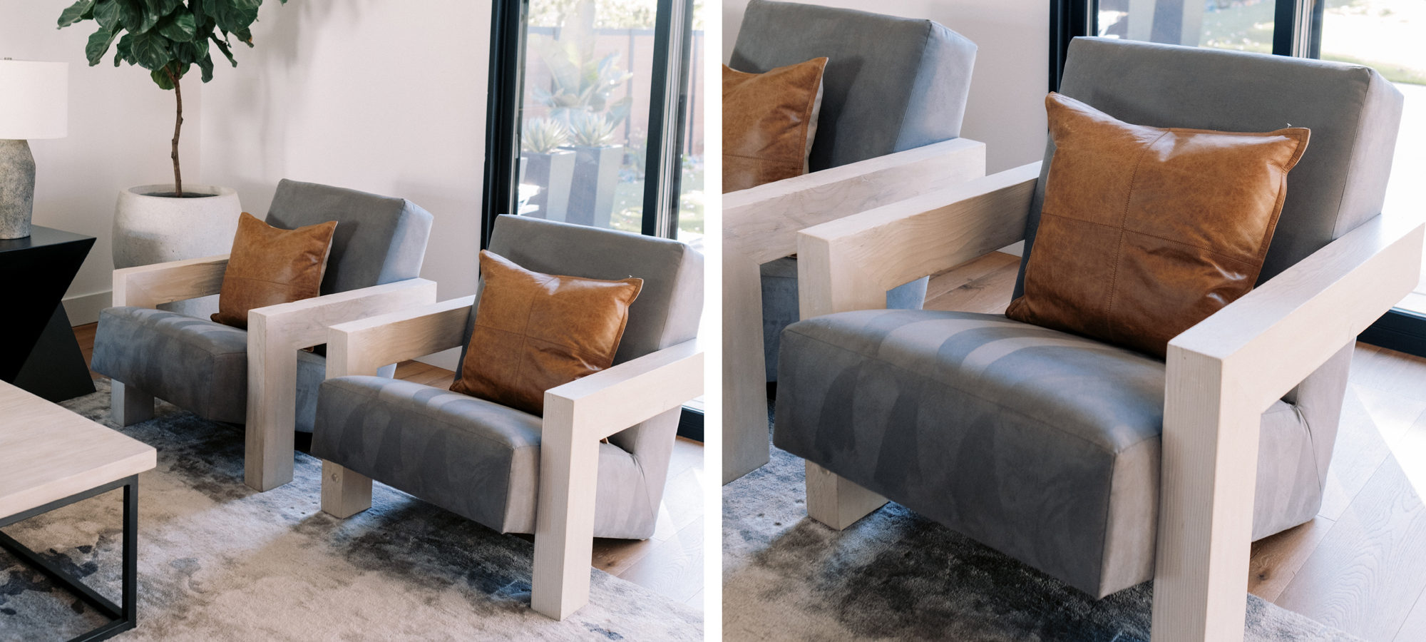
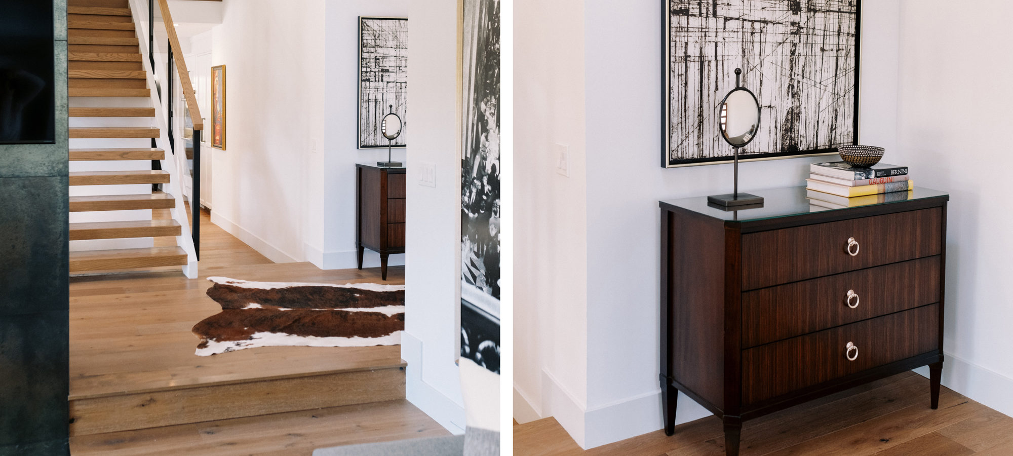
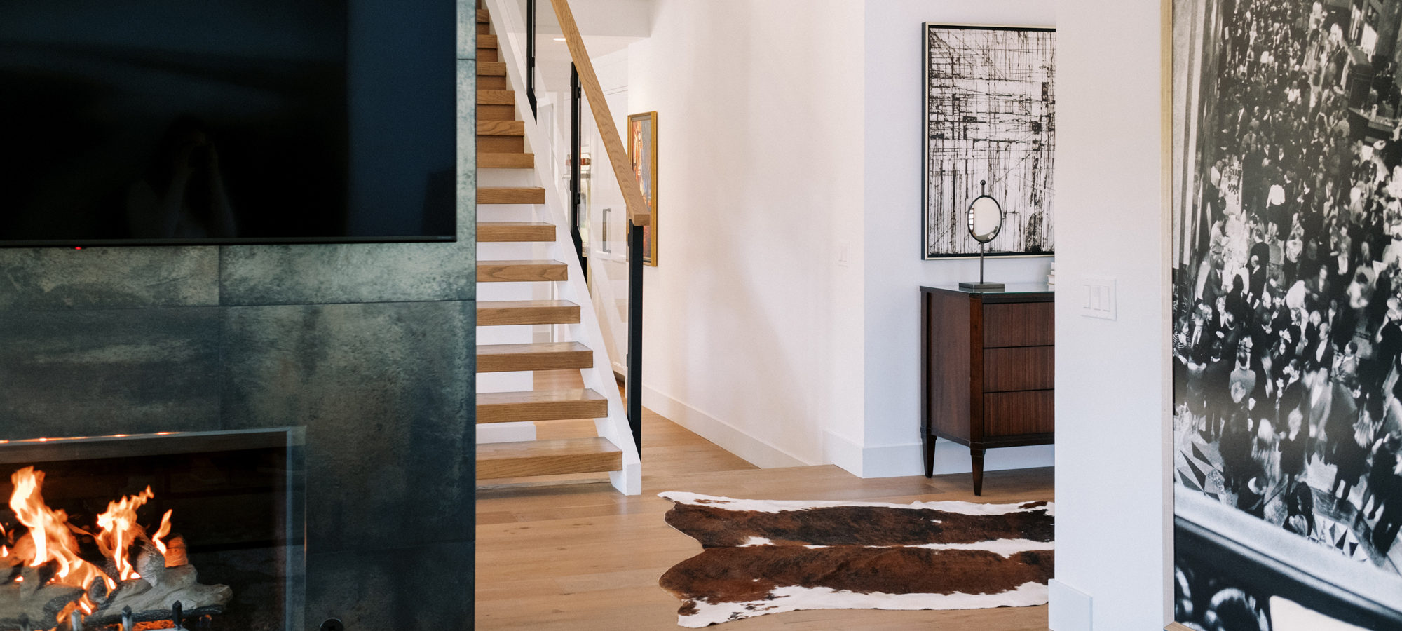
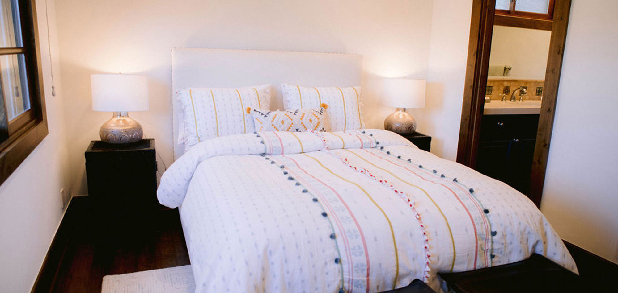
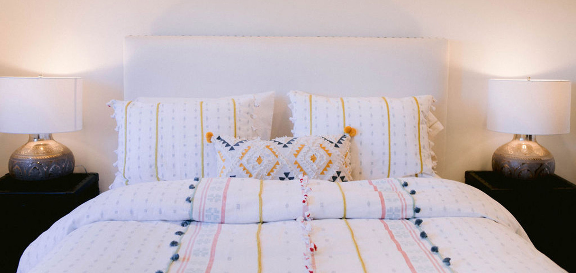
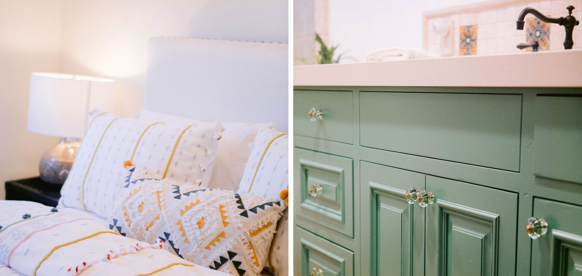
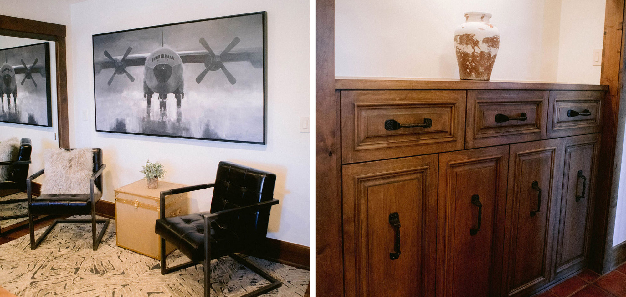
Influenced by Loft Chic Design
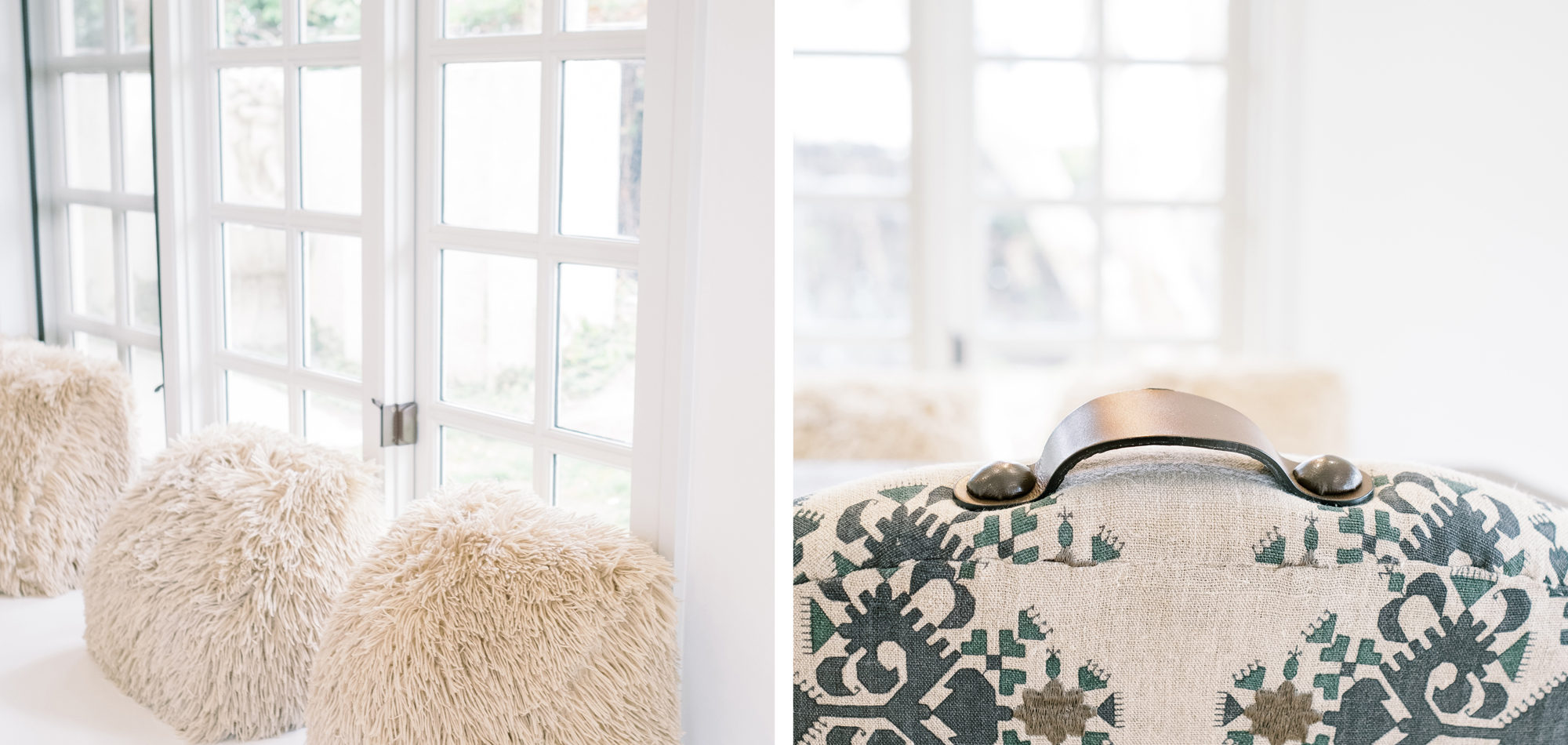
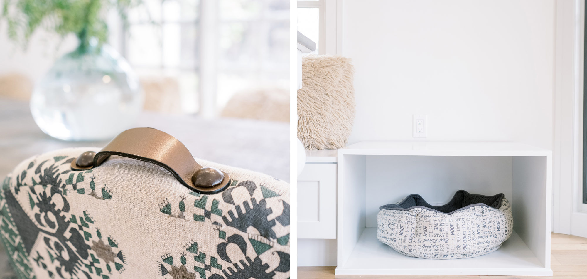
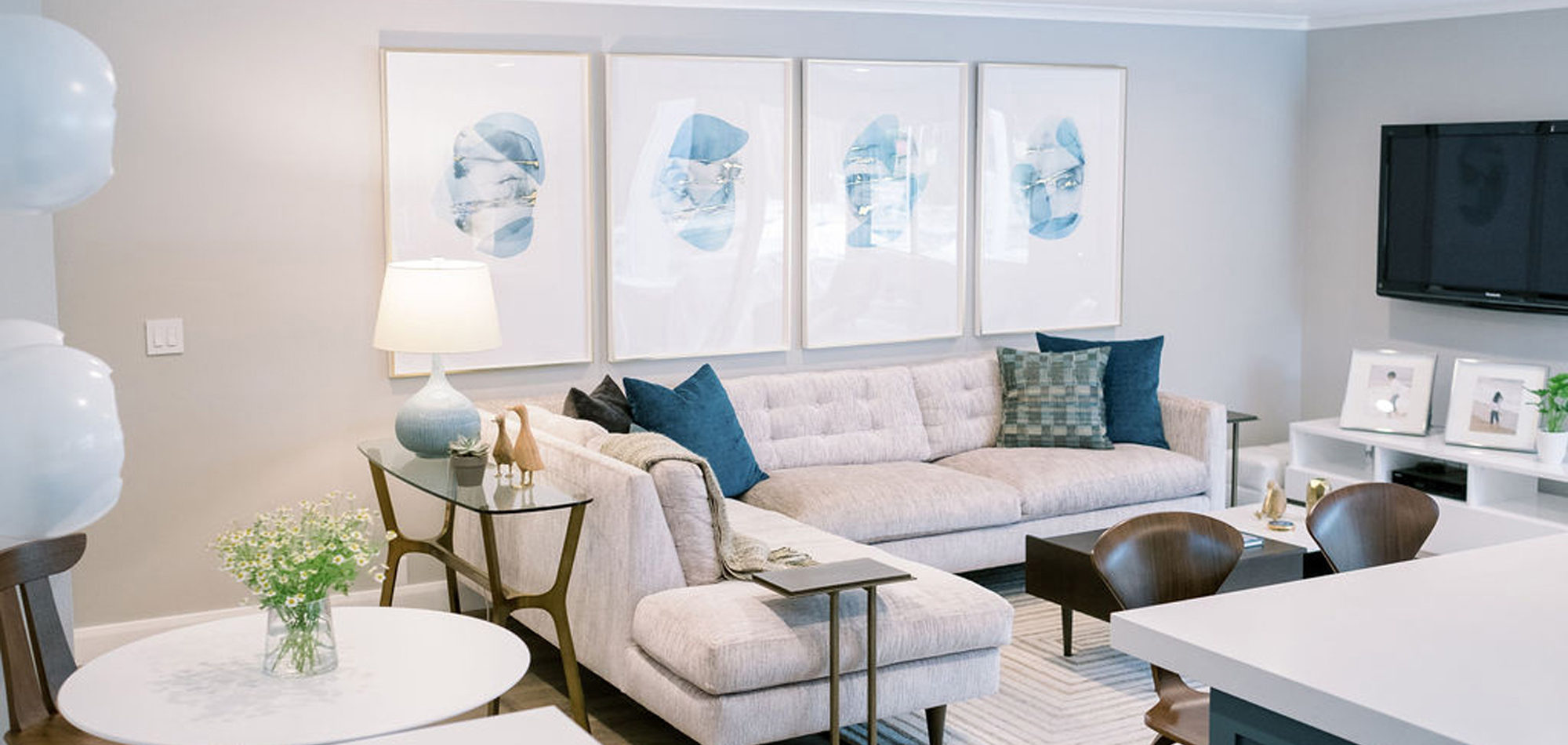
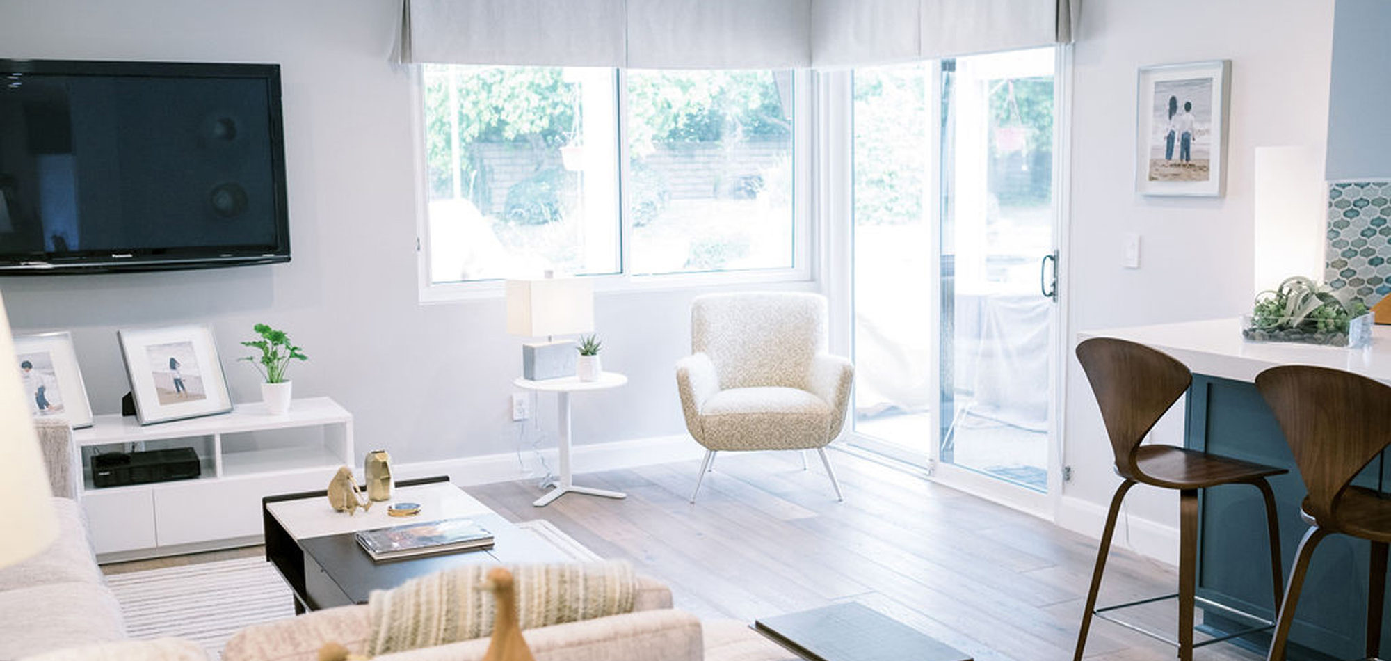
Our empty nester clients (with two dogs) purchased a home that desperately needed a complete overhaul inside and out from the ground up. Although our clients said they had “no clue on where to start” they knew they were going to spend a considerable amount of money and they wanted to make sure it was spent wisely. They knew they needed a plan and plenty of research and that is where we came in. Our job was to open up the spaces and take it from dreary and dated to open and fabulous.
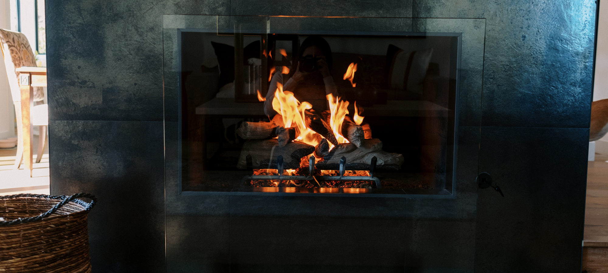
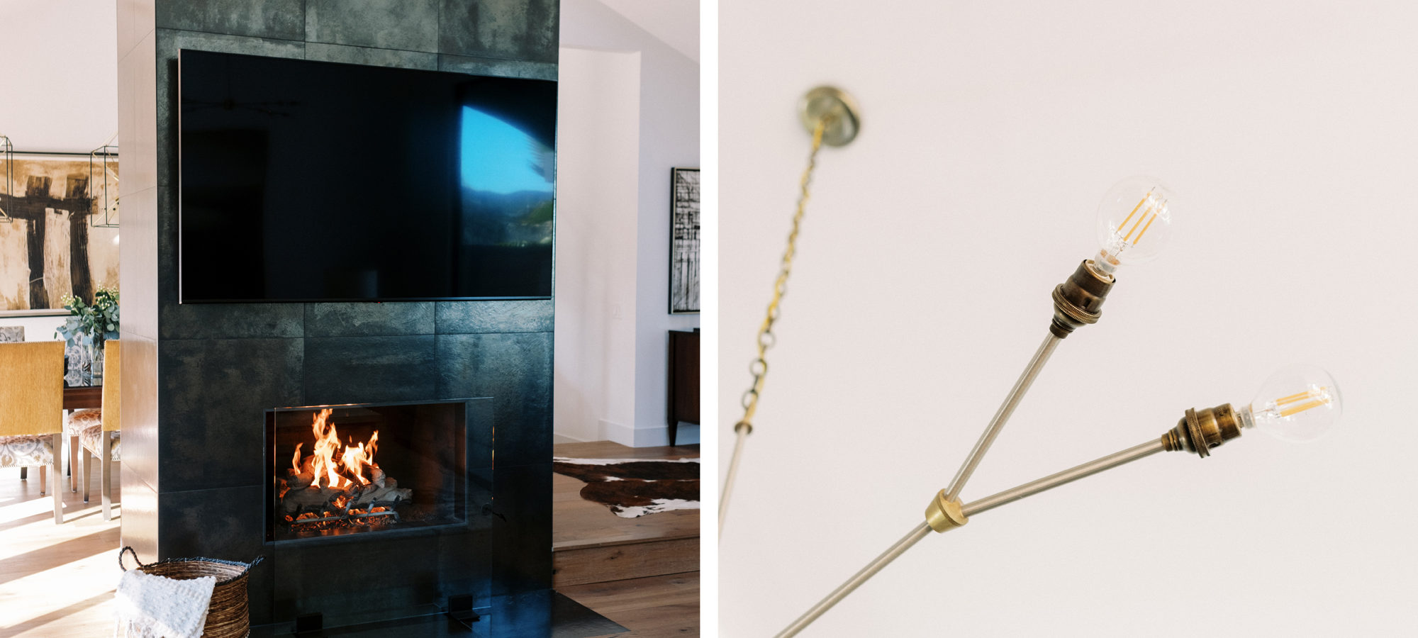
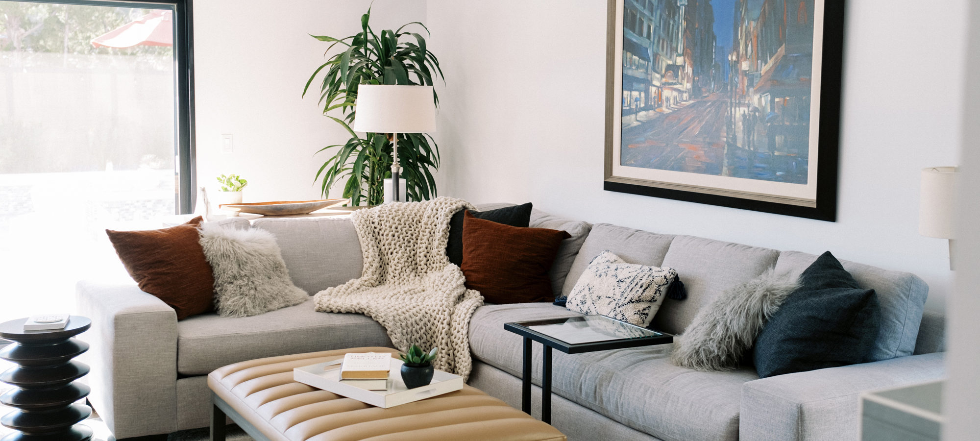
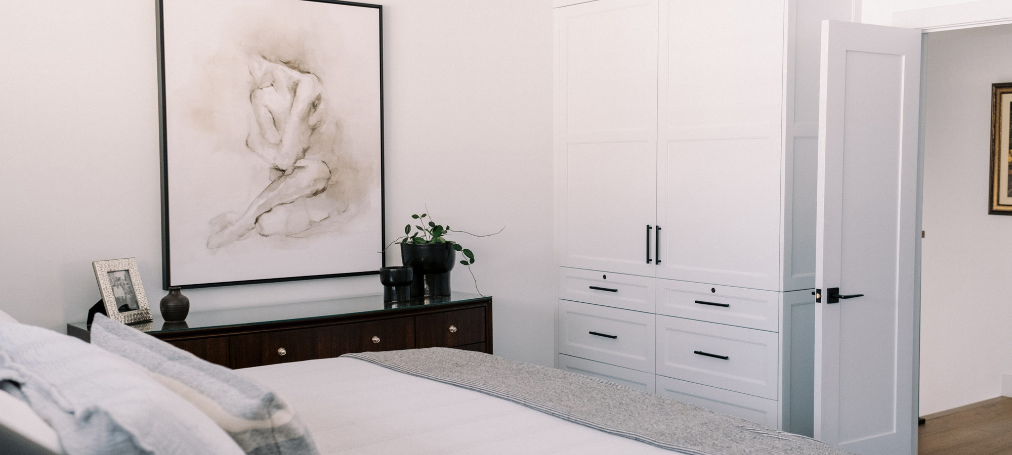
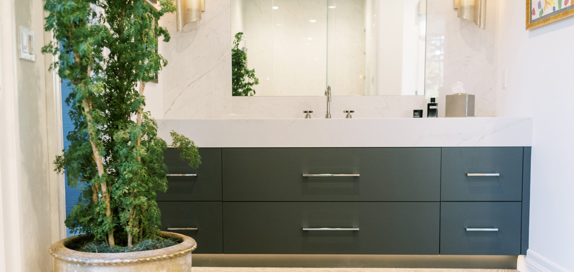
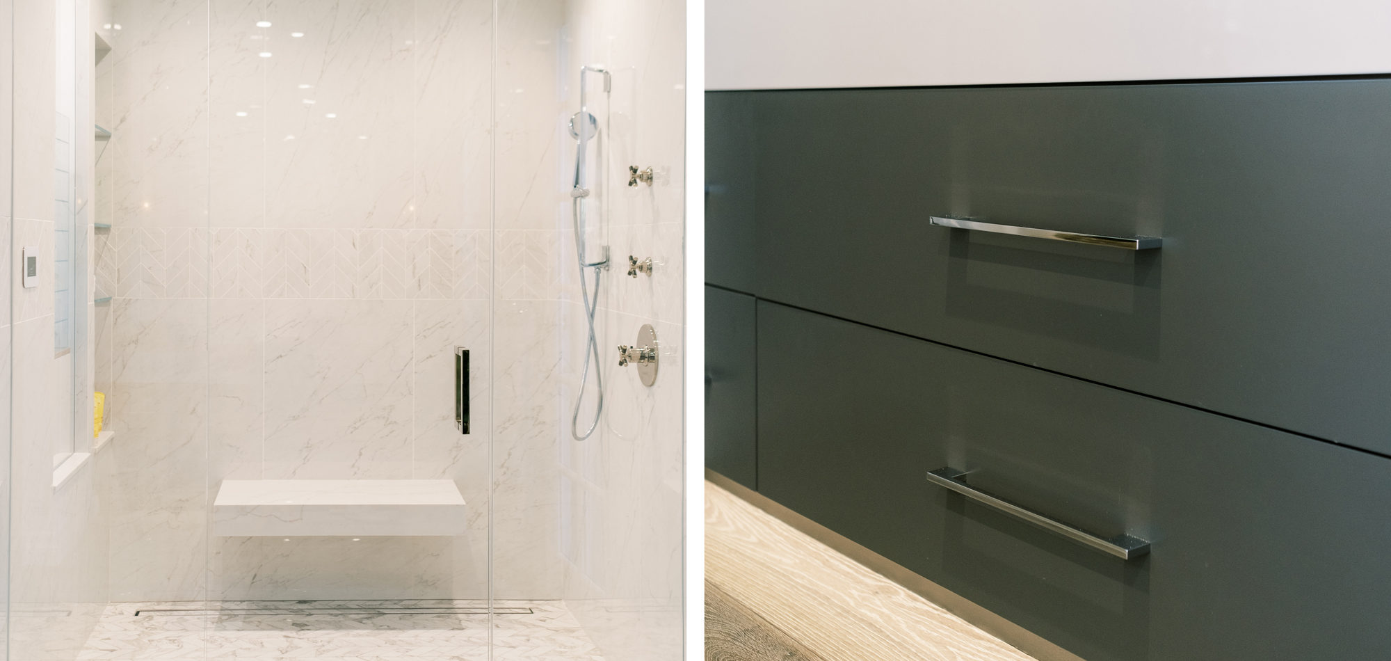
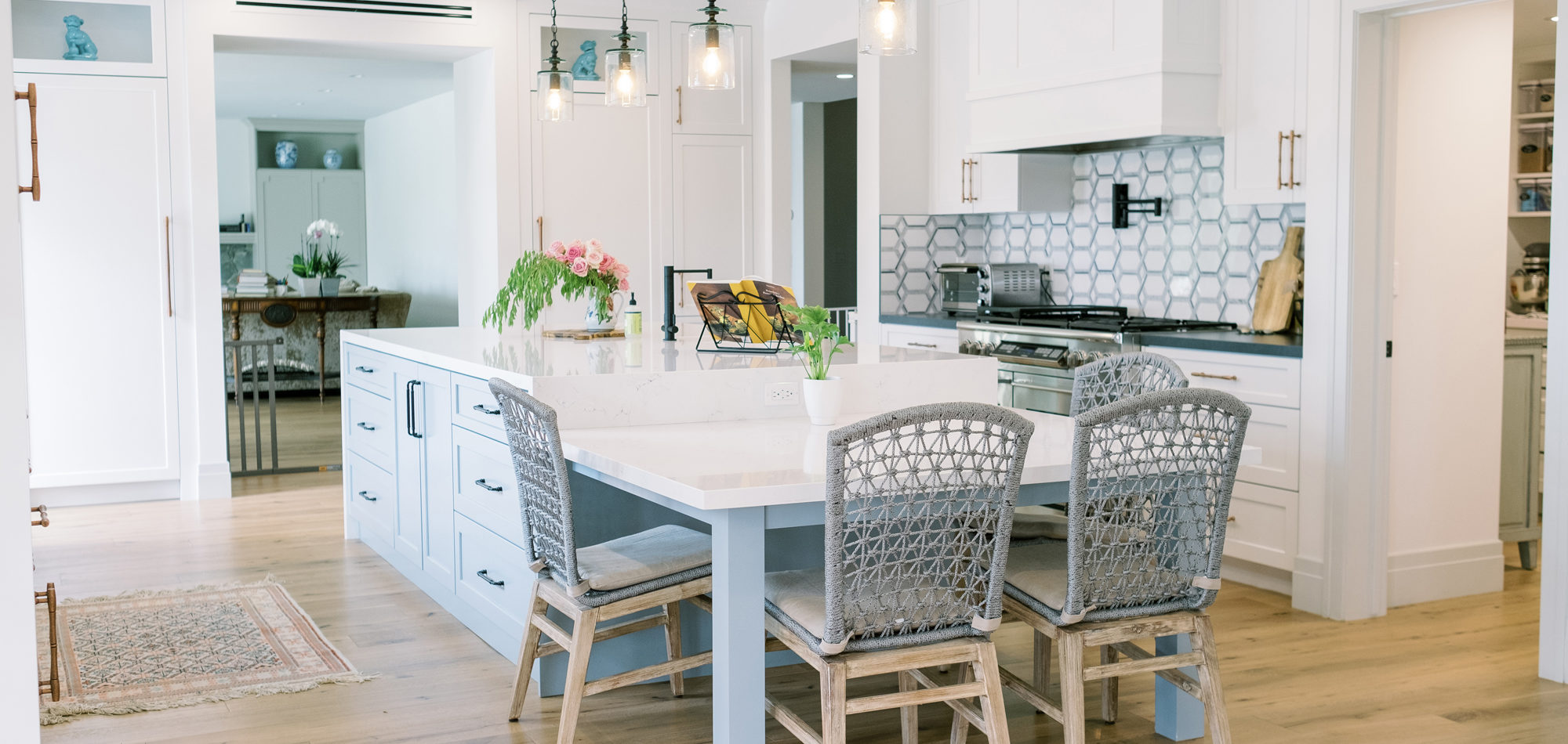
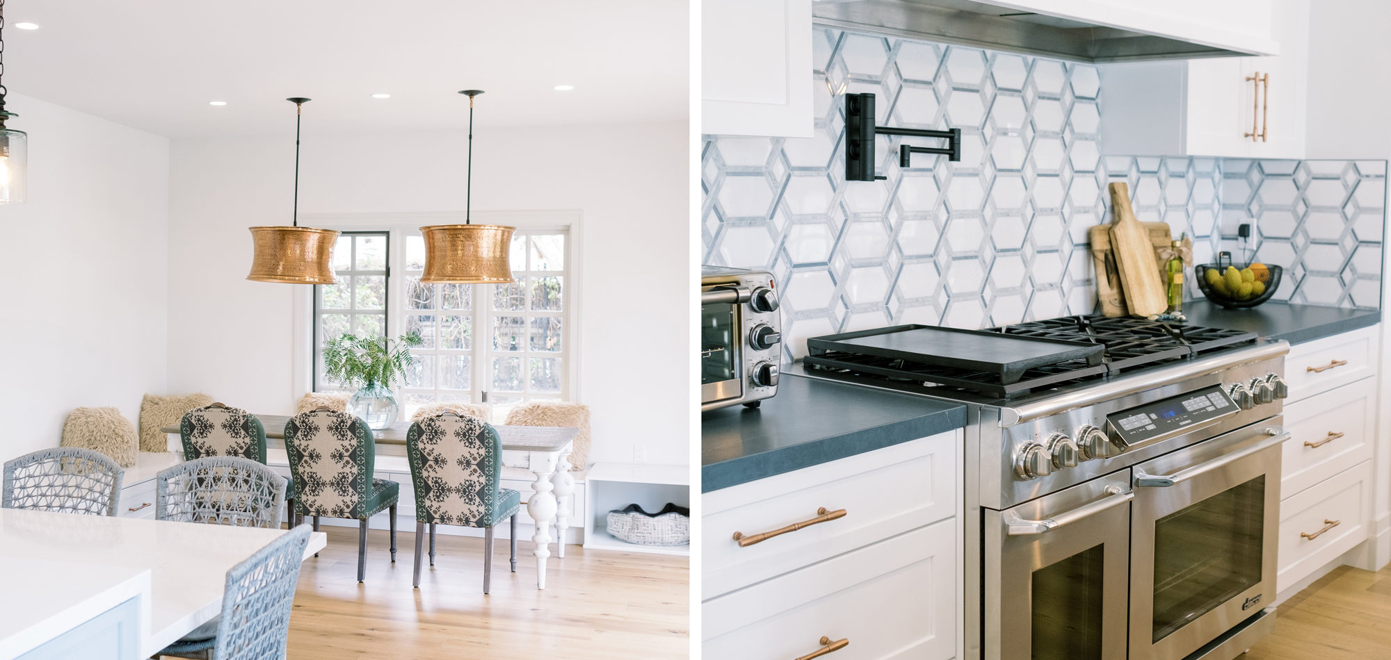
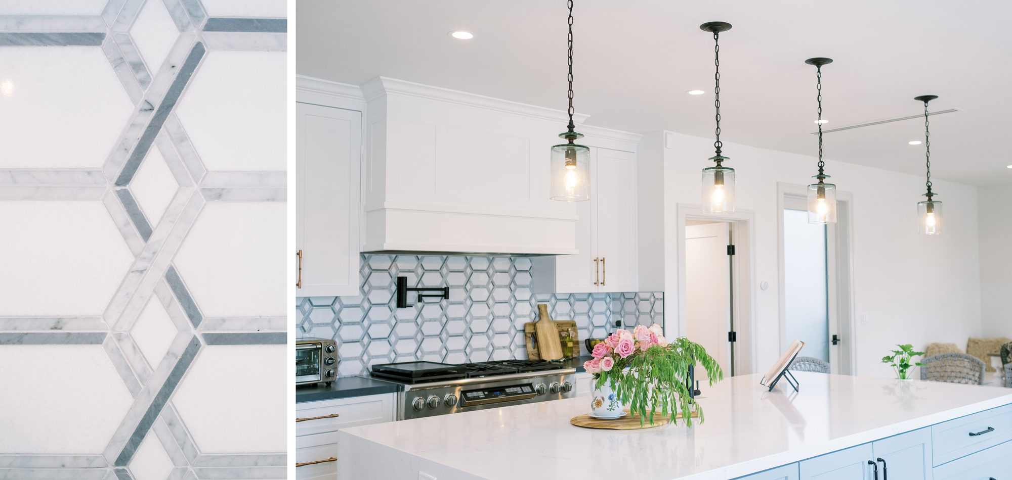
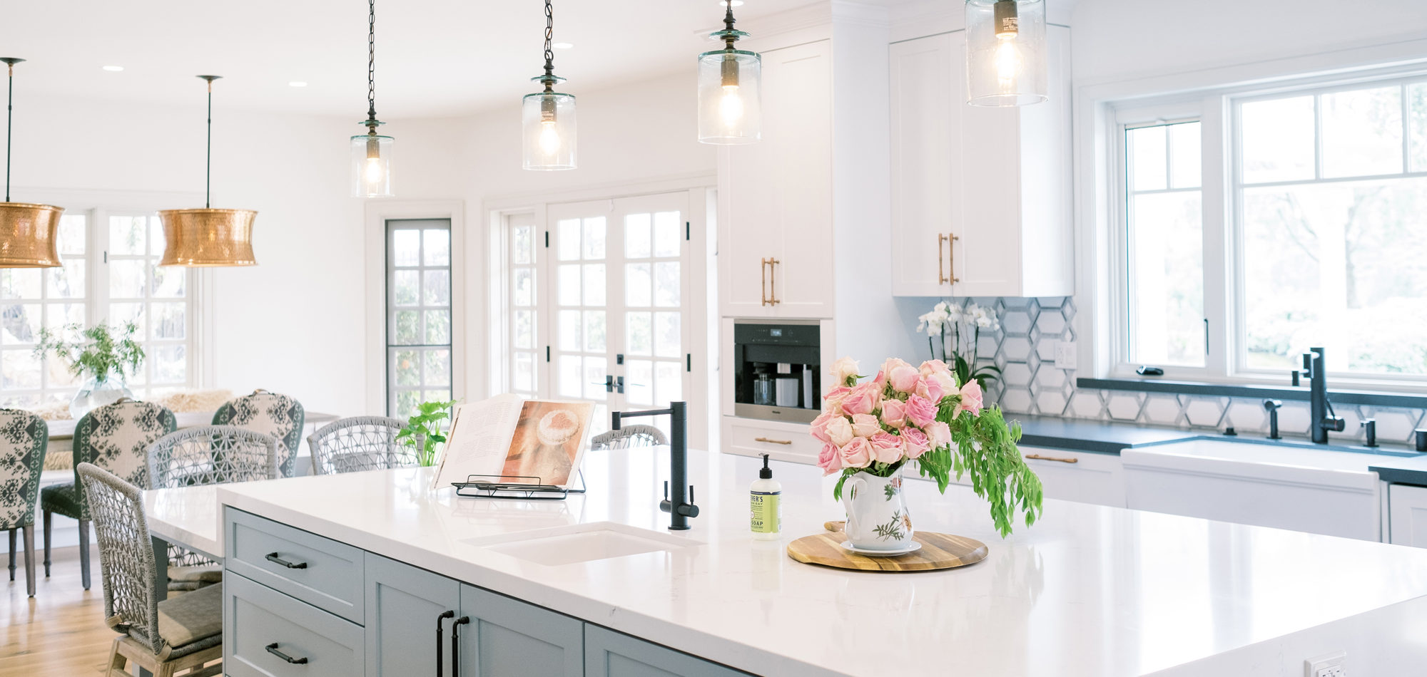
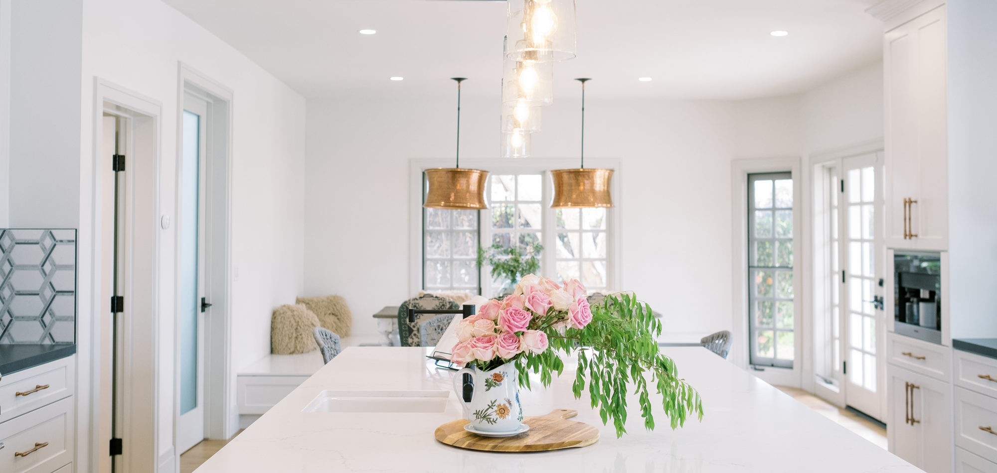
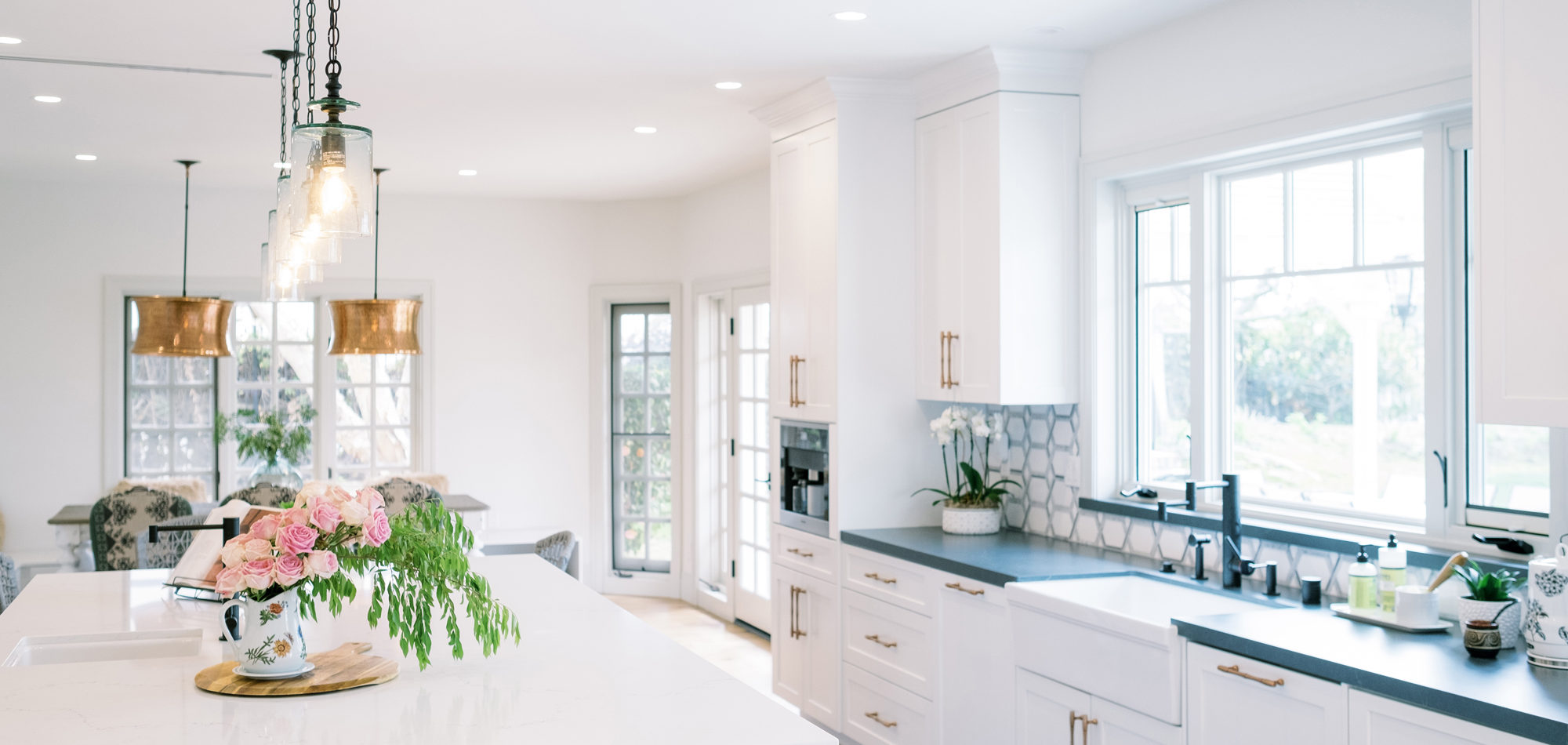
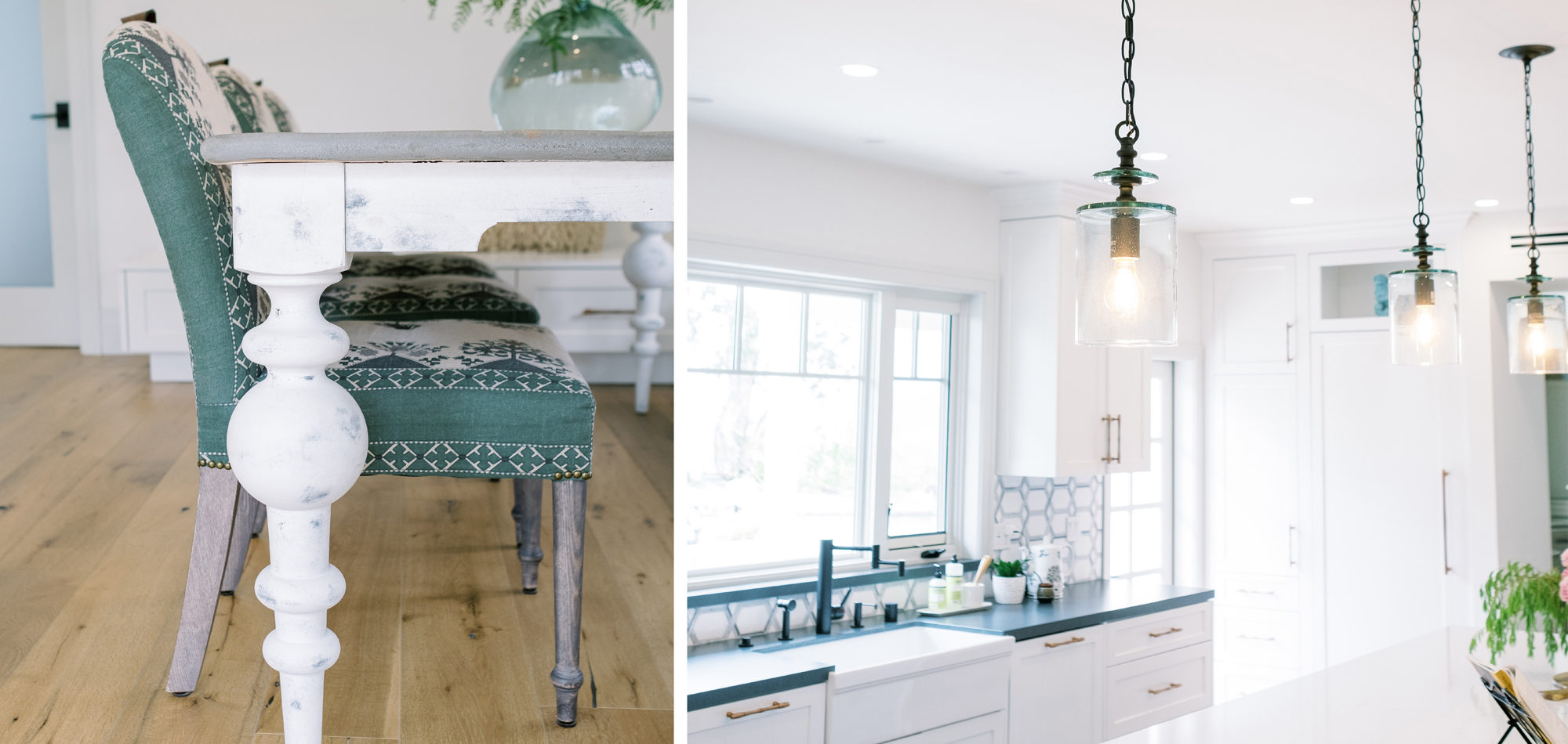
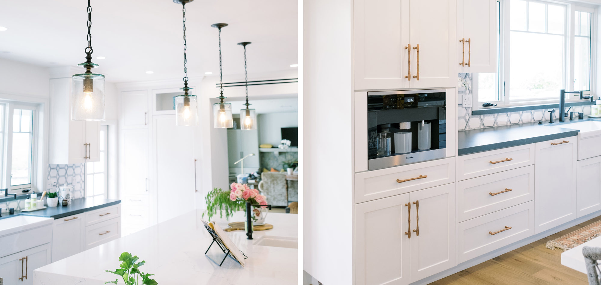
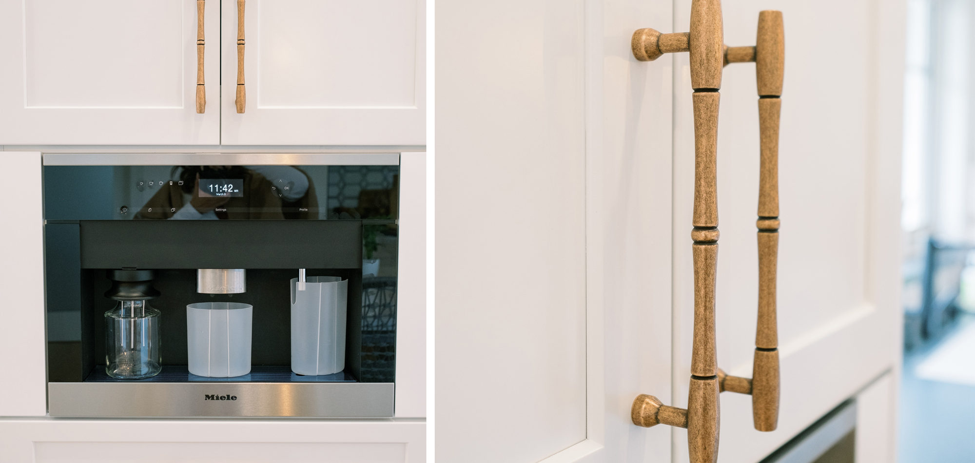
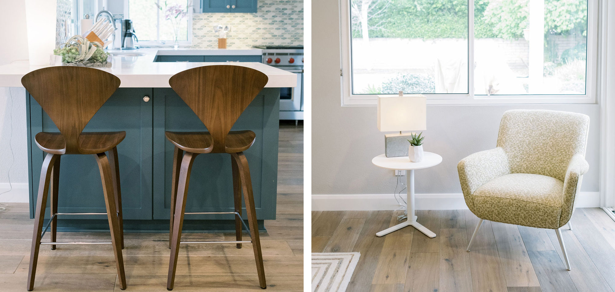
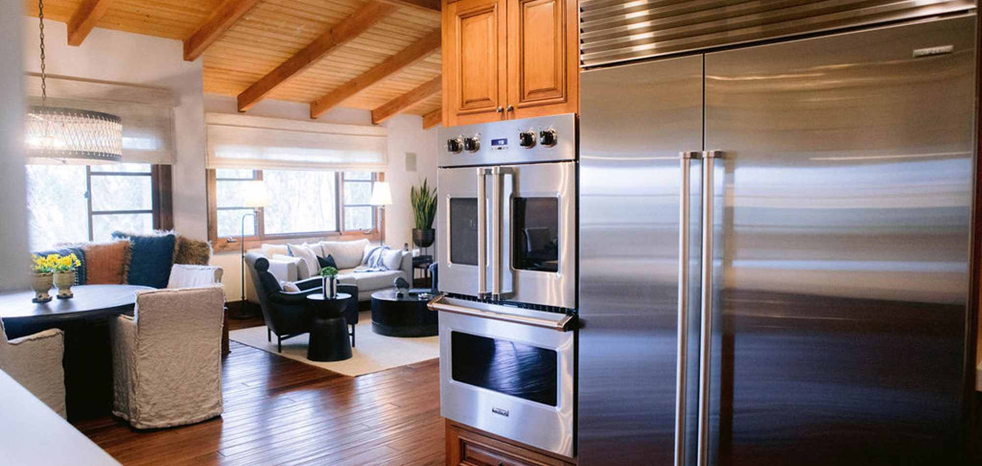
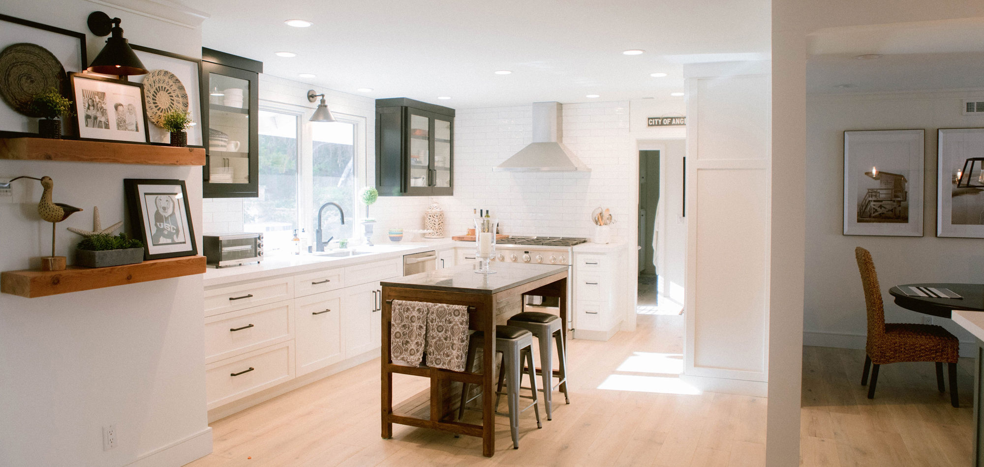
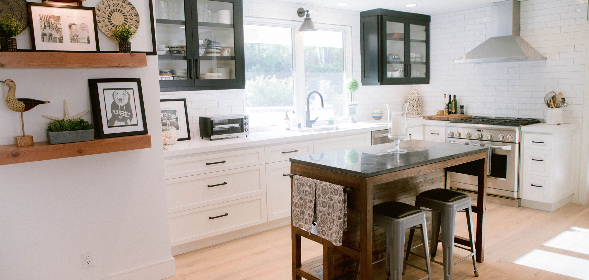
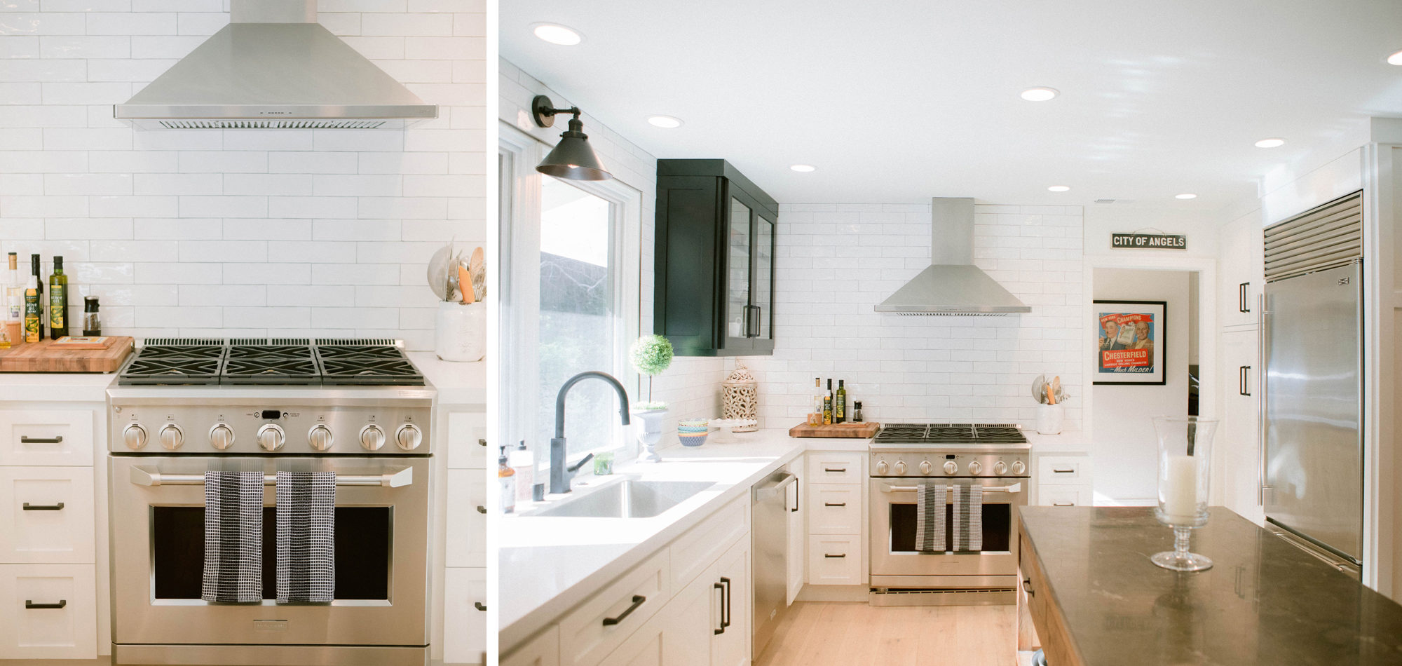
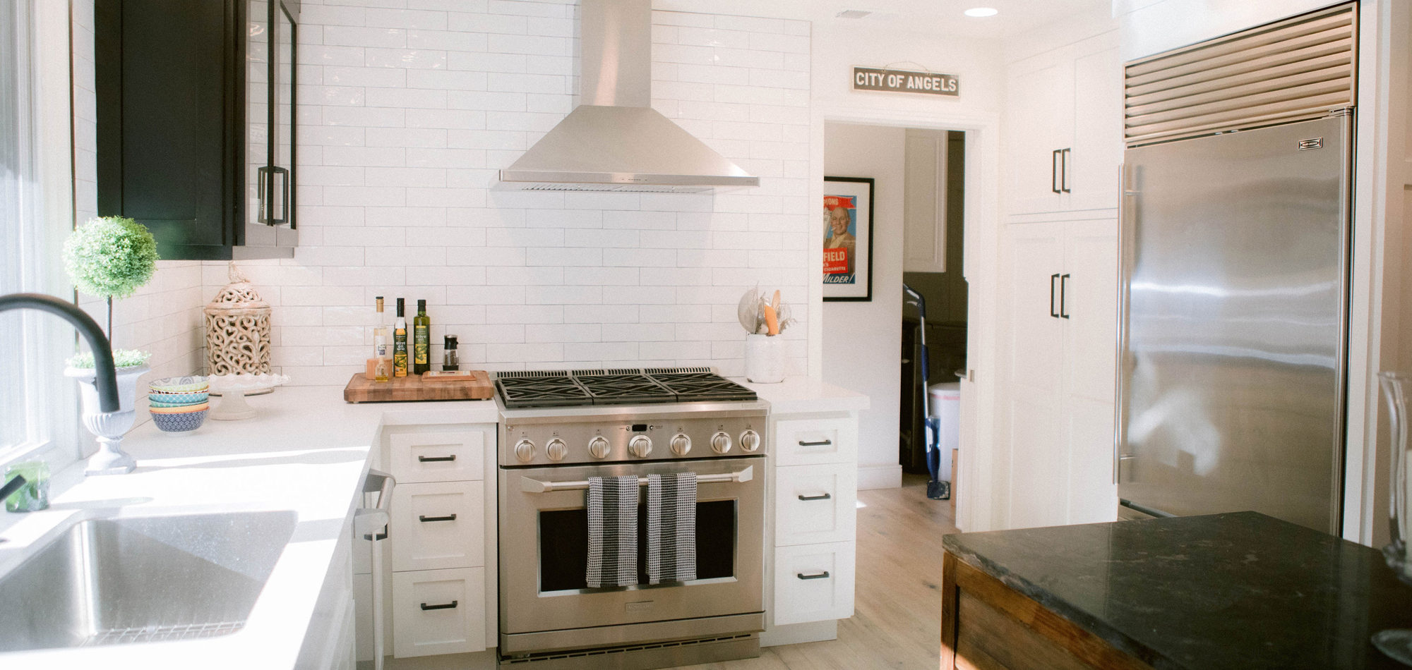
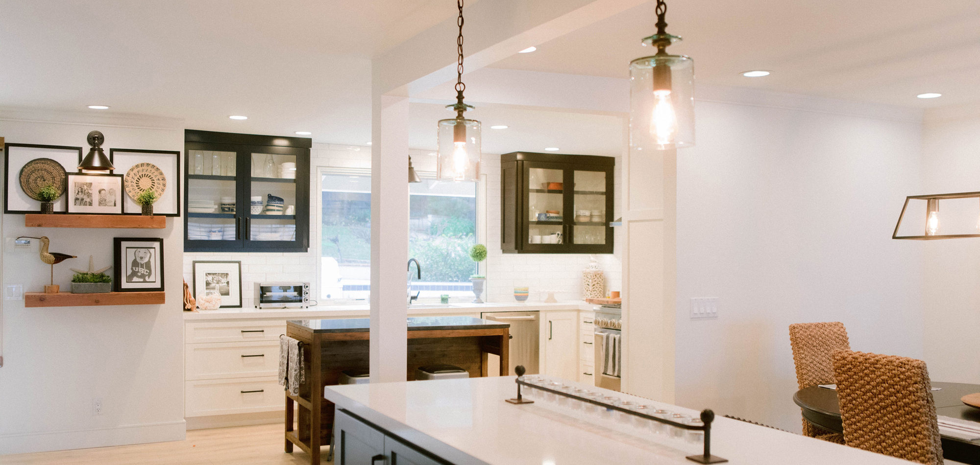
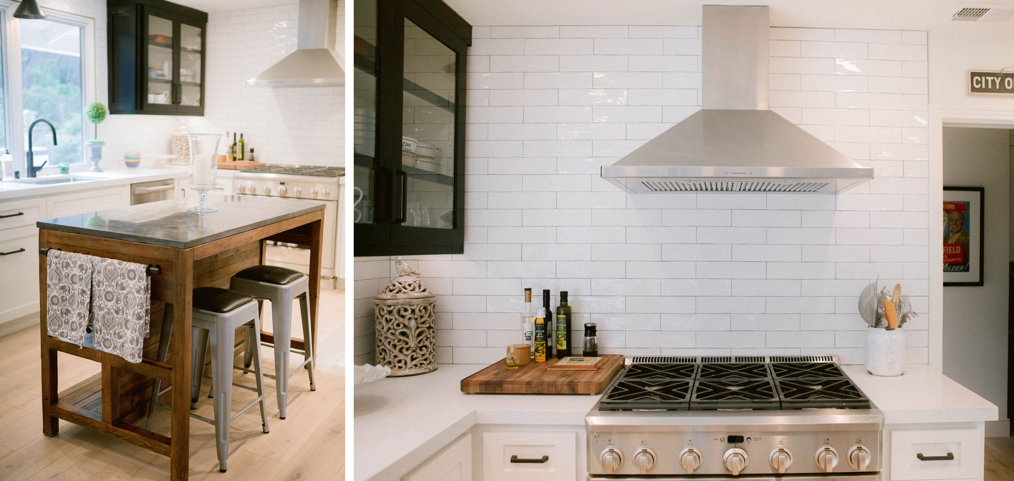
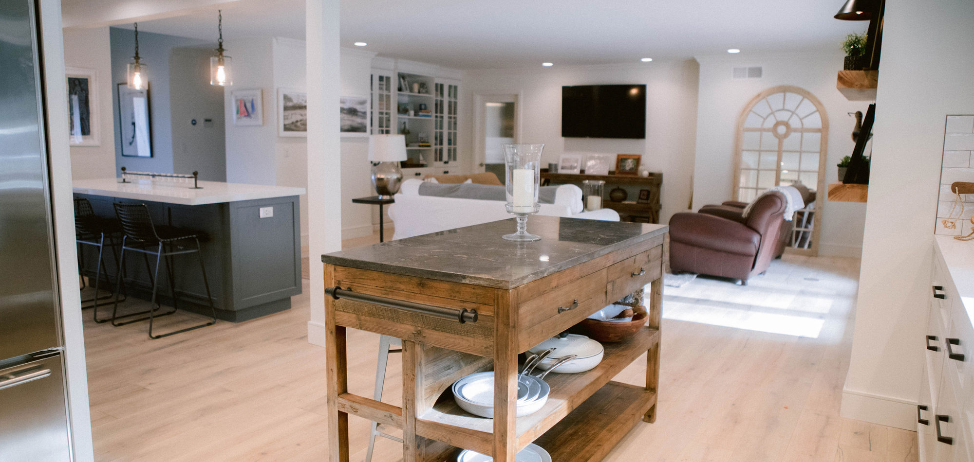
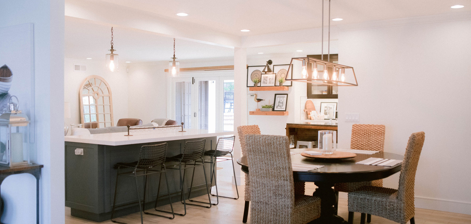
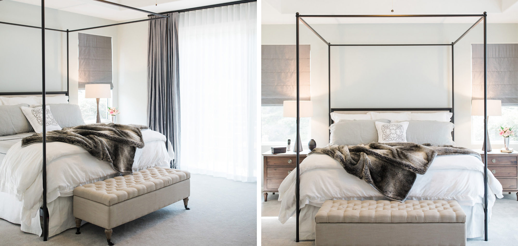
Hardwood flooring and neutral finishes carry you through the now open concept lower level. We removed walls in the kitchen and borrowed space from a hallway. Appliances were camouflaged behind cabinet panels for a seamless look. An oversized island provided functional options for our clients’ varied needs. The island, which was designed to be the hub of the kitchen/family room, is painted in Benjamin Moore’s Racoon Fur, and accented with a two-toned waterfall Caesarstone countertop. A sunny built-in bench and two bistro type tables suits the varying needs of our clients to have a quick bite, work in a sunny nook on a laptop or have a drink and appetizer with family or friends. The original floor-to-ceiling brick fireplace was replaced with a glazed porcelain that has a metallic type of sheen. Some of the client’s existing furniture and artwork was curated with new options to fashion a comfortably and pleasing aesthetic. In the primary retreat we reworked the floor plan to incorporate a walk-in closet, separate custom storage cabinets and spa-like bath area.
We knew the journey would be such a wonderful experience with our professional clients. They appreciated great design and have their own personal sense of style which we were happy to tap into so the home felt like the perfect complement to them.
The new pictorial design story has been beautifully created with the photography expertise of Jenny Quicksall Photography.
Influenced by Eclectic Design
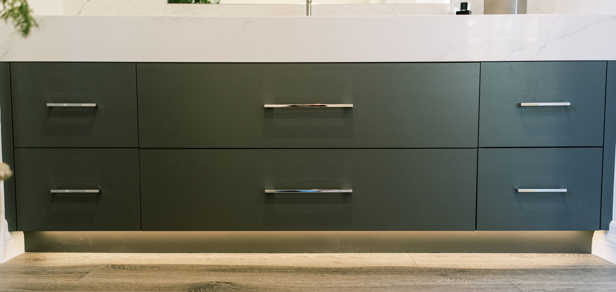
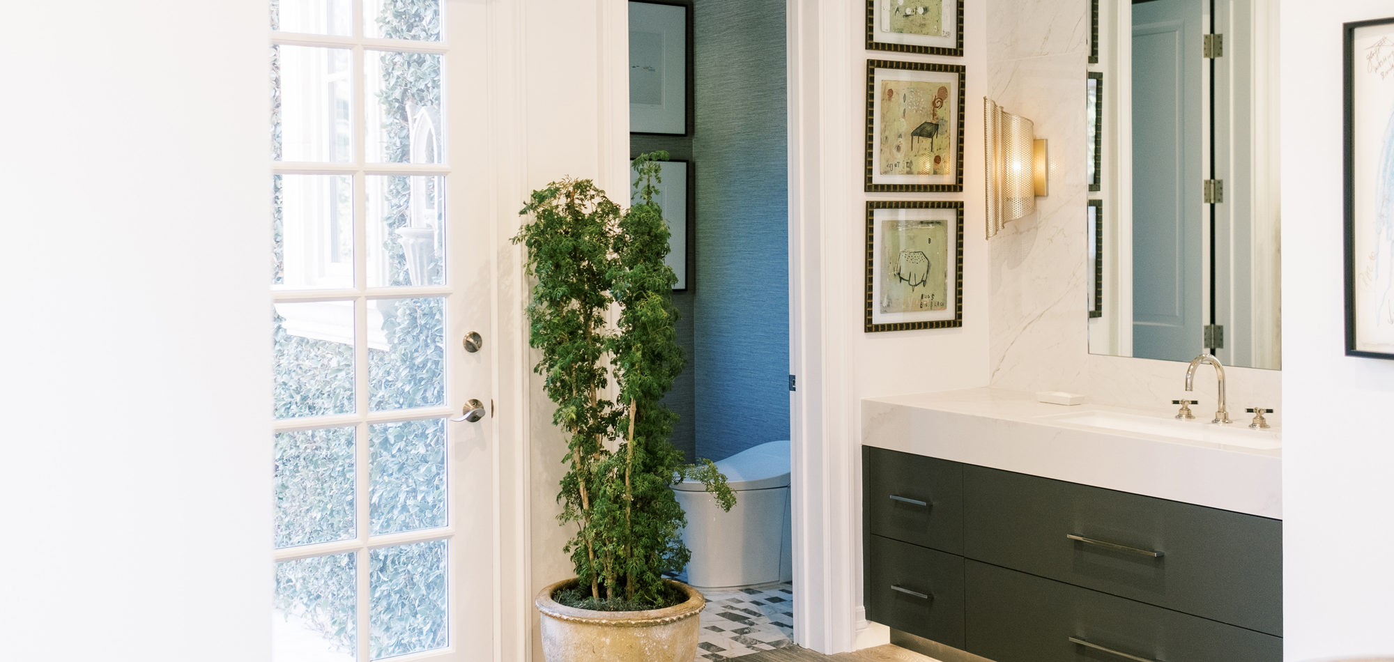
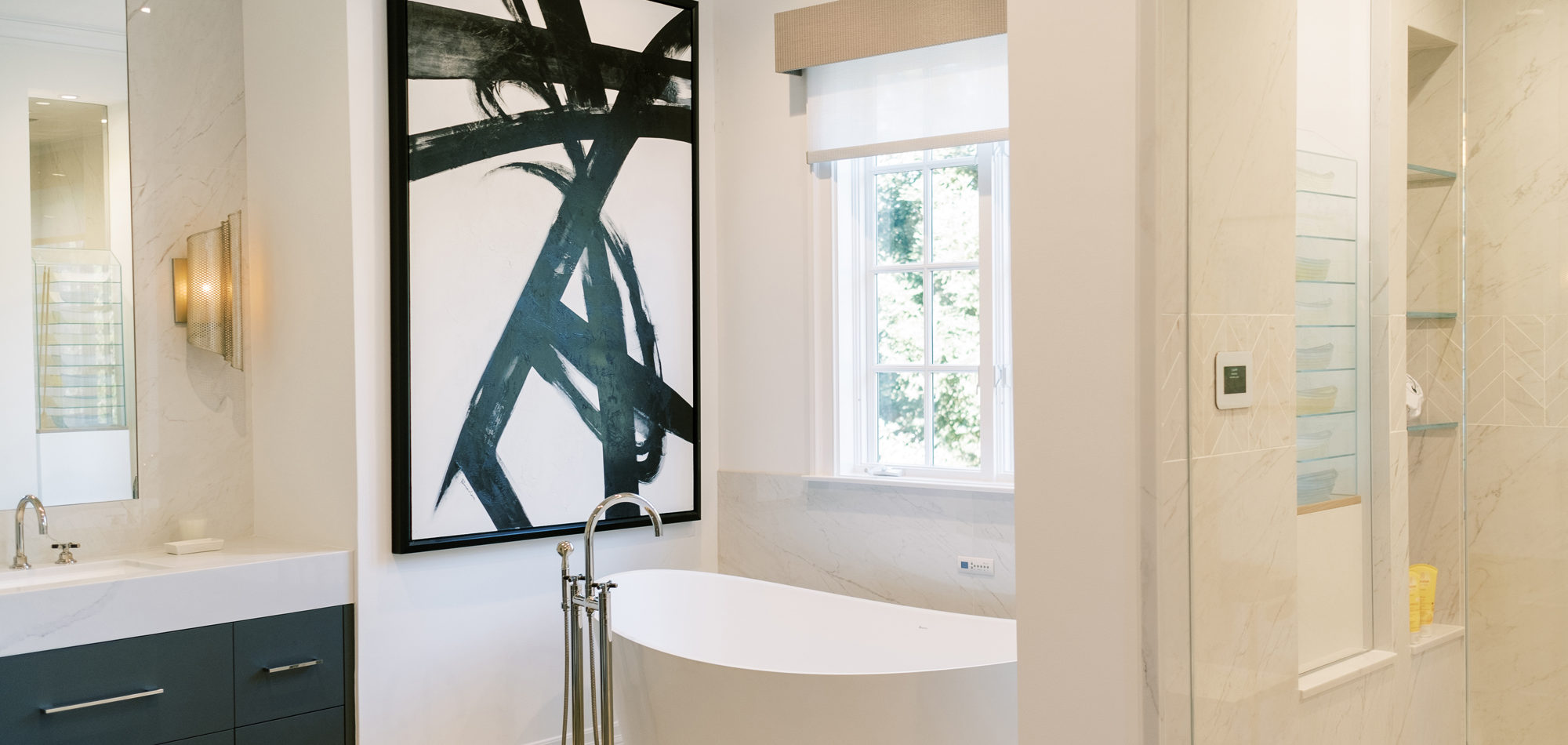
We had the pleasure of designing an expansive bathroom and closet retreat in the exclusive community of Lake Sherwood, tucked away within the Santa Monica mountains. So much fun working with our client who is self-proclaimed OCD as it pertains to attention to detail, has a strong sense of who he is and what he wants. He gave us his wish list which we massaged and added to, to create a space that is truly as unique as its inhabitant.
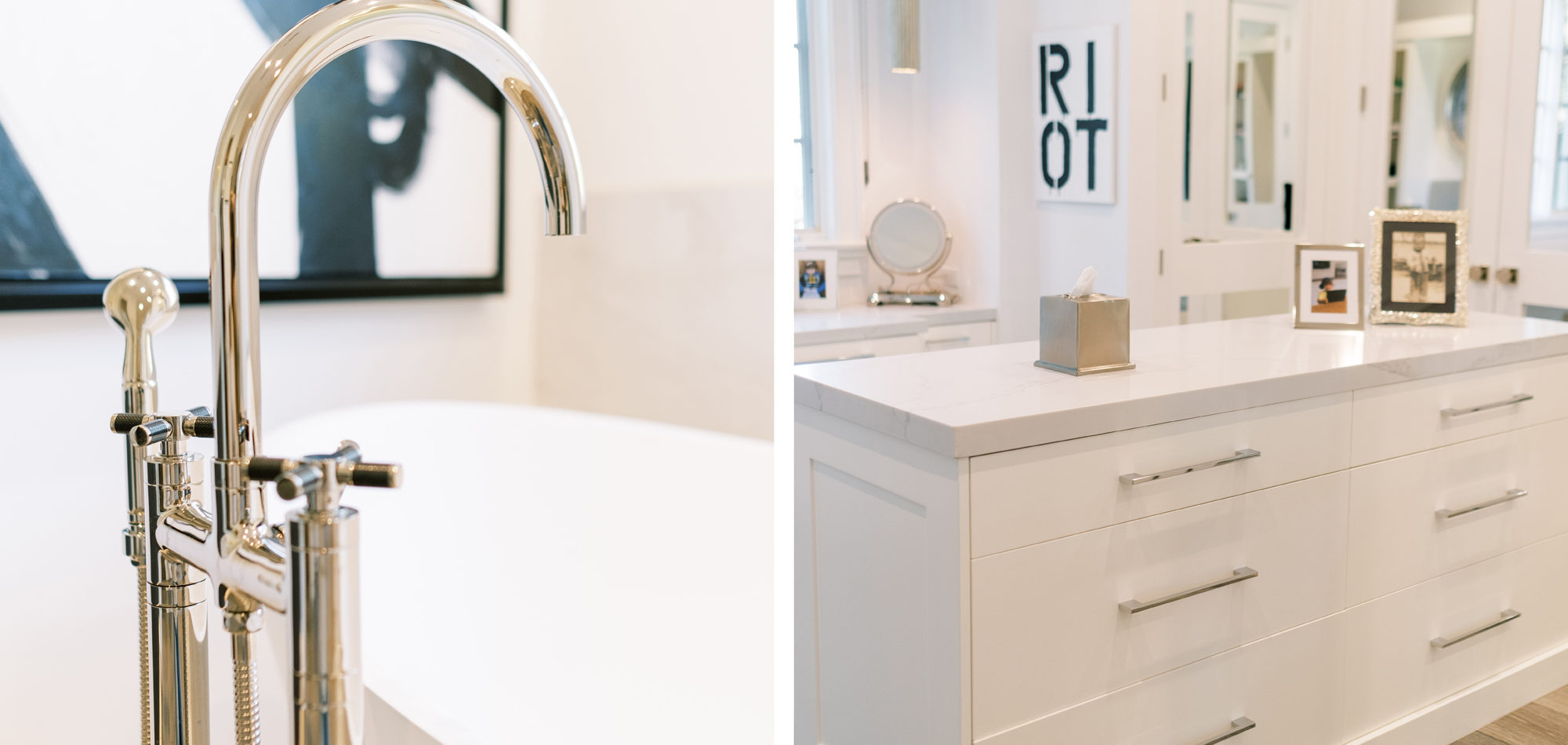
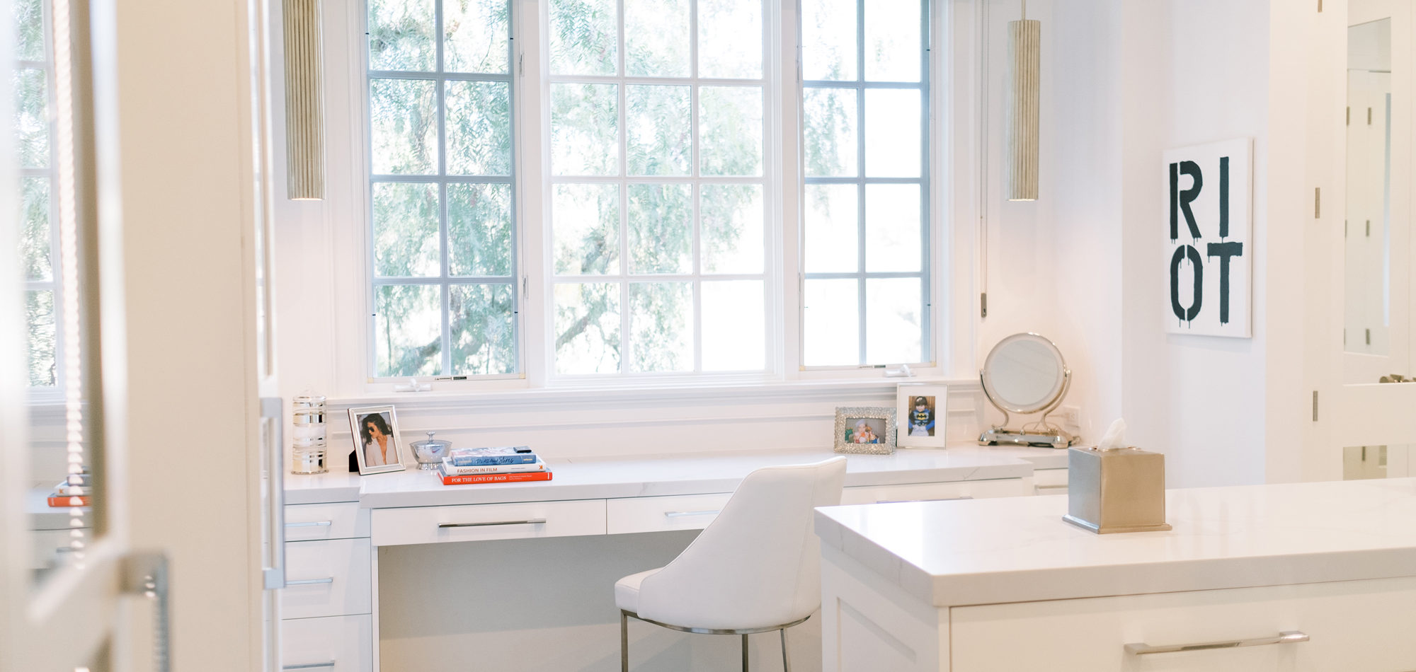
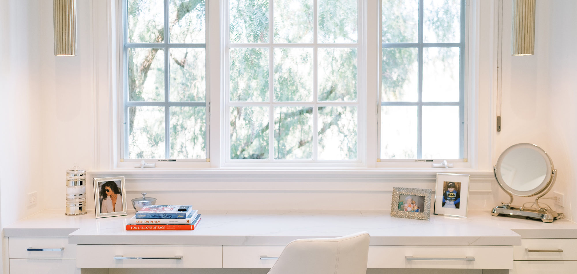
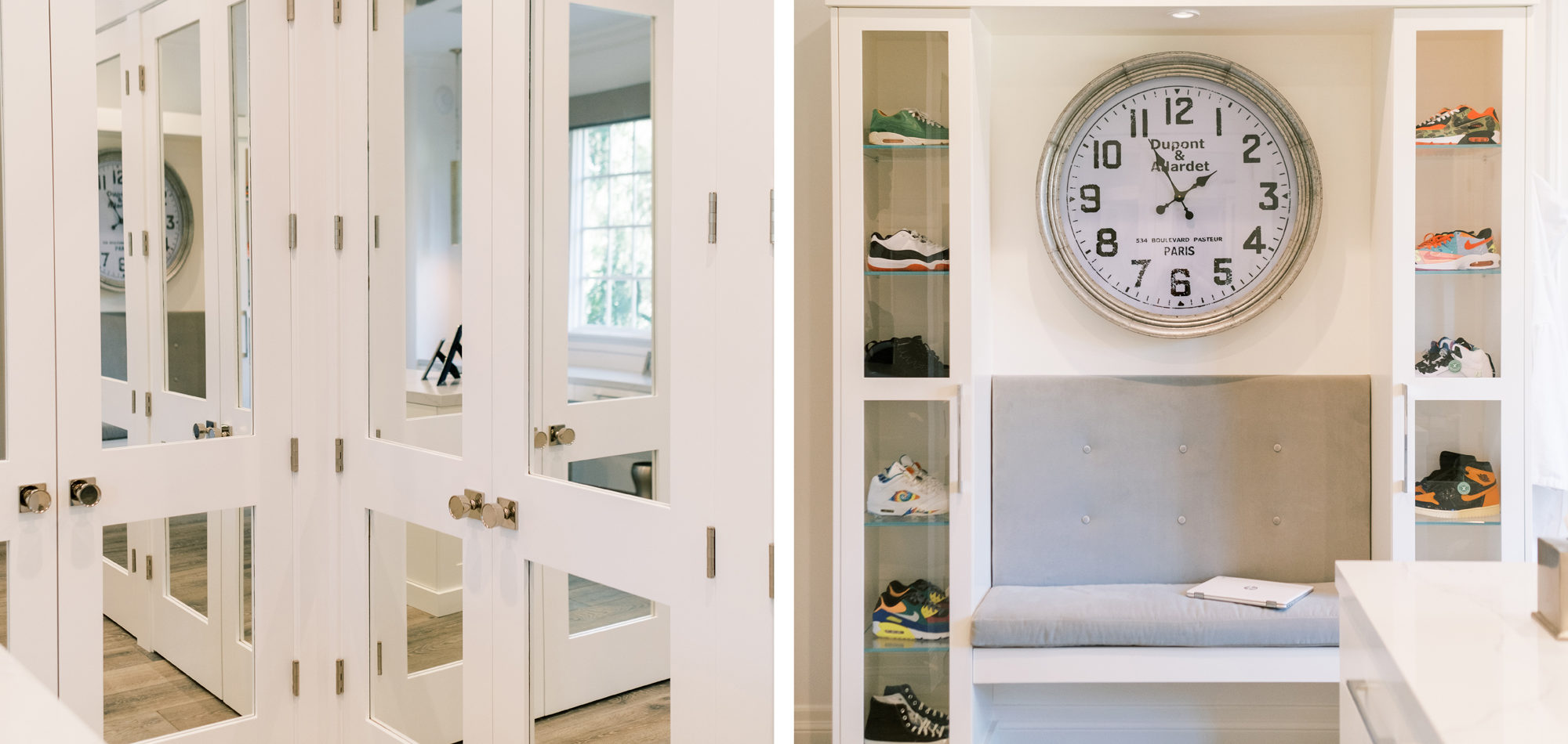
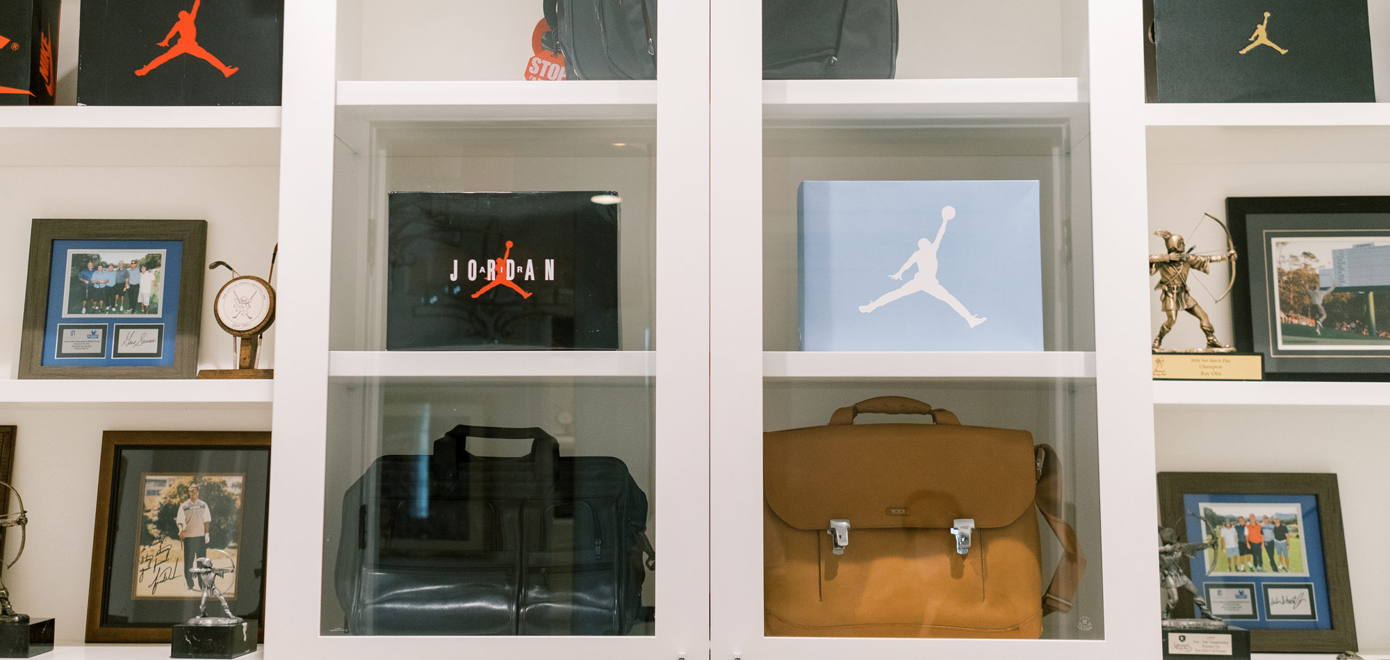
Some of the key features to our client, who cares a lot about functionality, were two separate vanities, all white with dramatic accents, an area for make-up, and a shoe cabinet. He is an avid art collector so arranging his existing art and items in the space was important to him.
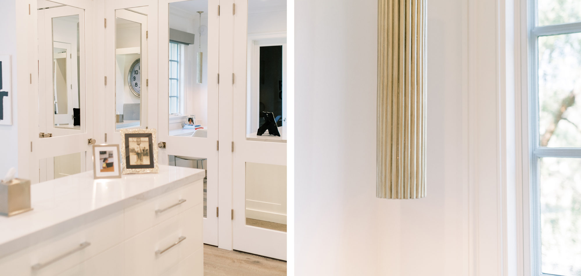
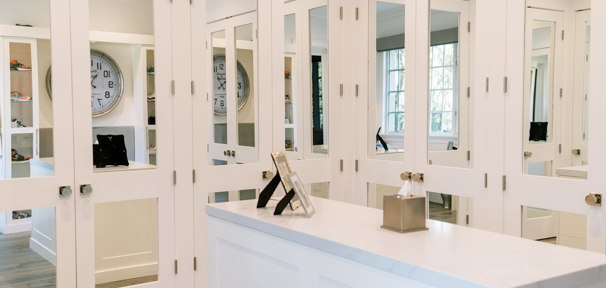
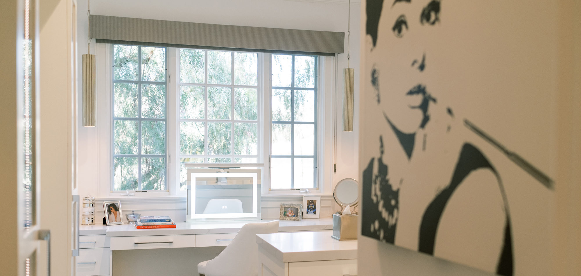
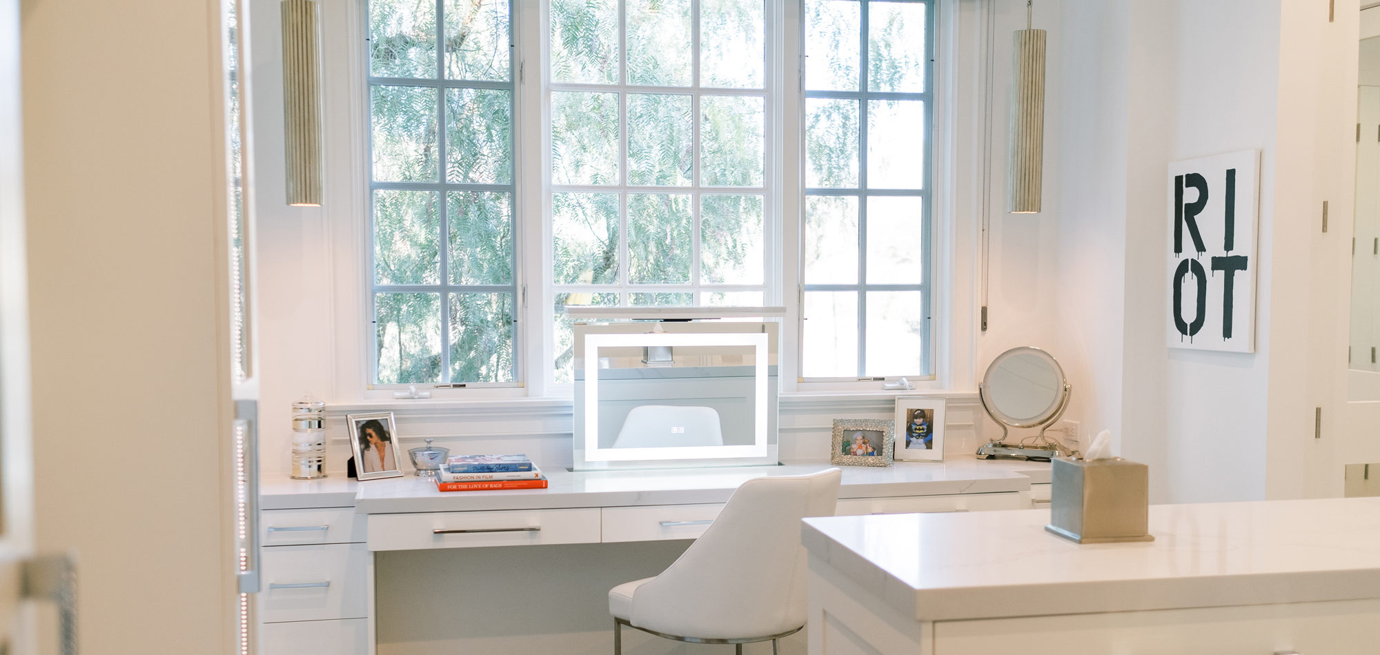
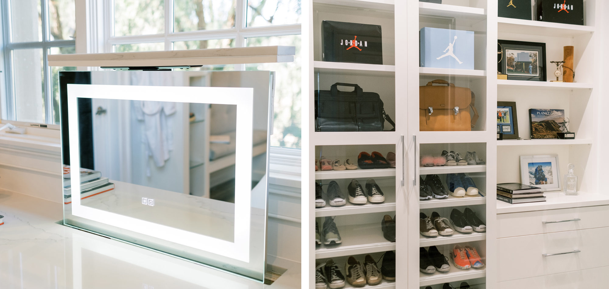
The first task was reworking an existing secondary bathroom to replace with a dressing/closet area. It was important to our client to have the vanity in front of the window. Additional accent lighting was achieved by flanking pendant lights. Necessity is the mother of invention, so we designed a pop-up lighted mirror to be used when needed and to hide under the cabinetry when not in use. Mirrored closet doors opened the space and allowed for light to bounce off the surfaces. A mirrored shoe cabinet was lit inside and has glass doors to showcase the client’s collection.
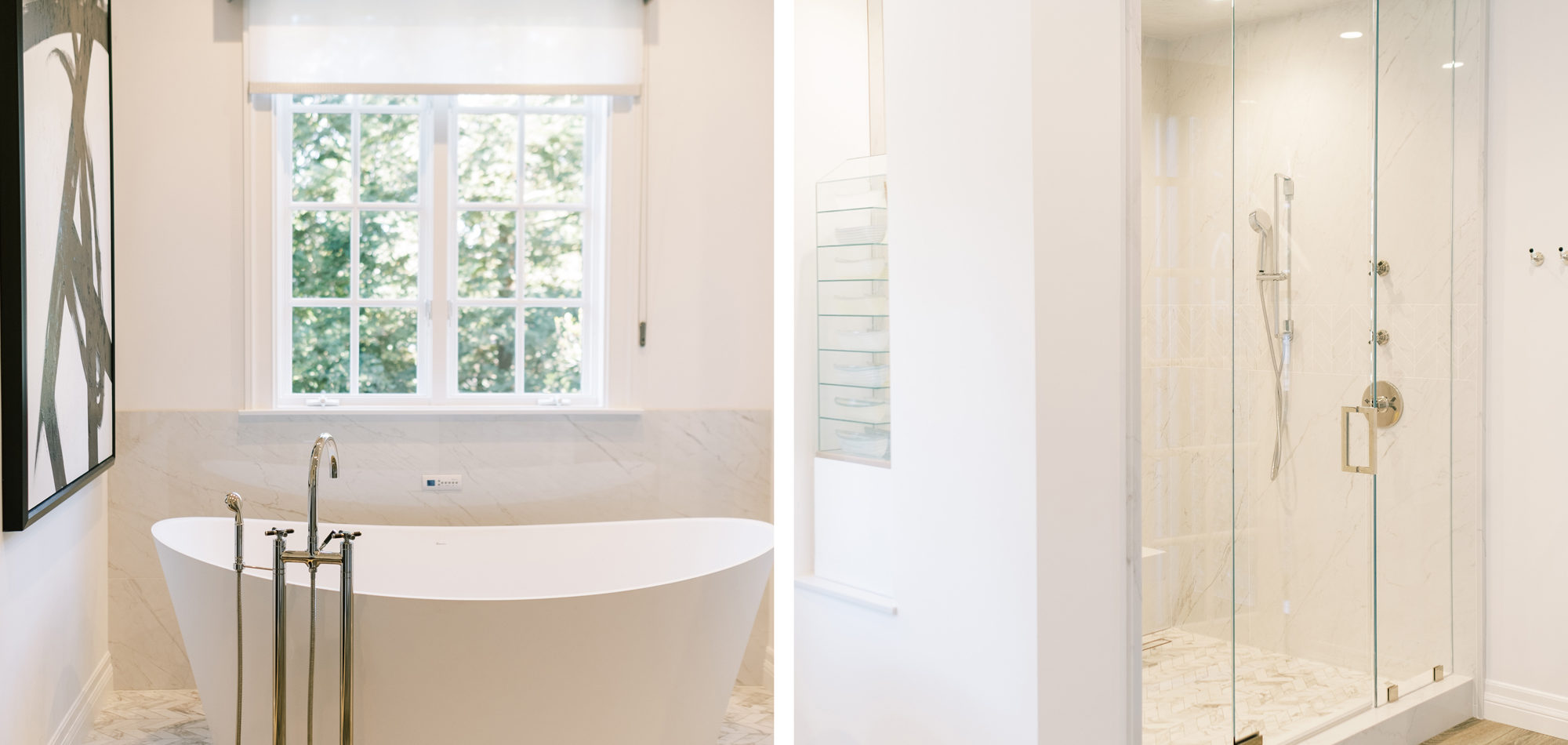
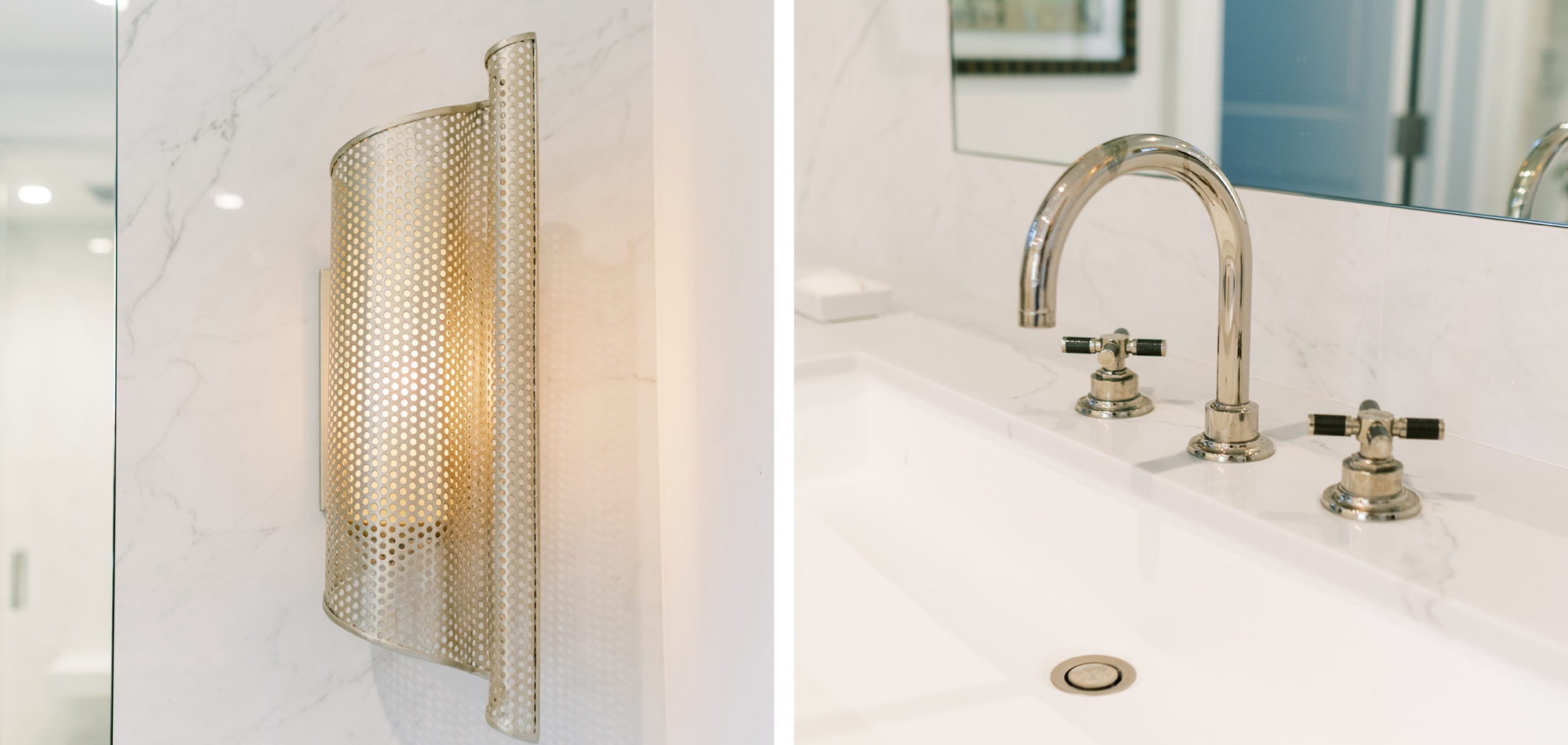
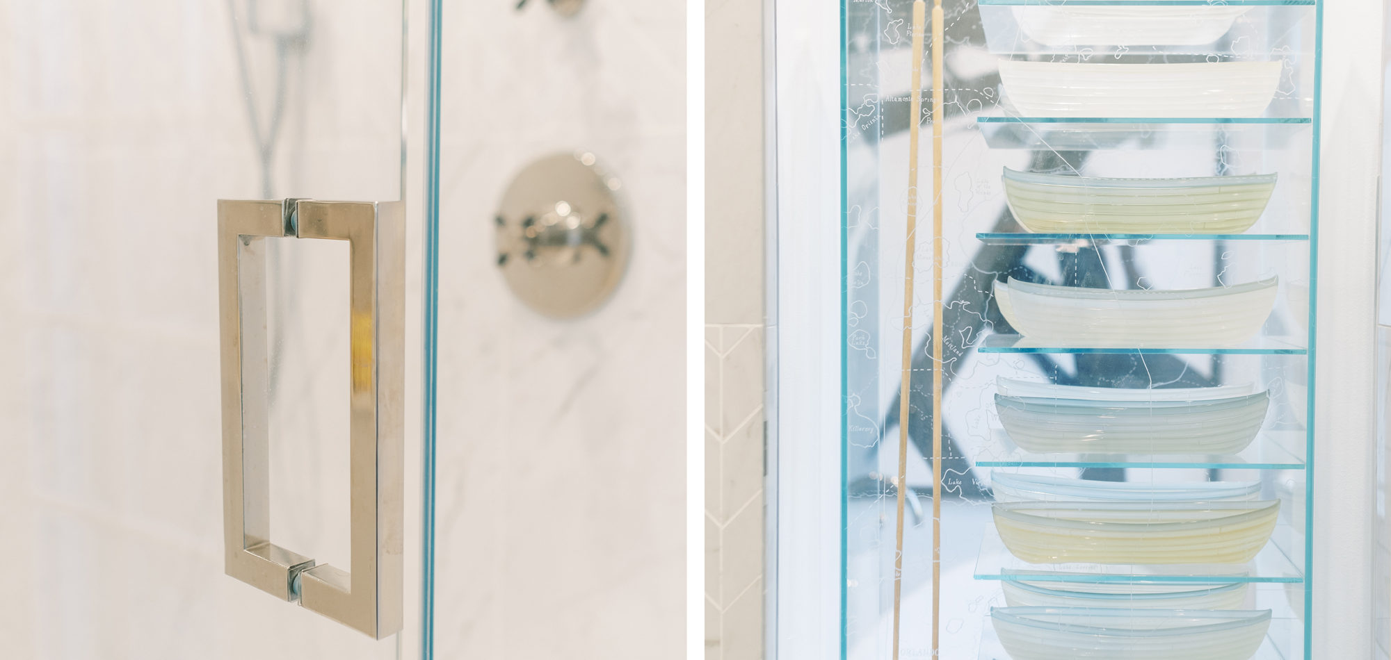
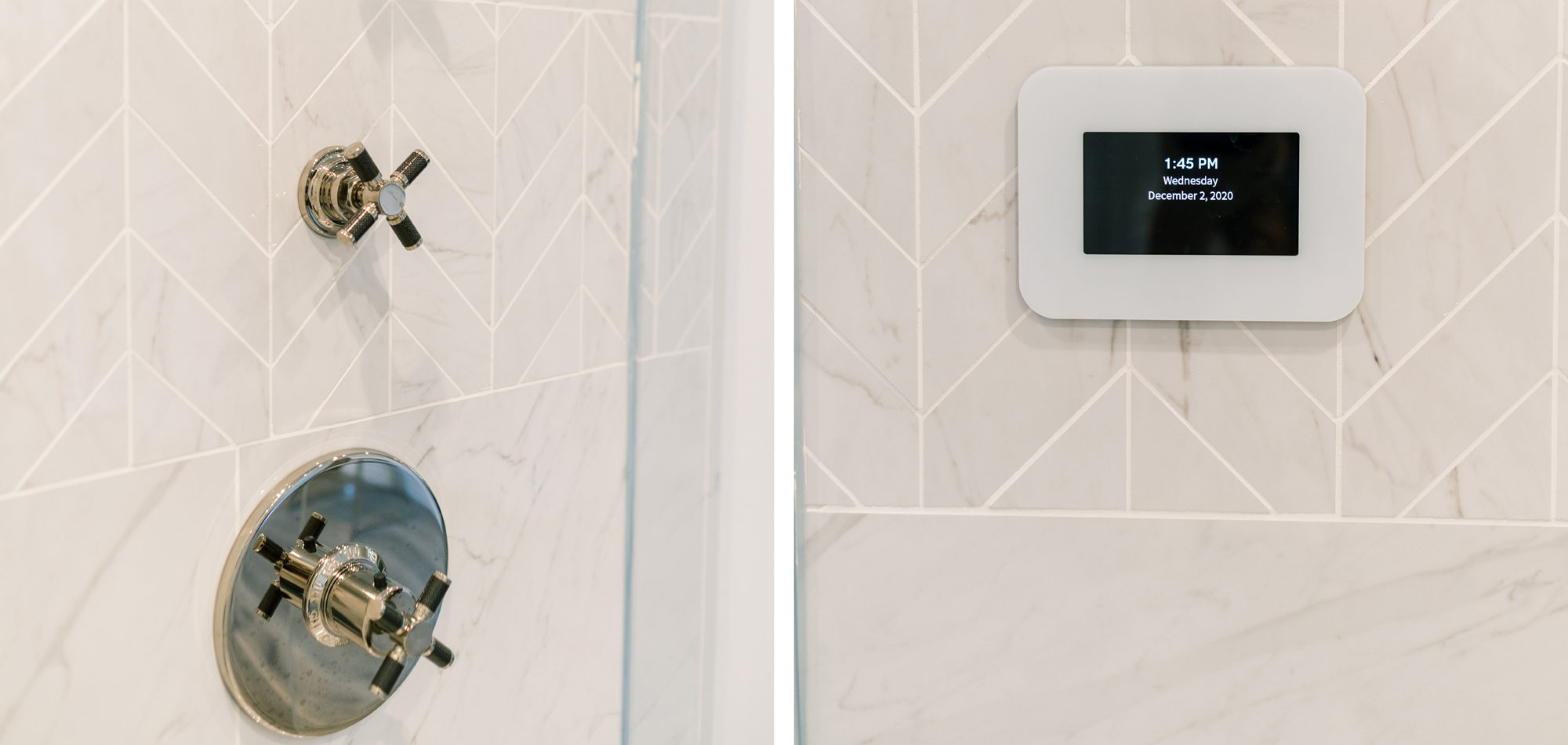
A stunning Bain Ultra tub set the stage for this personalized bathroom. The client’s fabulous art and sculpture added individuality to the room. Luxury finishes were chosen from the Pirch Showroom, stunning lighting choices from Currey and Company.
Photographed by the talented Jenny Quicksall Photography.
Influenced by Modern French Country
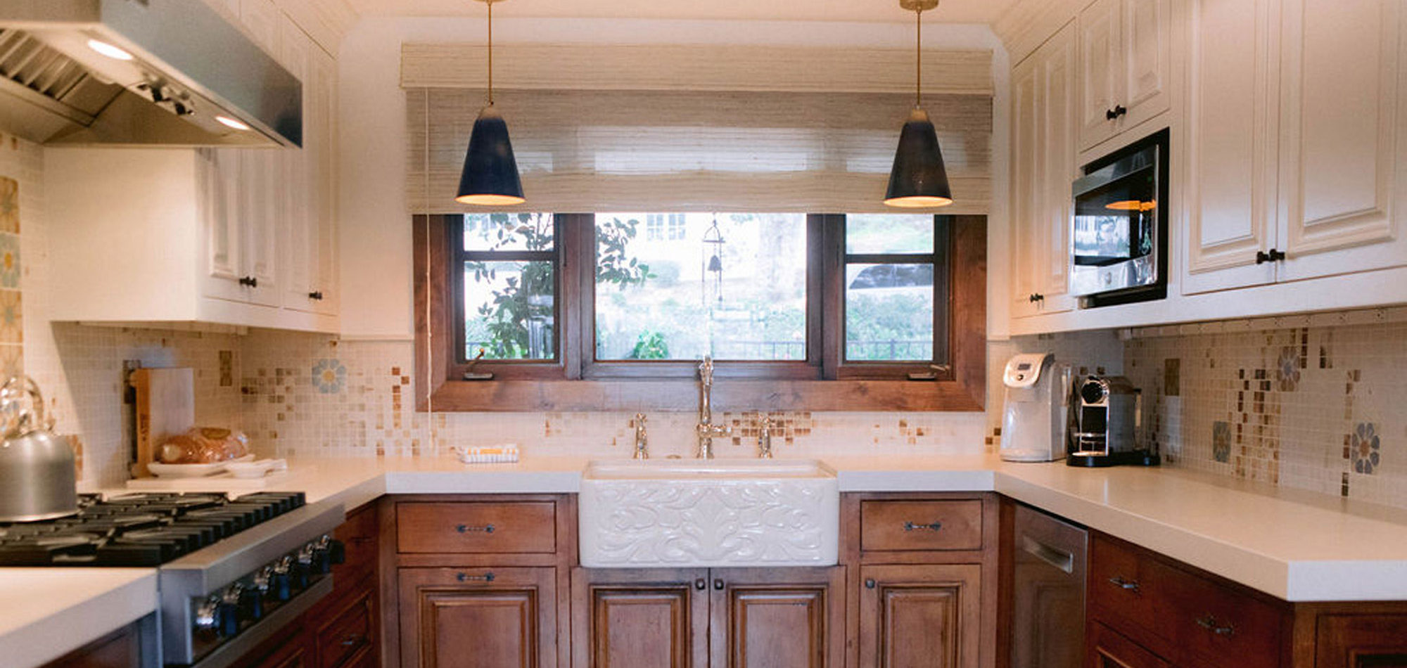
Upon first meeting with our client who has a family of four and Molly, a Cavalier King Charles Spaniel, it was an instant connection. They had recently purchased the home for its excellent bones and spectacular mountain views.
Like most of our clients, they are busy professionals who have a sense of what they want and require assistance to pull it all together seamlessly with beauty and function. They were looking for a simple French Country theme with nothing ornate.
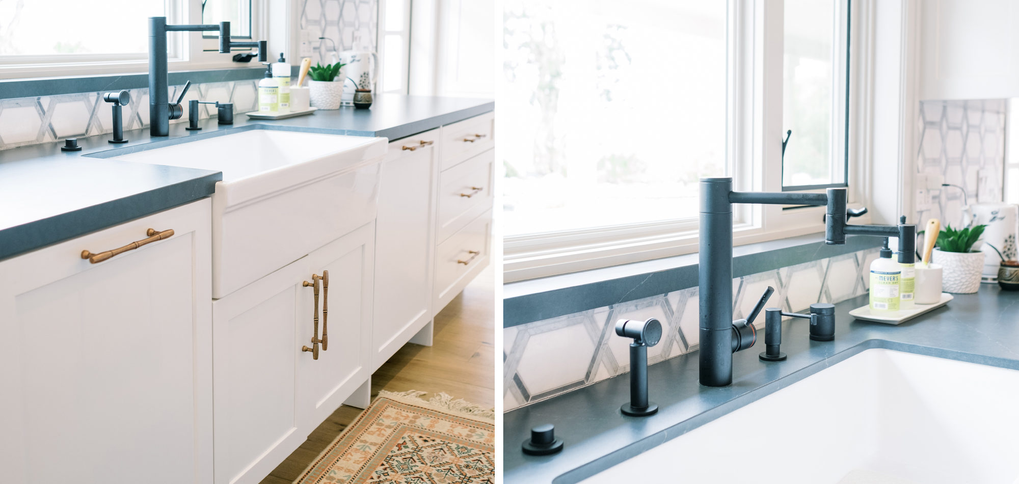
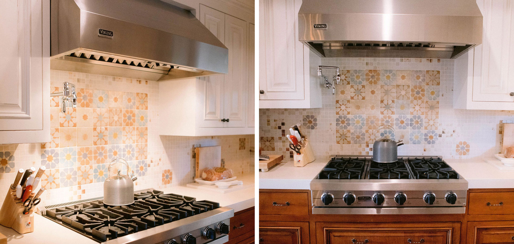
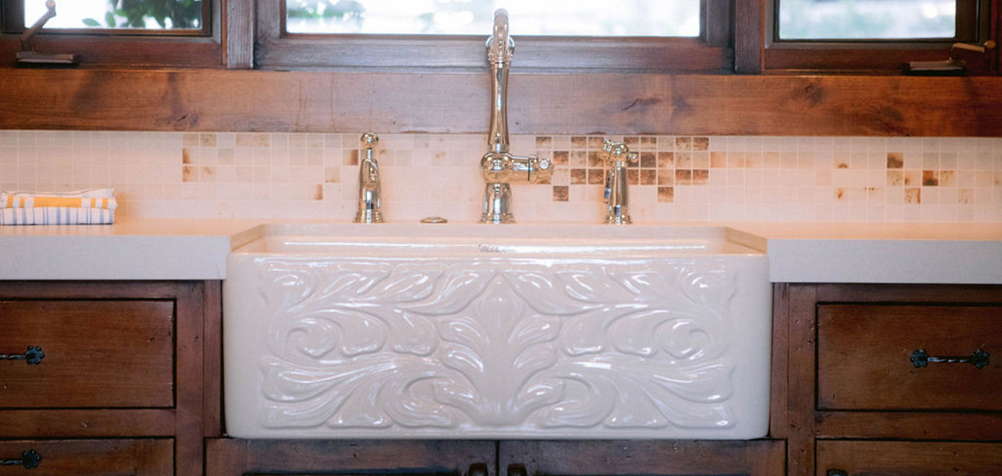
It is important to understand the needs and desires of our clients. In this case, there is one main cook, however, there can be 3 or 4 cooks in the kitchen during holidays and family dinners. They like to have people hang out in the kitchen with them when preparing dinner. They wanted the look of one main island and panels on the appliances. Baking is important to our client, and she wanted a place to roll dough. Other items on the wish list included a range with wall ovens, a Farmhouse sink, pot filler, whitewashed hardwood flooring throughout, and a blue island. We were also asked to rework the layout to include a walk-in pantry and a separate closet to access from the hallway.
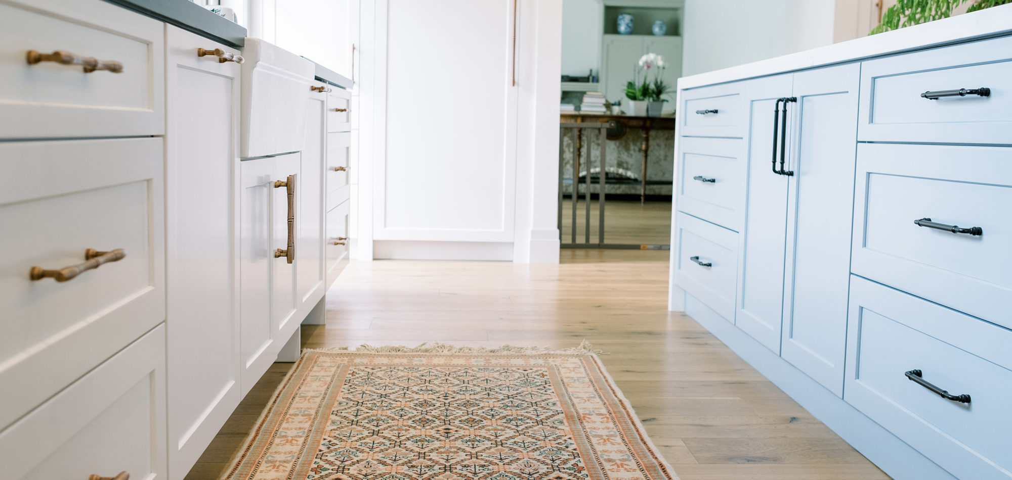
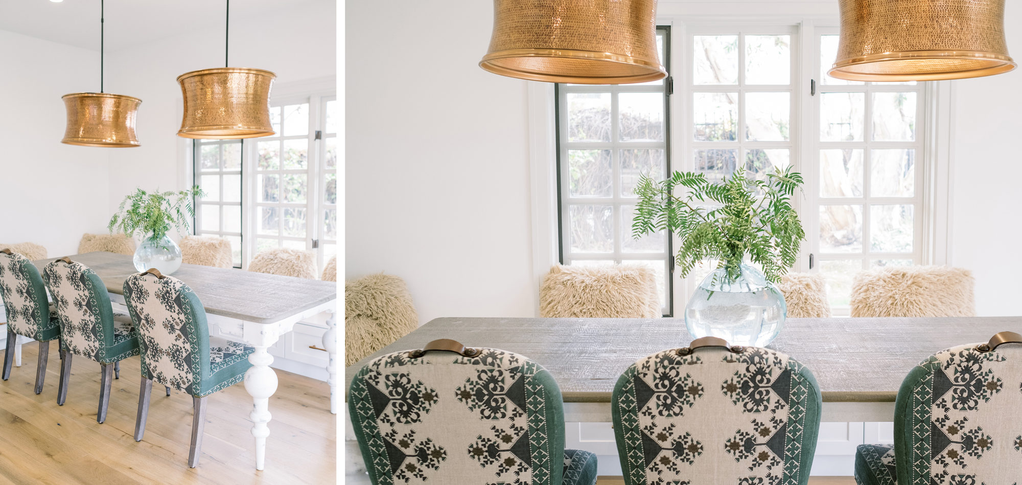
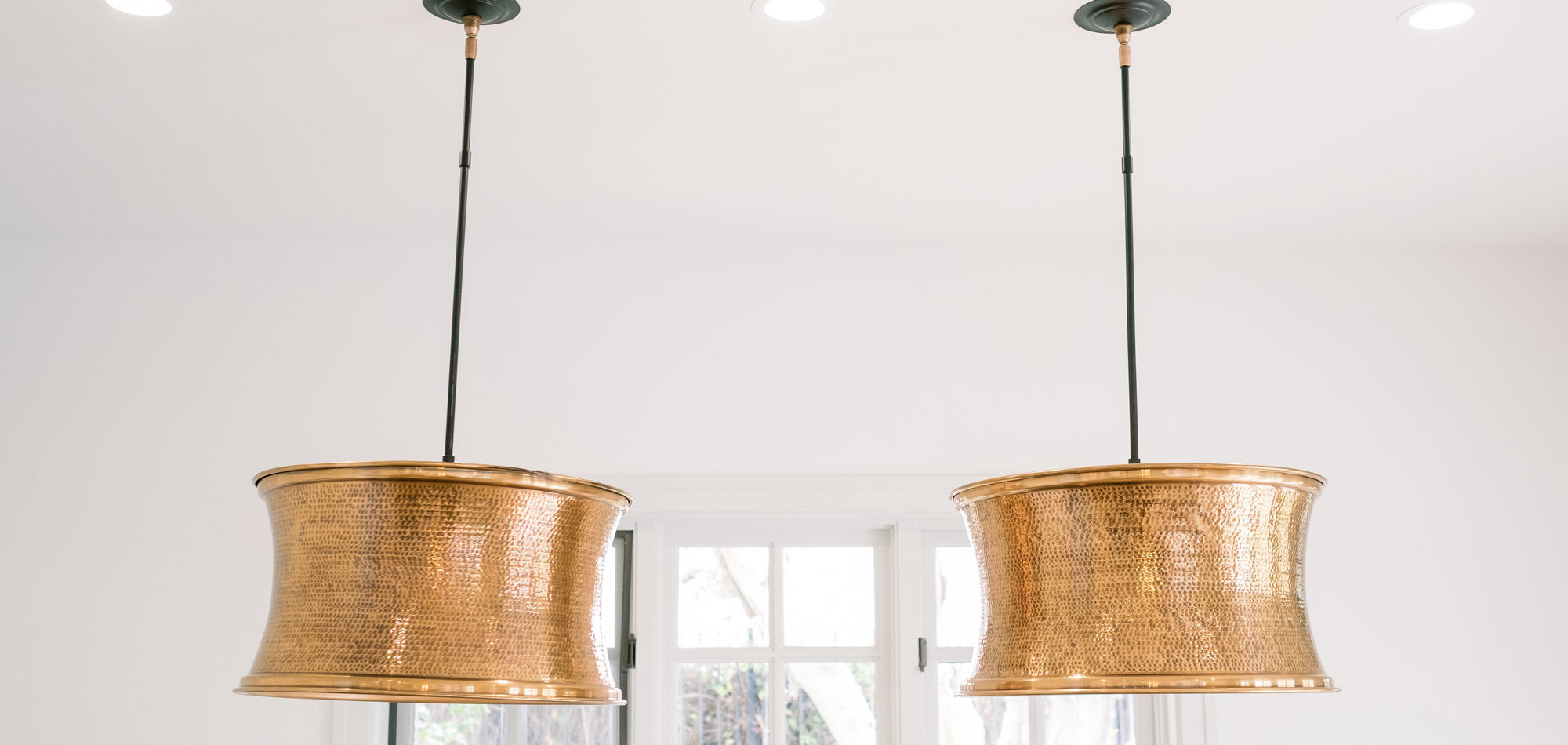
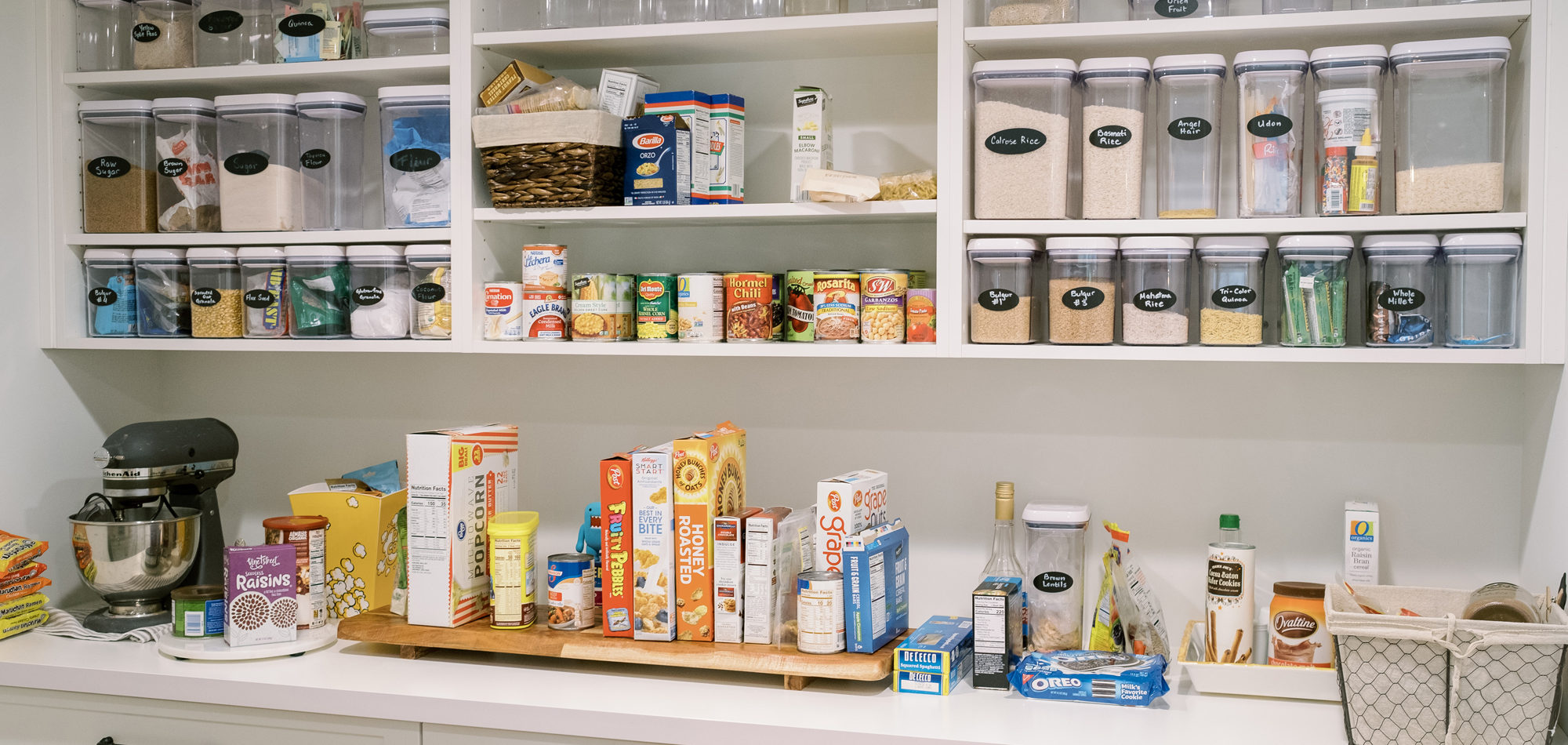
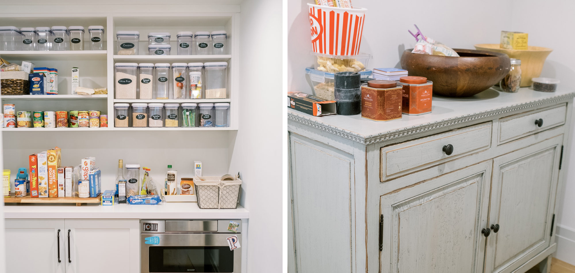
Painted cabinets in Benjamin Moore’s White Wisp and Solitude set the stage for this stunning kitchen. The cabinets were topped off with quartz countertops to emulate stone and a stunning backsplash to tie it all together. We wanted the look of stone without the maintenance. As with all kitchens, lighting the space was an important consideration. Recessed lighting was combined with an LED strip under cabinet lighting. Then a combination of pendants was used over the island and dining table. The island had multiple heights and functions. The lower portion doubled as the baking station and a secondary eating area. The walk-in pantry, every cook’s dream, was attractive and organized enough to leave the door open to view. A stunning kitchen that can be enjoyed for its function, is easy to maintain, and had a calm feeling.
We worked with several of the client’s fabulous furniture and art pieces which we were able to integrate into the design beautifully. And of course, there were some amazing new furniture pieces added. Lighting in the living room and hallway was also important. Note the interesting large-scale lighting that showcases art in the setting. A wow was created by adding a gold-tinted backsplash for the bar area looking dramatic with the dark cabinets.
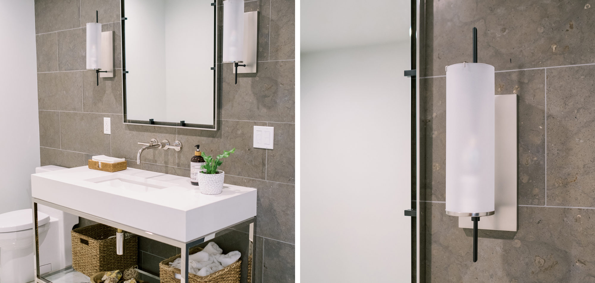
A dark and dated powder bath came to life with a modern French Country flair. The vanity and mirror from Restoration Hardware were set off with honed limestone backsplash on the entire wall behind and a wall-mounted faucet.
We are proud of this renovation that brought tailored style to this once outdated home. The curated furniture, art, and lighting create a truly unique and exciting interior.
Photography by Jenny Quicksall Photography
Influenced by Mid-Century Modern Design
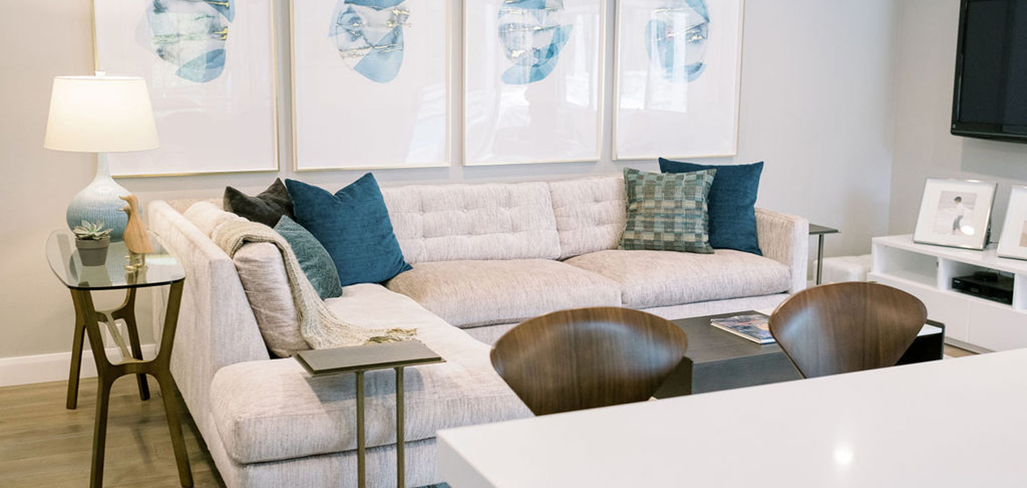
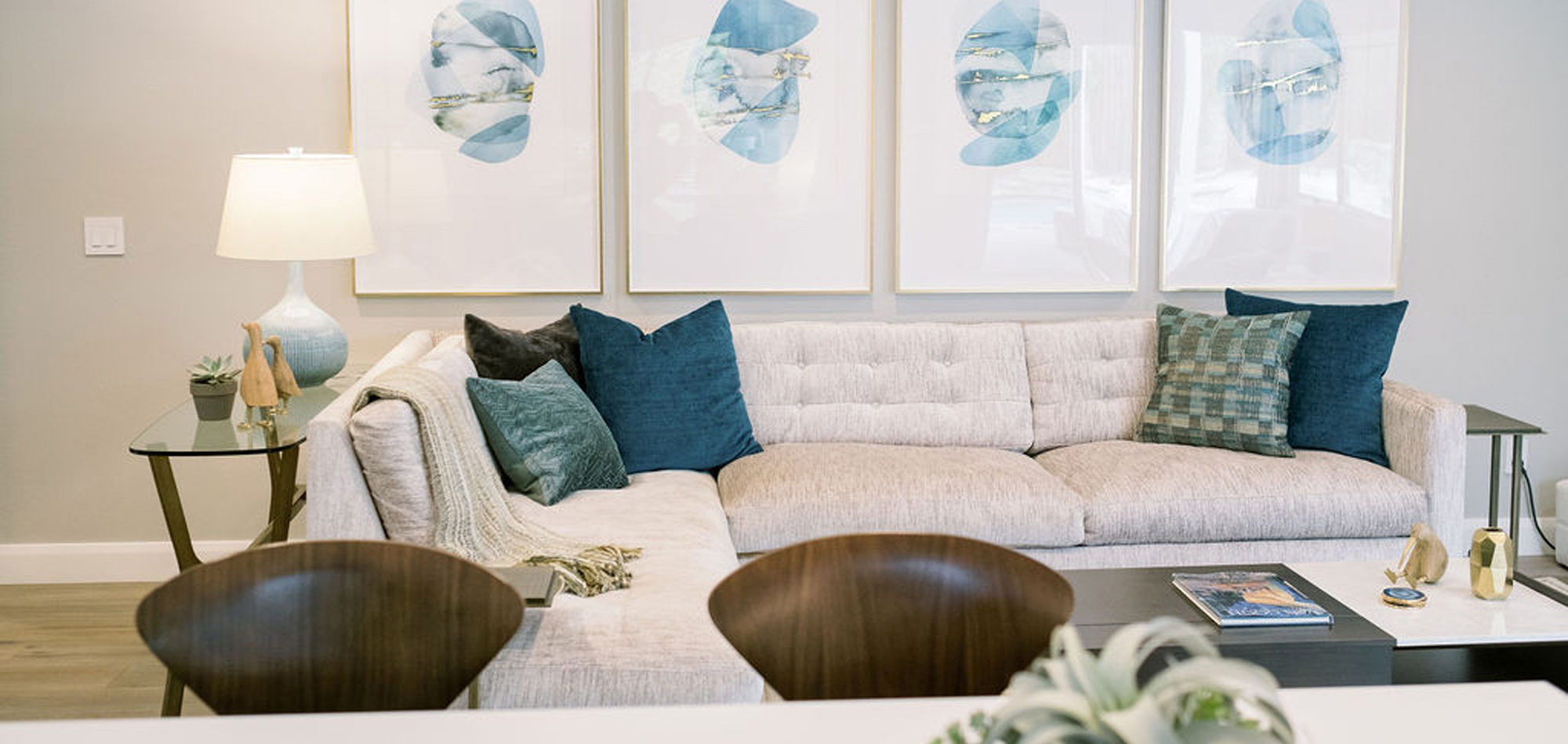
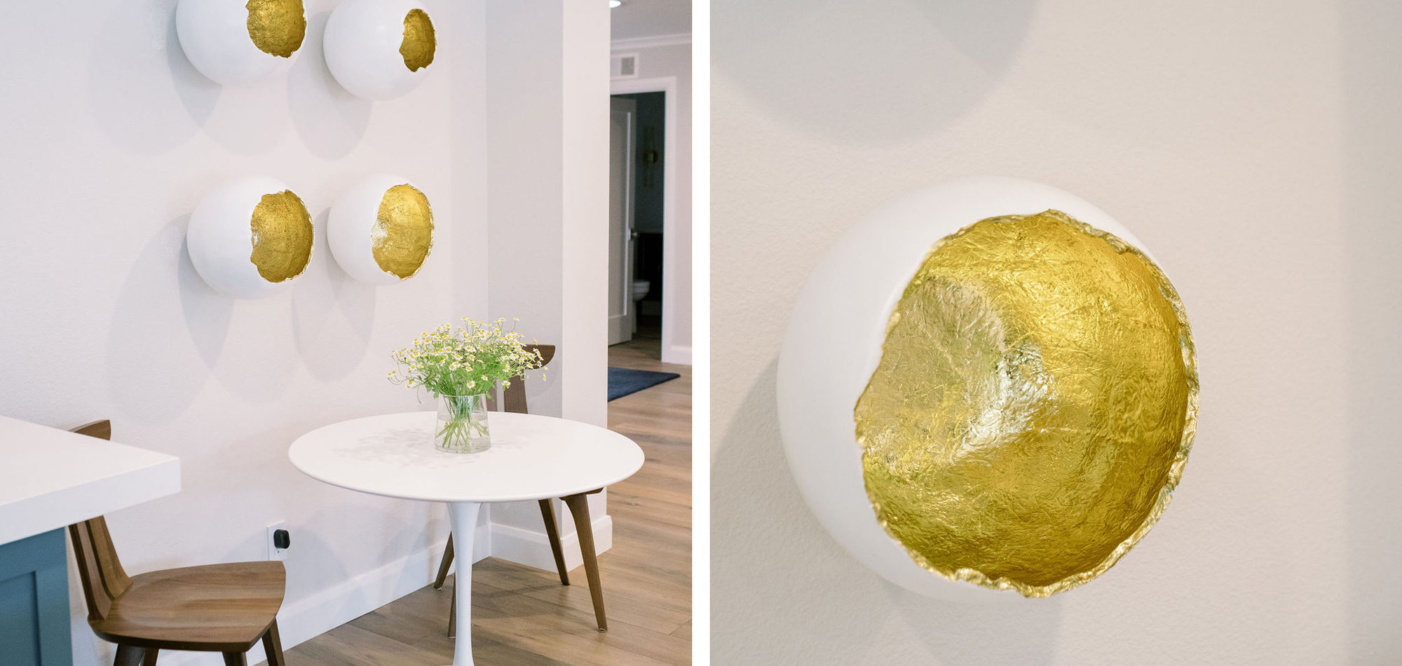
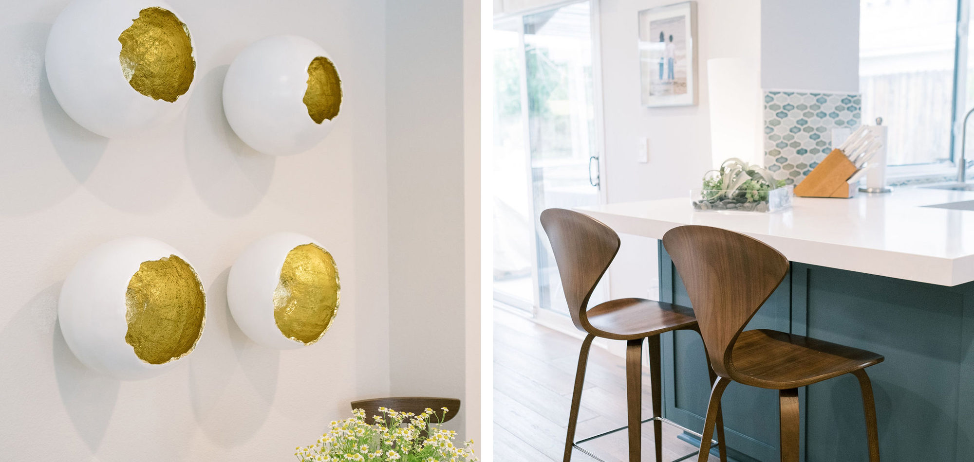
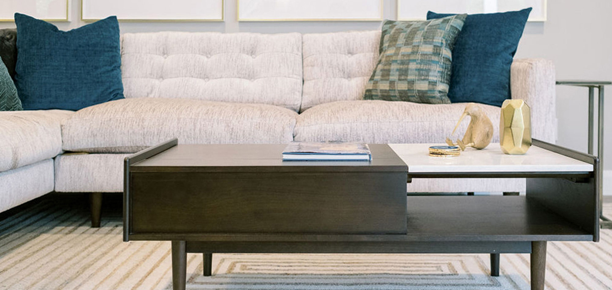
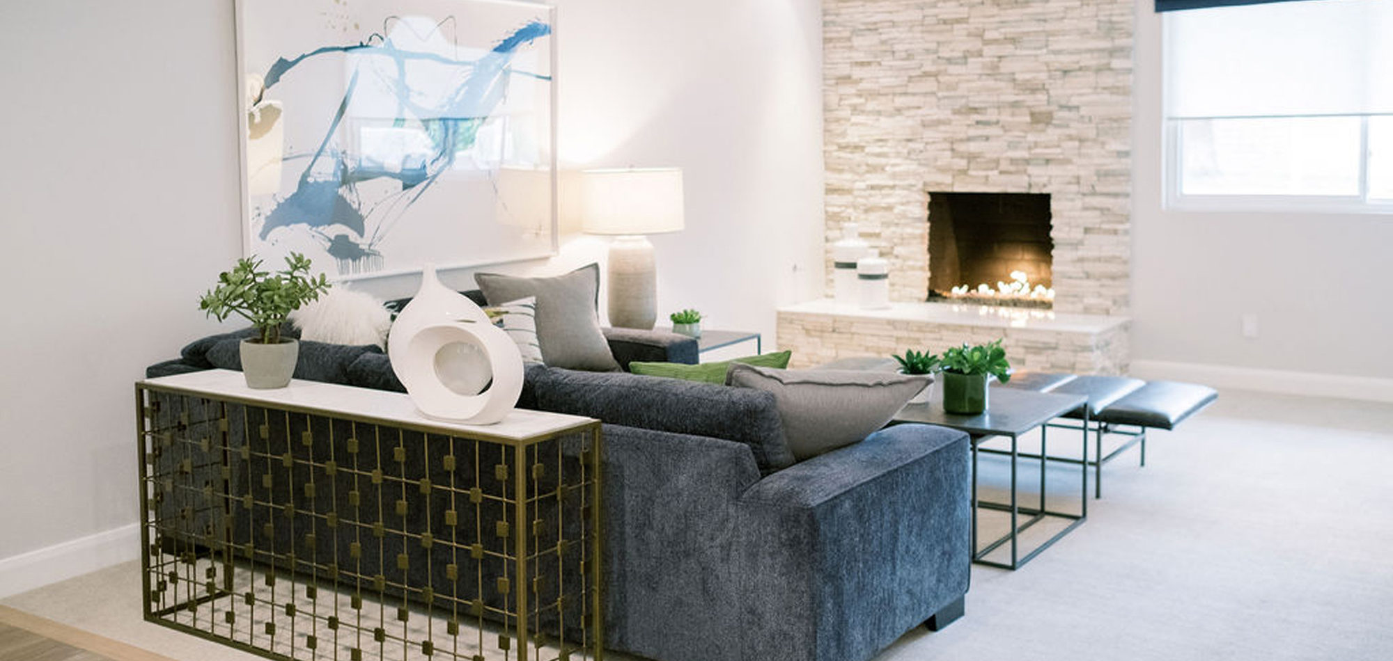
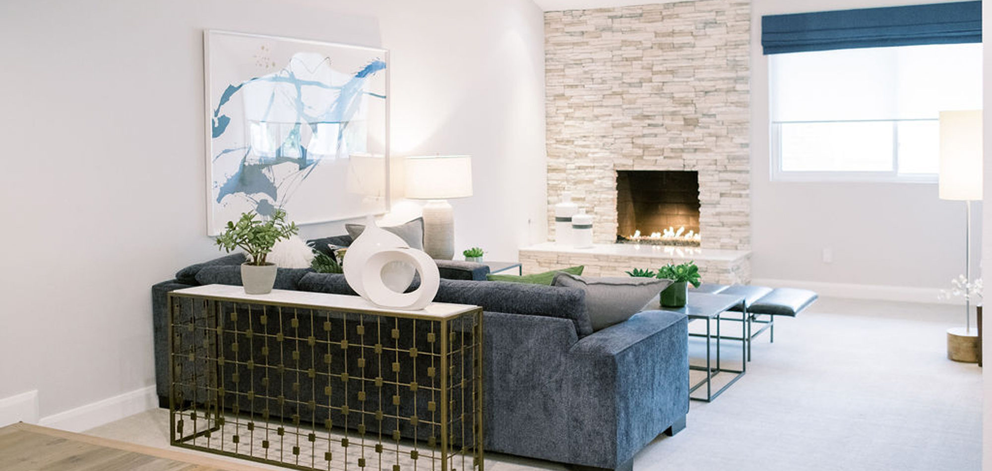
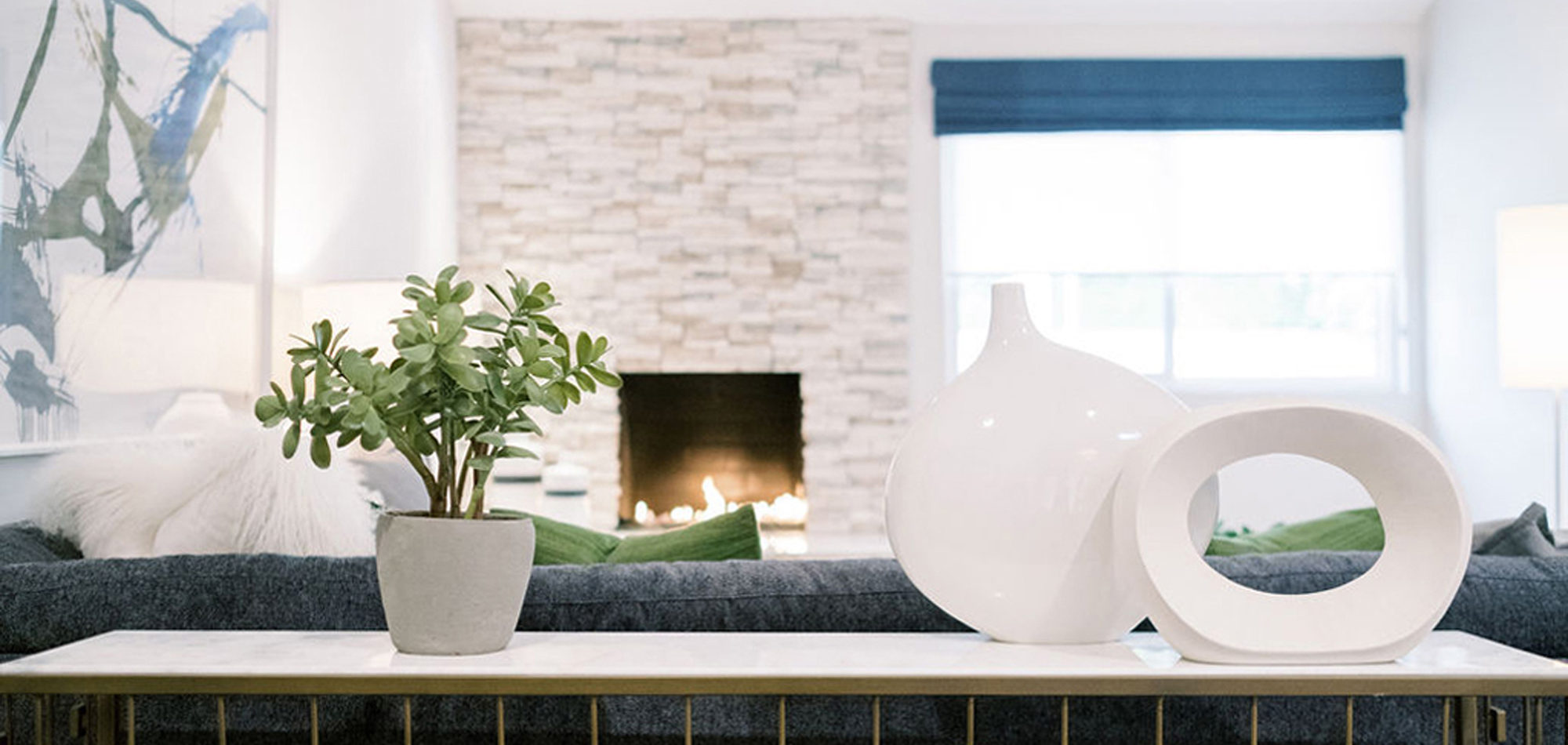
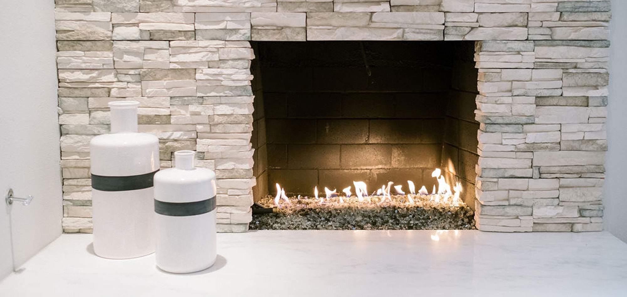
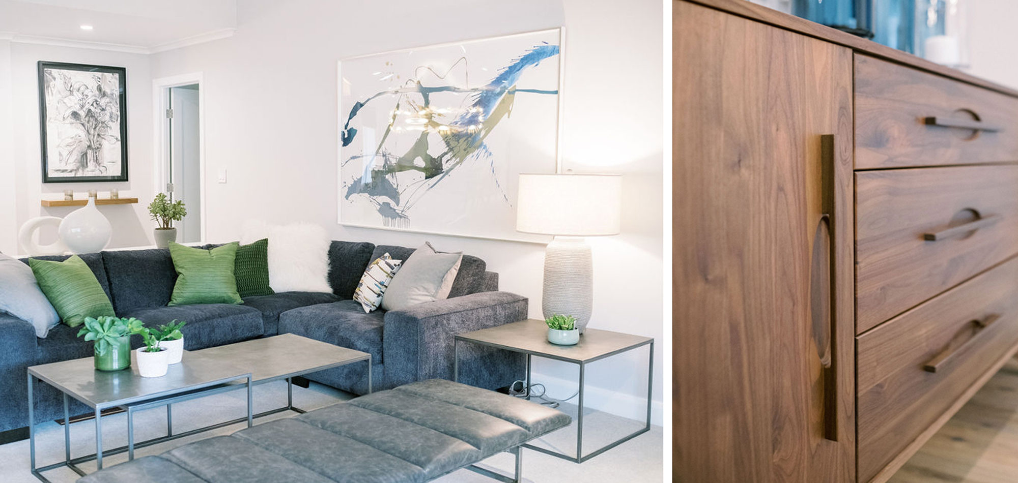
Our exuberant client requested a design with some funky and fun Mid-Century influence. She wanted color included in her home refresh. To have a space that was elegant, comfortable, and warm without taking the design style too literally. We began by laying out the space to suit preferences for seating and flow. We used some of the client’s own furniture while incorporating new pieces, some custom sofas, and a few mid-century pieces. We added bold color to large-scale art and tied it in with accessories to bring about rooms that were lively. Then we injected interest with an iconic light fixture over the dining table from Arteriors and added a splash of whimsey with “Broken Egg Art” from Phillips Collection (who says “every piece is a conversation”). In the beginning, our client wanted to keep her existing fireplace. We asked if she would be open to exploring other options and she agreed. In the end, we all decided that the original fireplace would look out of place in the new design. We elected to replace it with stacked stone, painted the inside firebrick black, and added decorative glass rocks for sparkle. They now love this updated look, and the fireplace adds a glow of warmth to the room. The overall atmosphere of the spaces induces balance, symmetry, and scale.
Photography by Jenny Quicksall Photography
Influenced by Santa Barbara Design
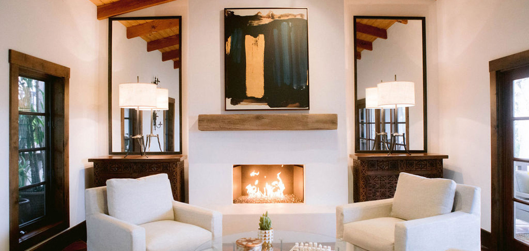
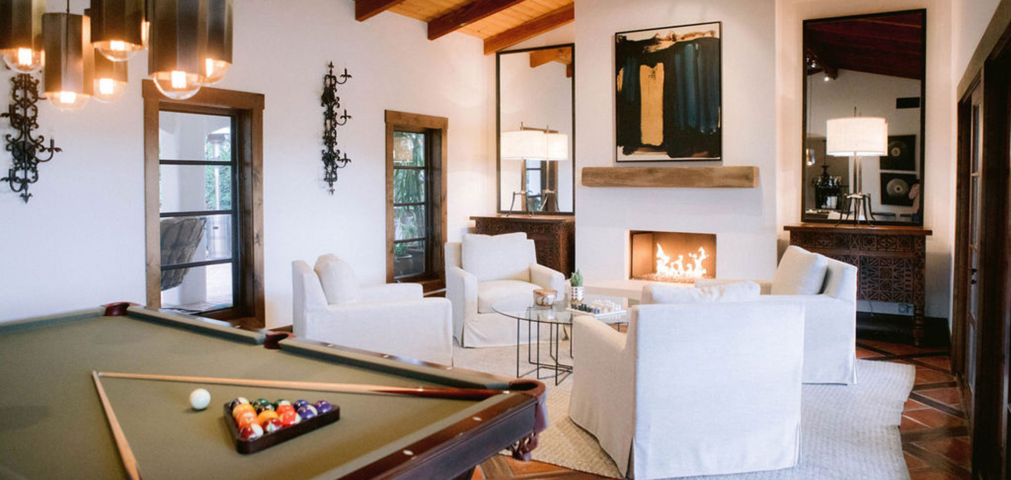
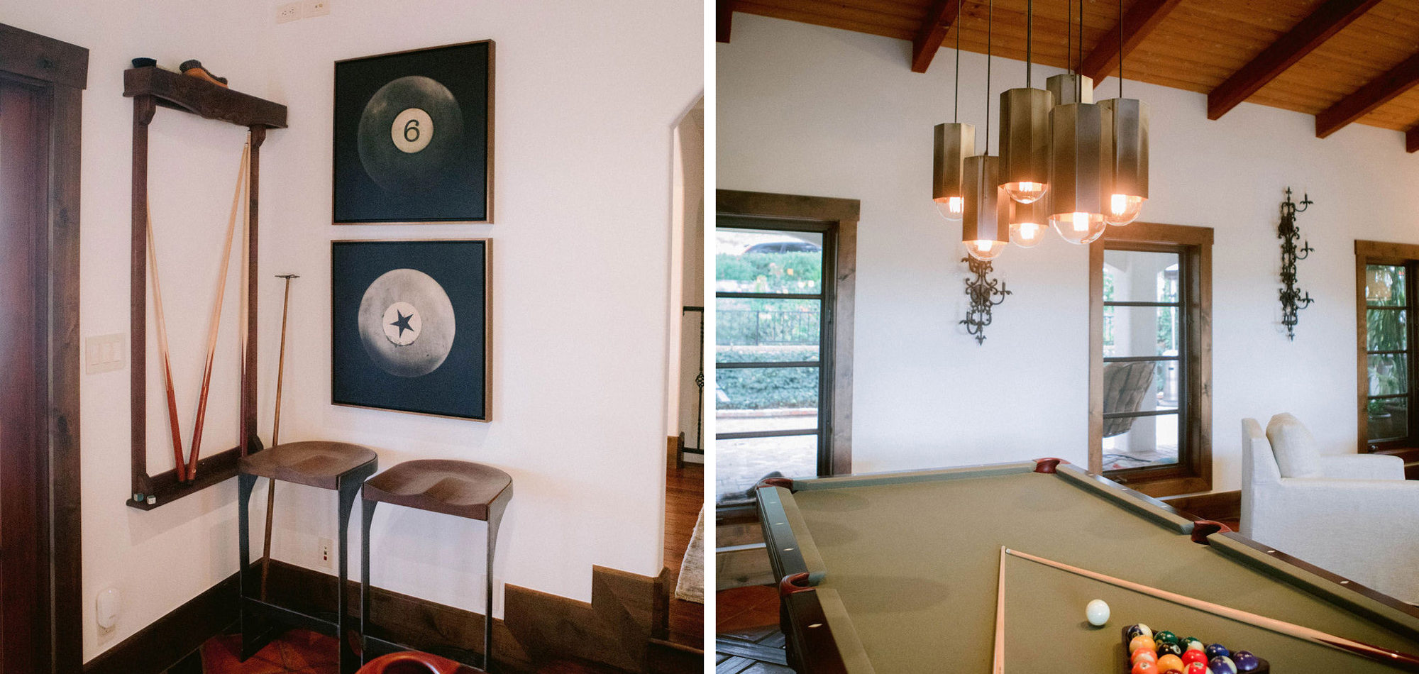
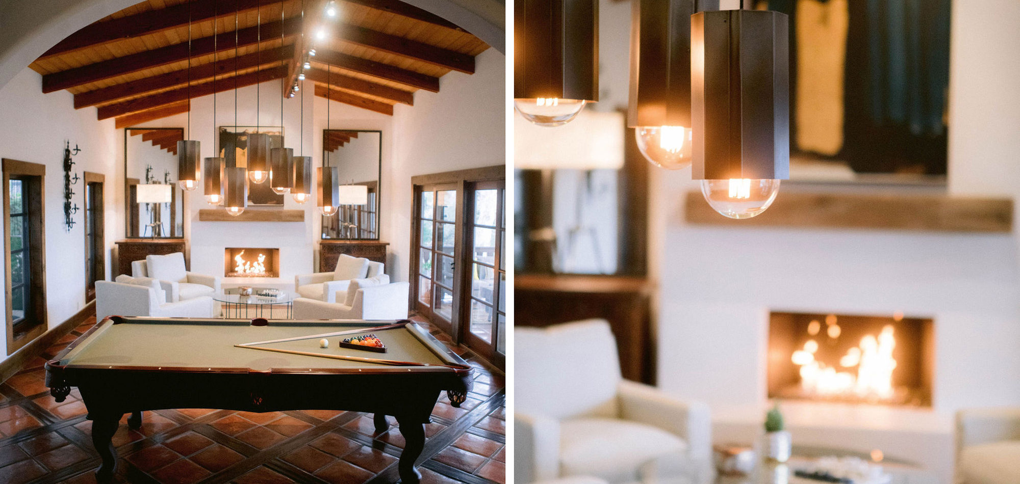
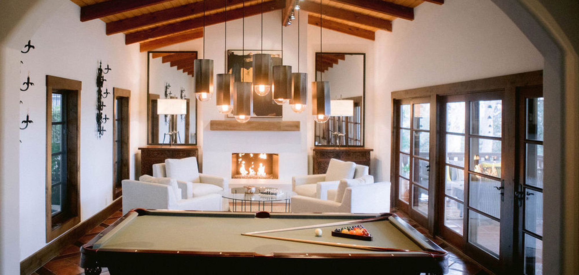
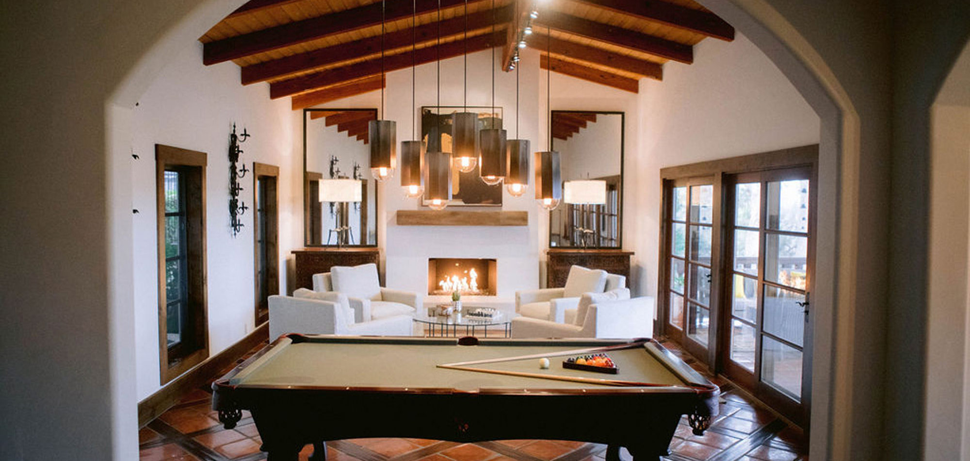
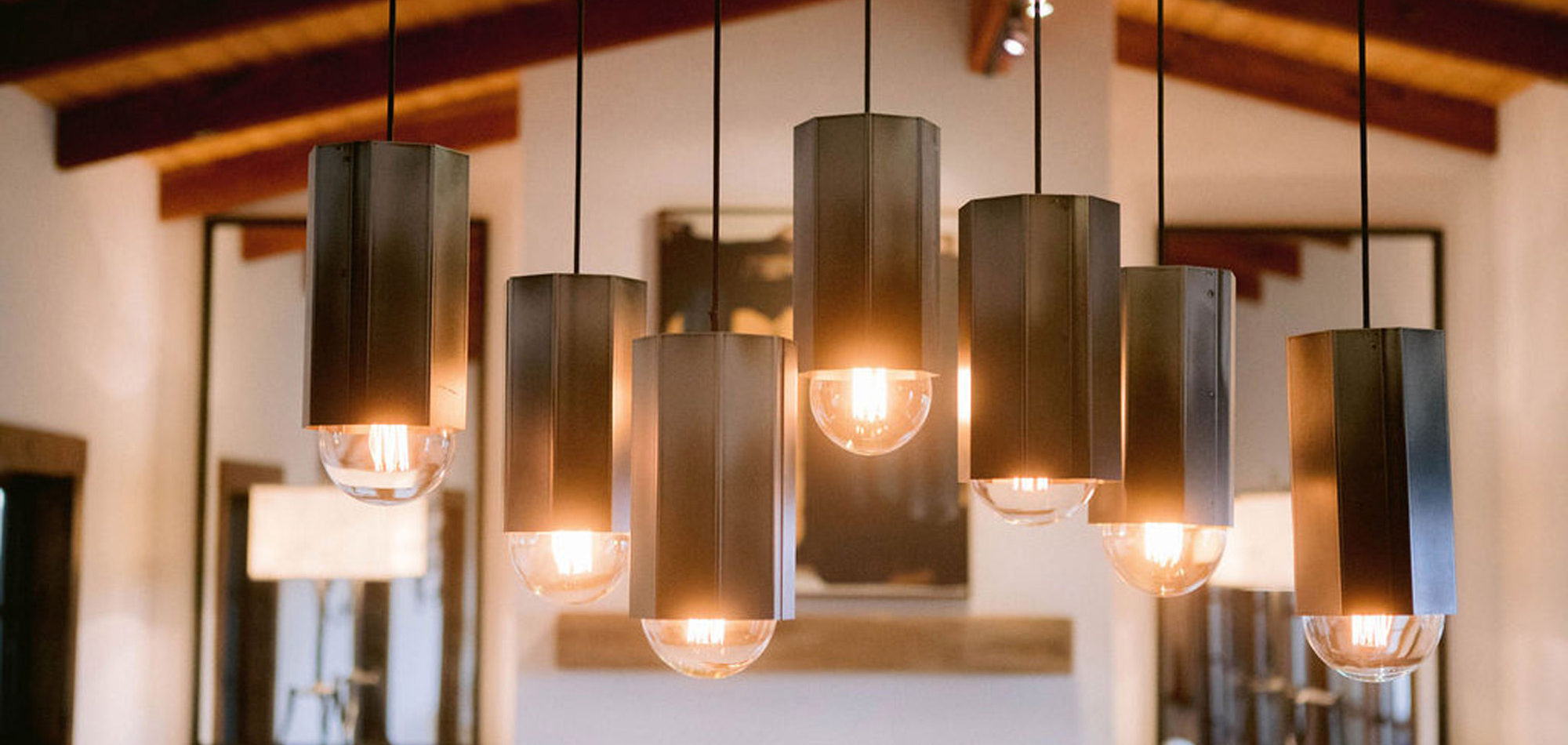
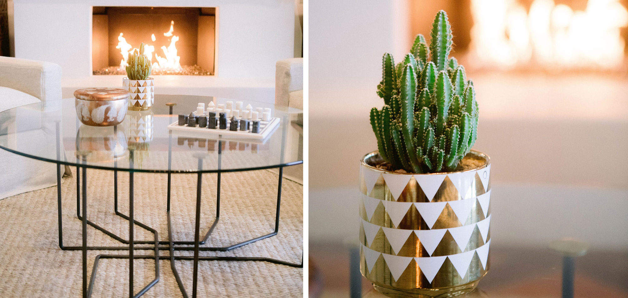
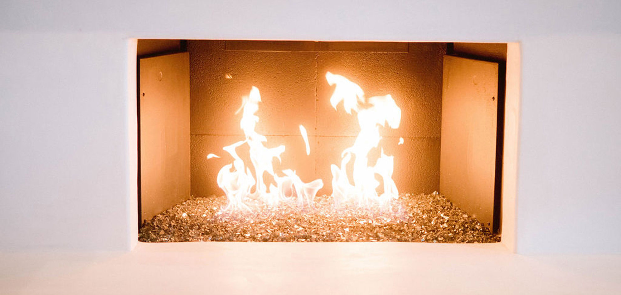
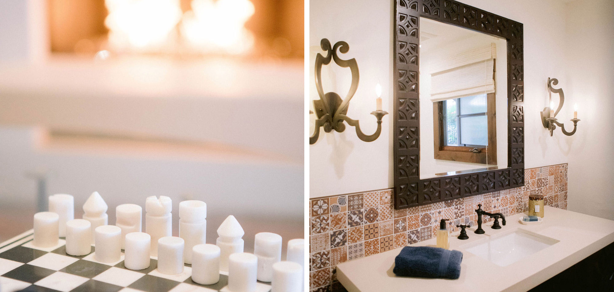
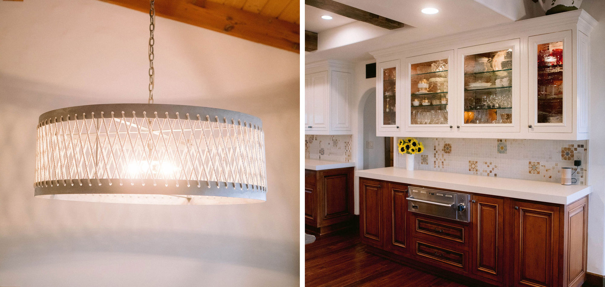
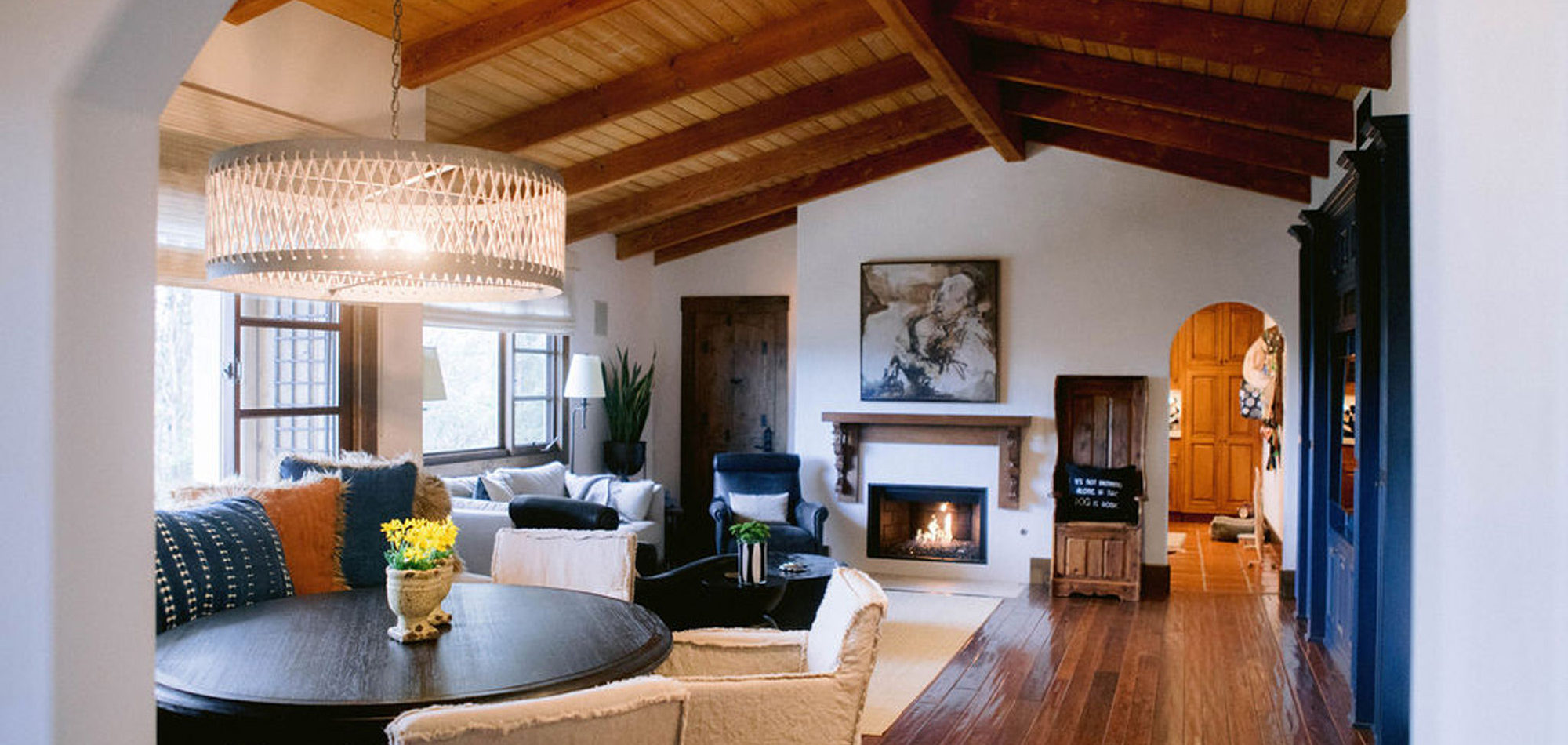
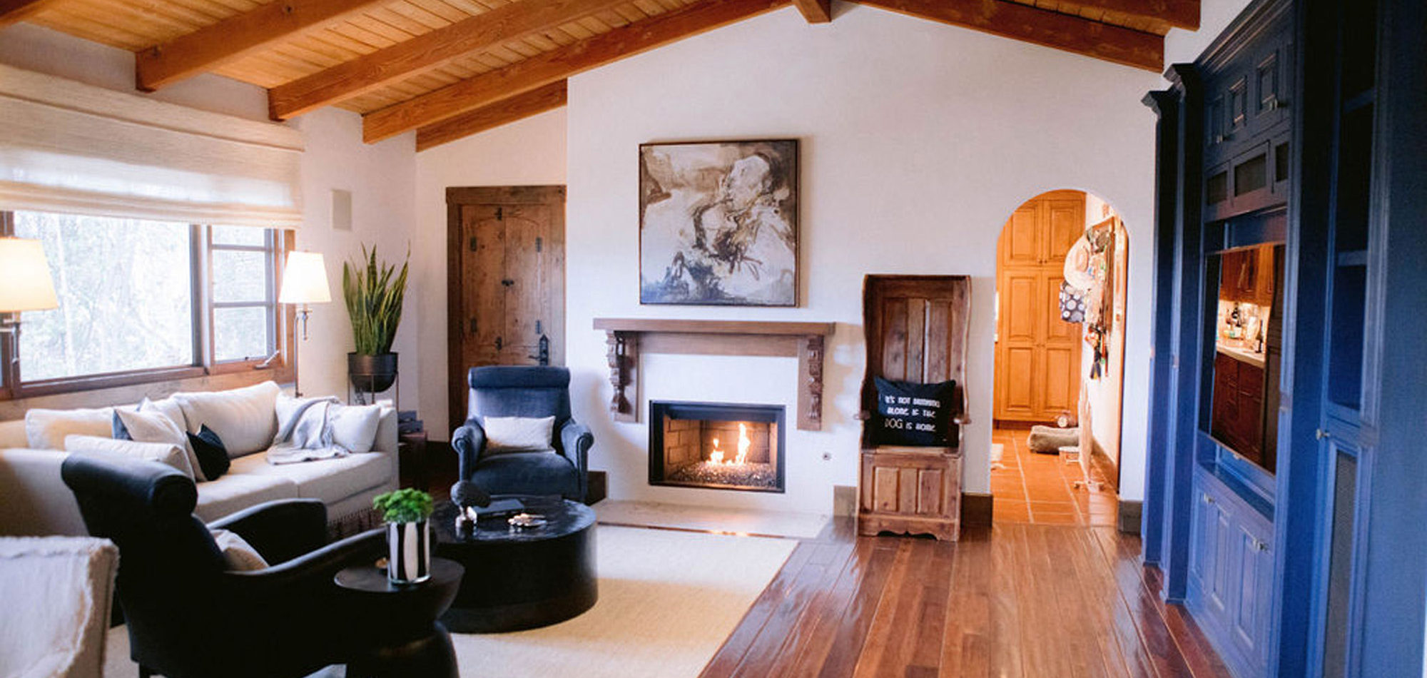
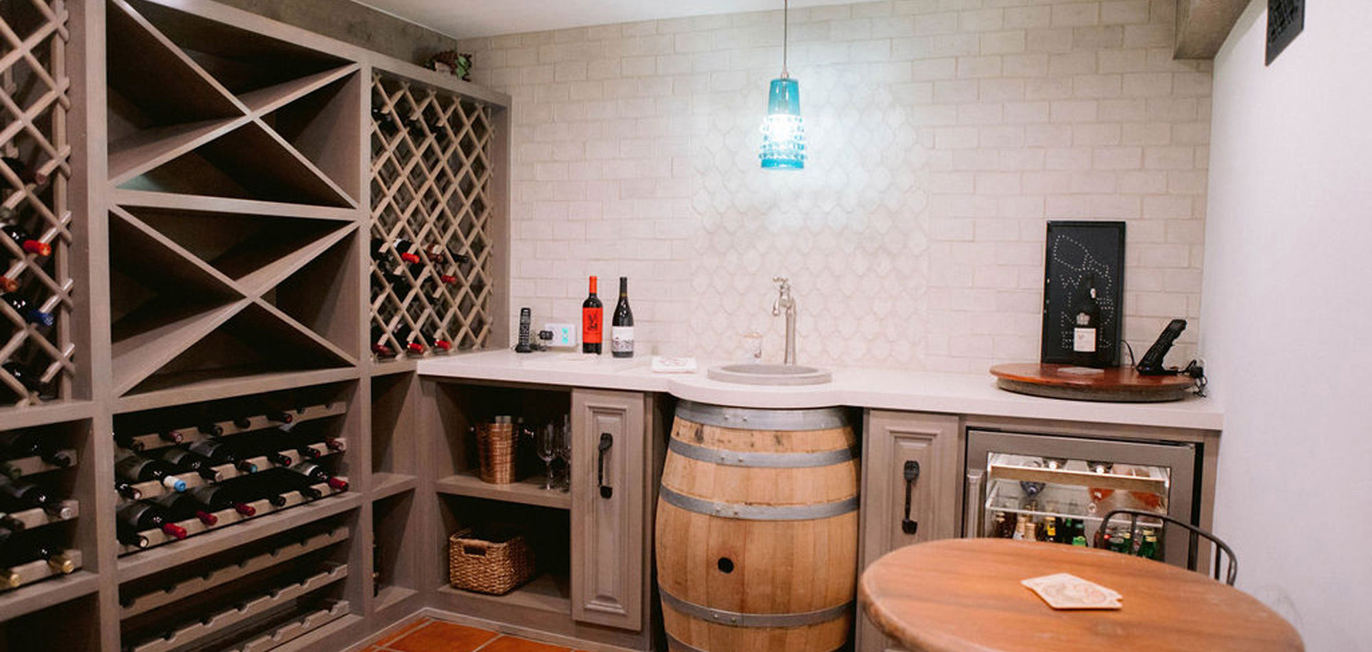
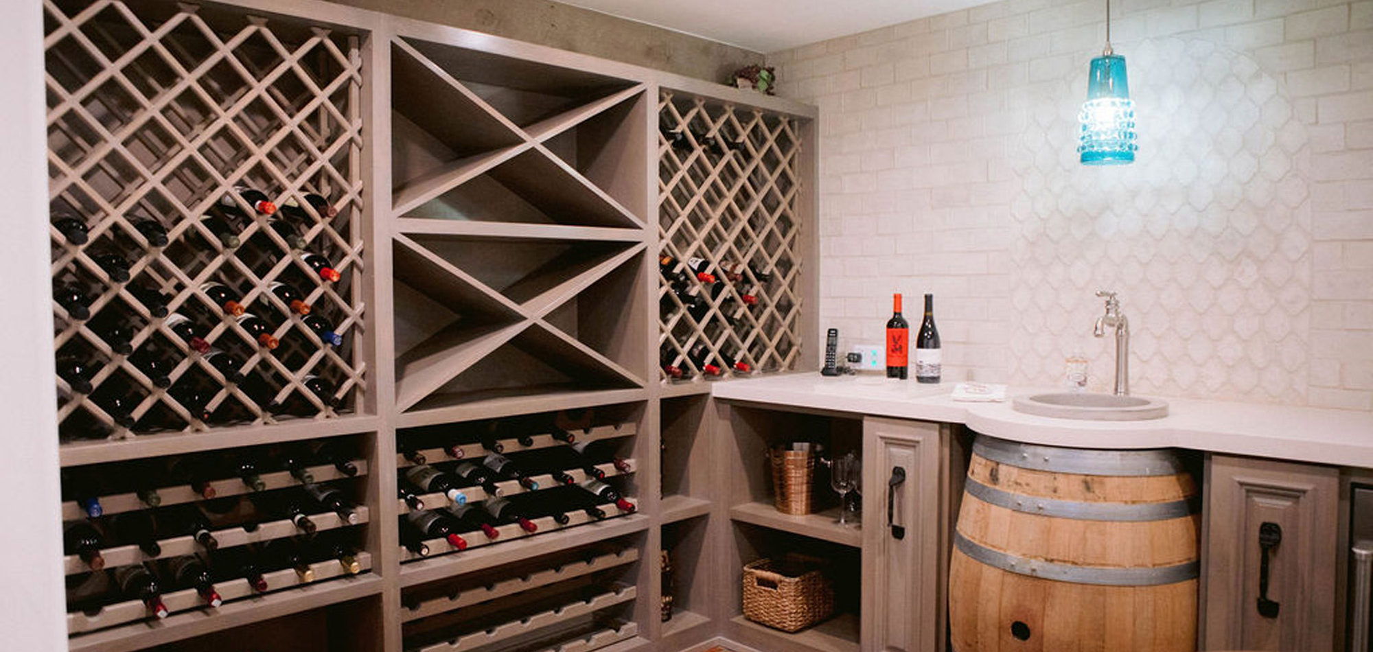
What a joy to work on this home with this fabulous couple and their two dogs. The executive couple who was downsizing wanted to have a new updated look in keeping with the integrity of their Spanish-style home. We wanted to bring in as much charm and interest to the spaces as reflected by its inhabitants. Some of the features, such as the Saltillo tile was to stay. We worked to modernize the home, keeping its best elements while producing a modernized vibe. The first challenge was situating a pool table in what was before the living room and was now the game room. Because this was the first room you see when you enter the home it was imperative to make it look like it was a planned addition. A custom light for over the pool table was designed to create a moody atmosphere. We replaced the brick on the outdated floor-to-ceiling fireplace with a neutral plaster and changed the log insert to glass. Then flanked the fireplace with two custom chests and added four comfortable swivel chairs for a perfect lounging area. The artwork really brought the space together blending sophistication and fun. The result is a warm and welcoming room.
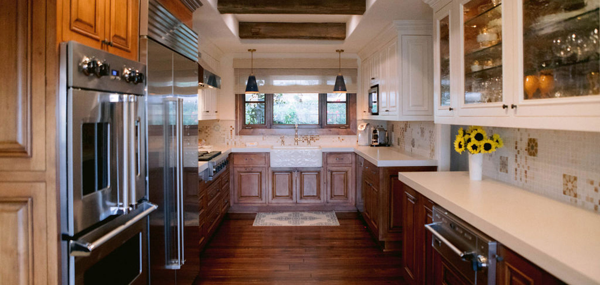
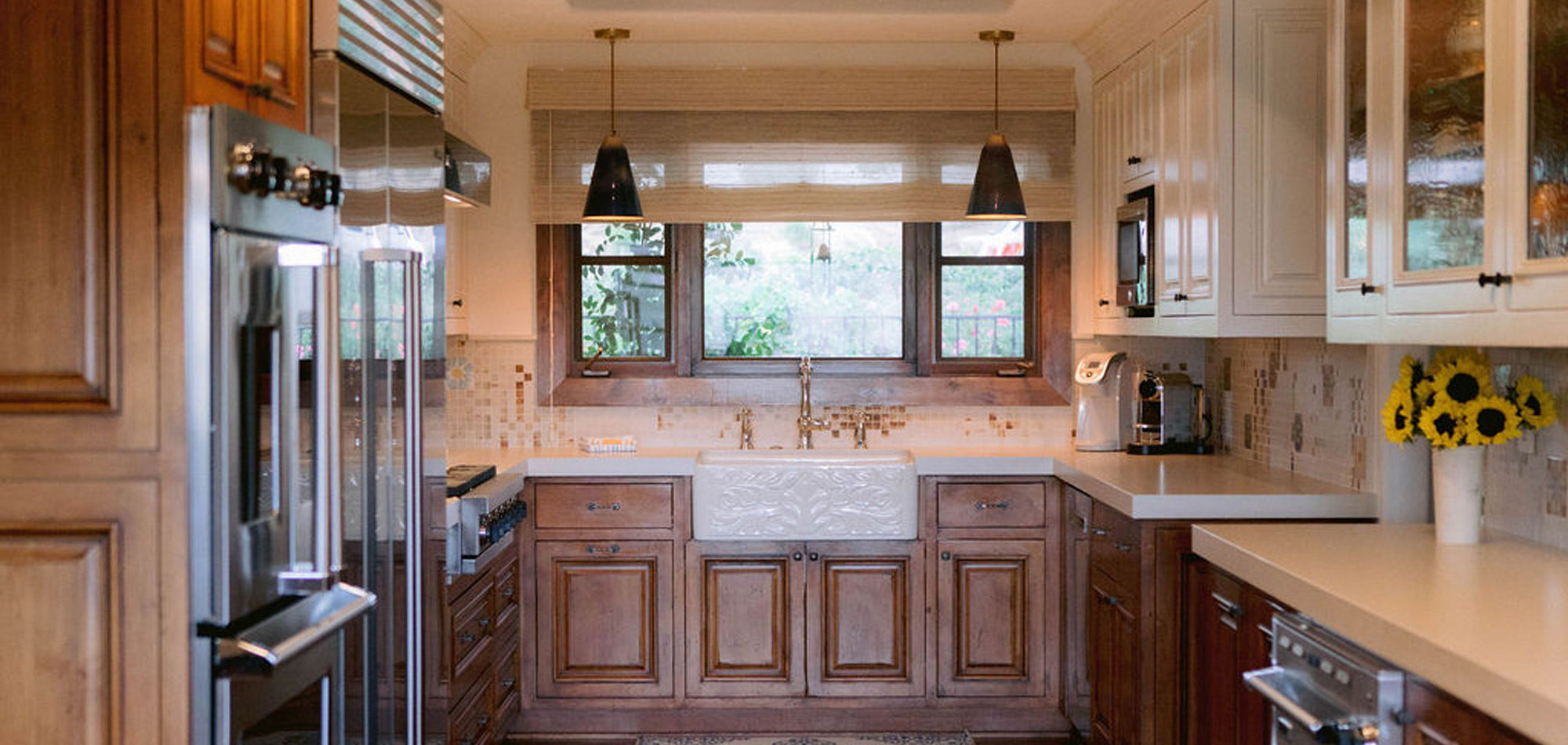
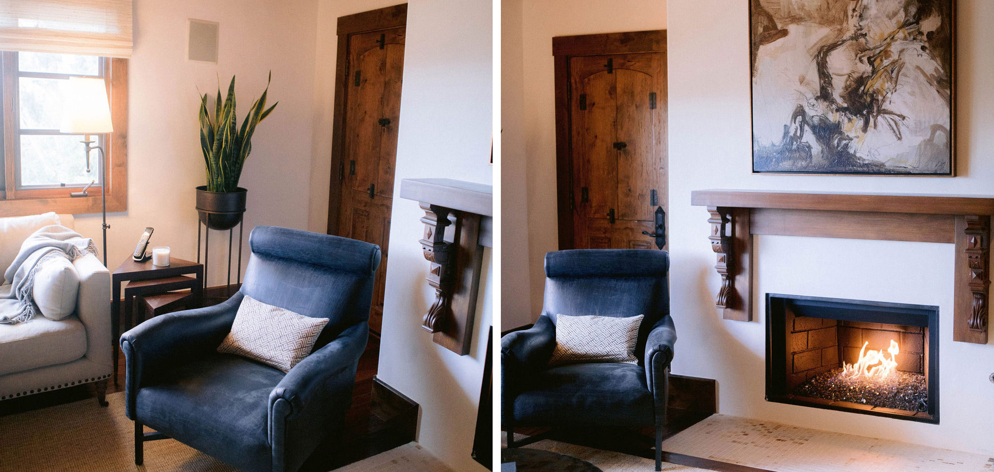
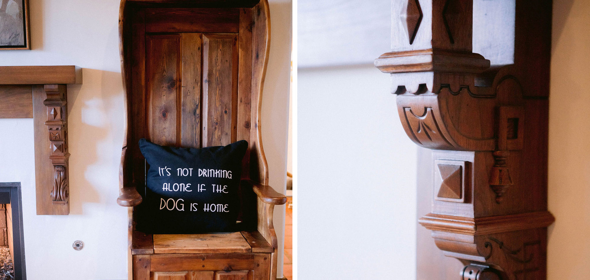
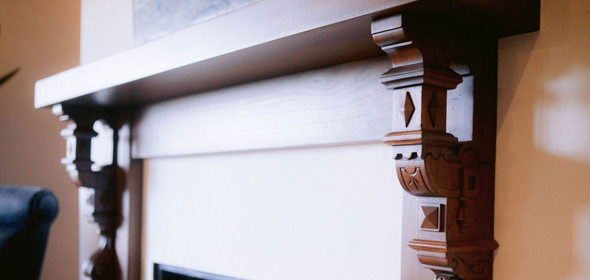
In the kitchen we retrofitted some of the cabinets. Then we painted the upper cabinets and distressed them for a new look and yet they looked like they had always been there. A honed countertop and Walker Zanger backsplash were chosen to add personality to the space. In the adjacent eating area, we removed a half wall to combine the room with the family room. A round table, bench with pillows from Cozy Nomad, and comfortable slipcovered chairs add to the welcoming feel. Another distinctive fireplace overhaul happened in the family room. We found some antique Spanish-inspired corbels and designed a custom mantle, topping it with an interesting piece of contemporary art. The wall unit was painted to update. The comfortable and stylish furniture setting allowed for two focal points and gave an updated modern look to the room.
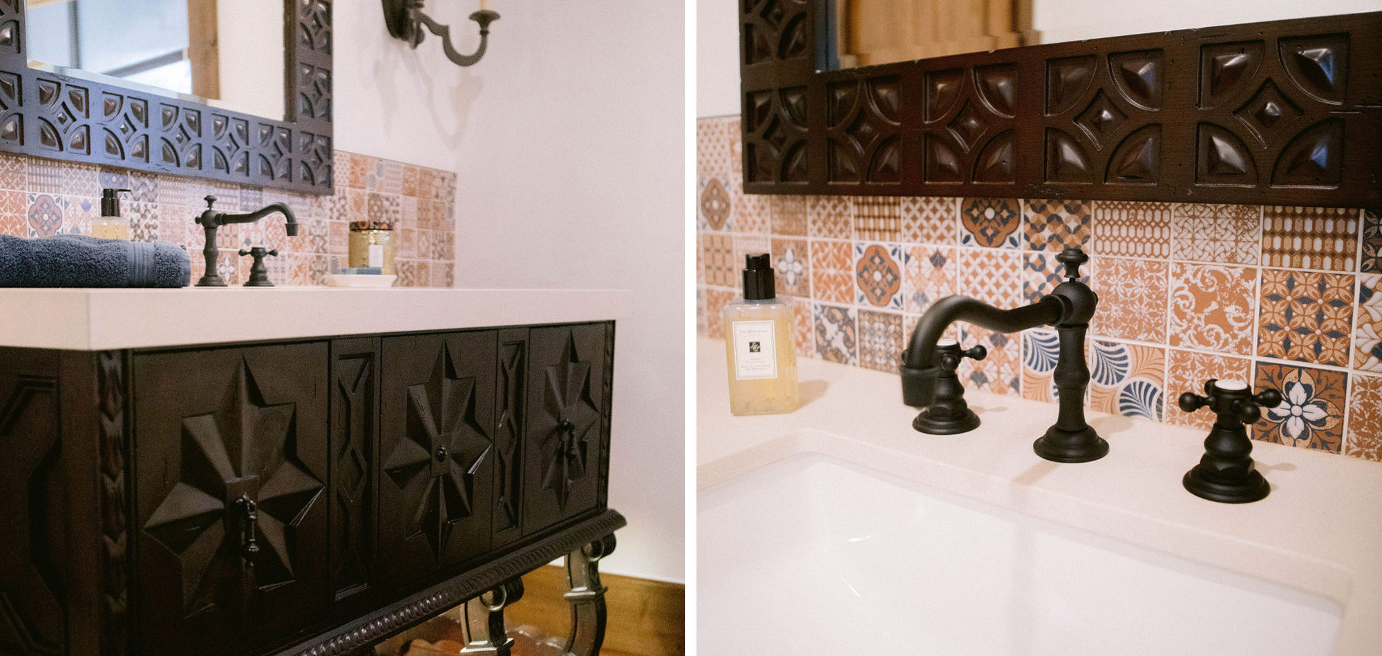
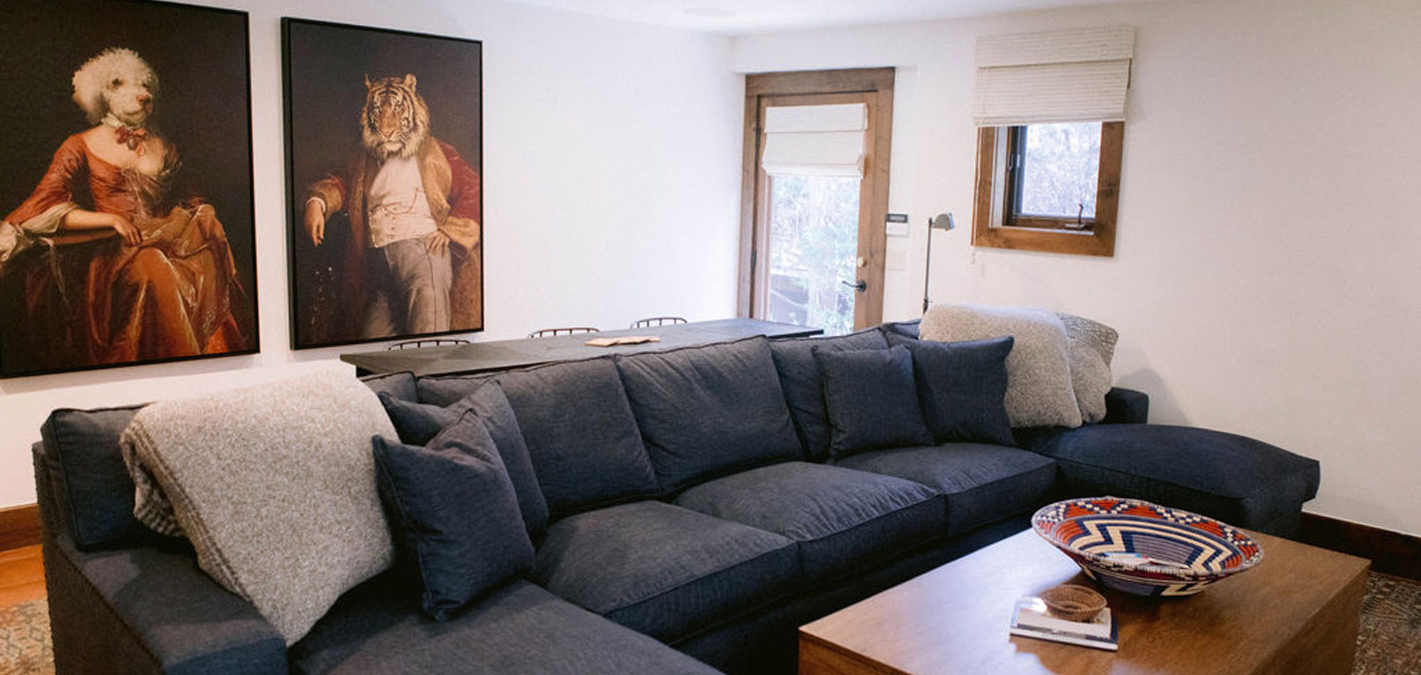
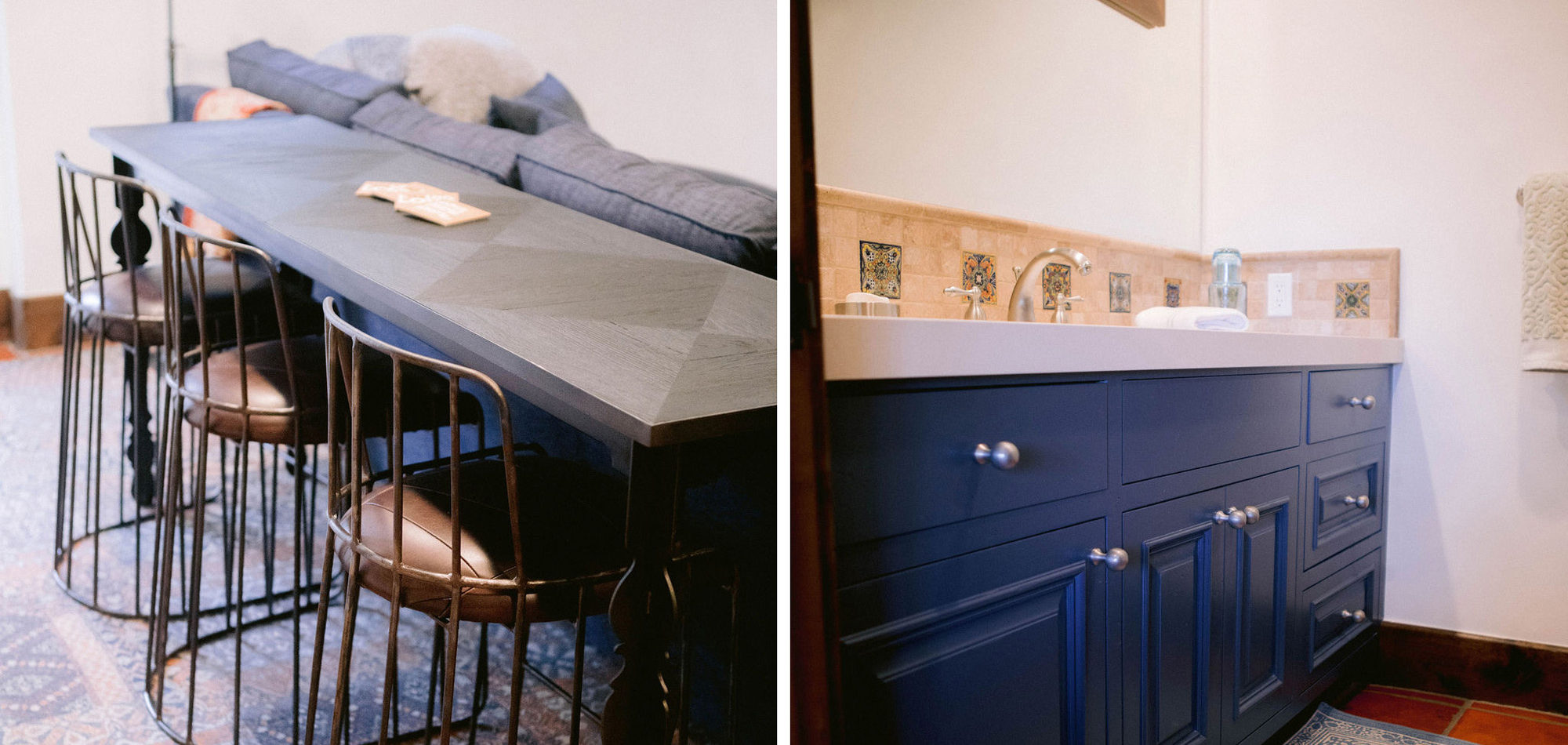
We updated all the bathrooms with paint for walls and cabinets, new counters, hardware, and lighting. Splashes of vibrant colours bring in more of a cheerful atmosphere. Bedrooms, sitting area, and office were outfitted with new furniture, rugs, and artwork on a neutral backdrop of paint. The media area and wine room were especially fun to create. More custom cabinetry was designed remembering to add the all-important lighting details. The large-scale unique artwork added whimsey and a conversation piece to the space.
Our clients wanted their home to feel welcoming, which is just like them by the way. The choices throughout the home reveal a happy feeling and create a space that is modern and in keeping with the integrity of the Spanish-style home.
Photographed by Jenny Quicksall Photography
Influenced by Modern Coastal Design
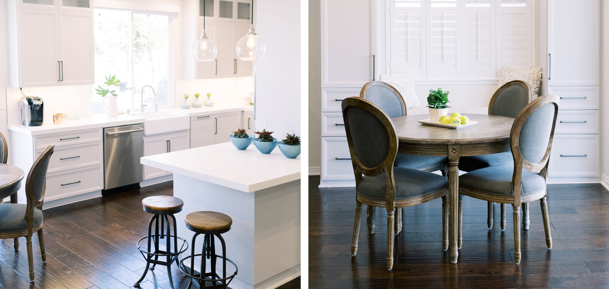
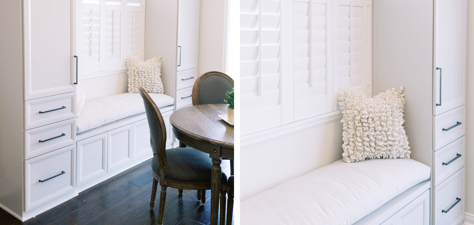
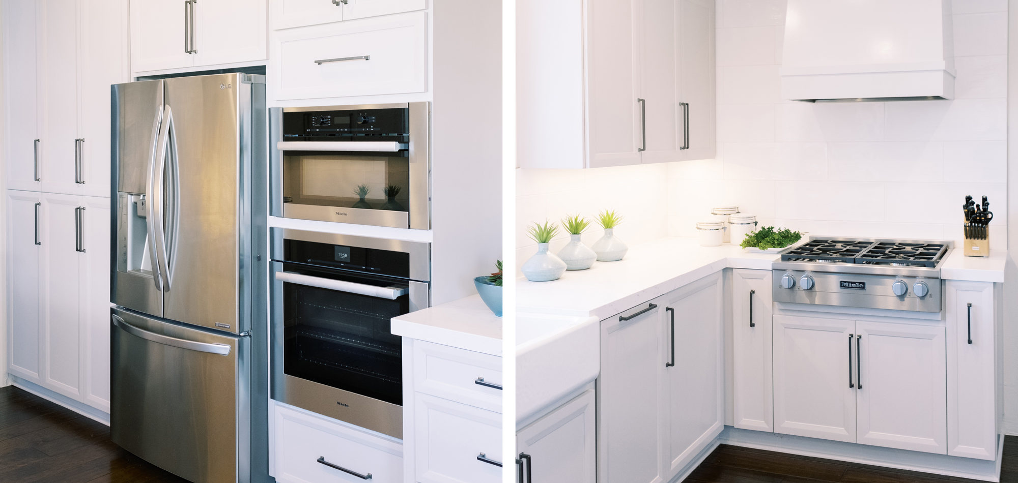
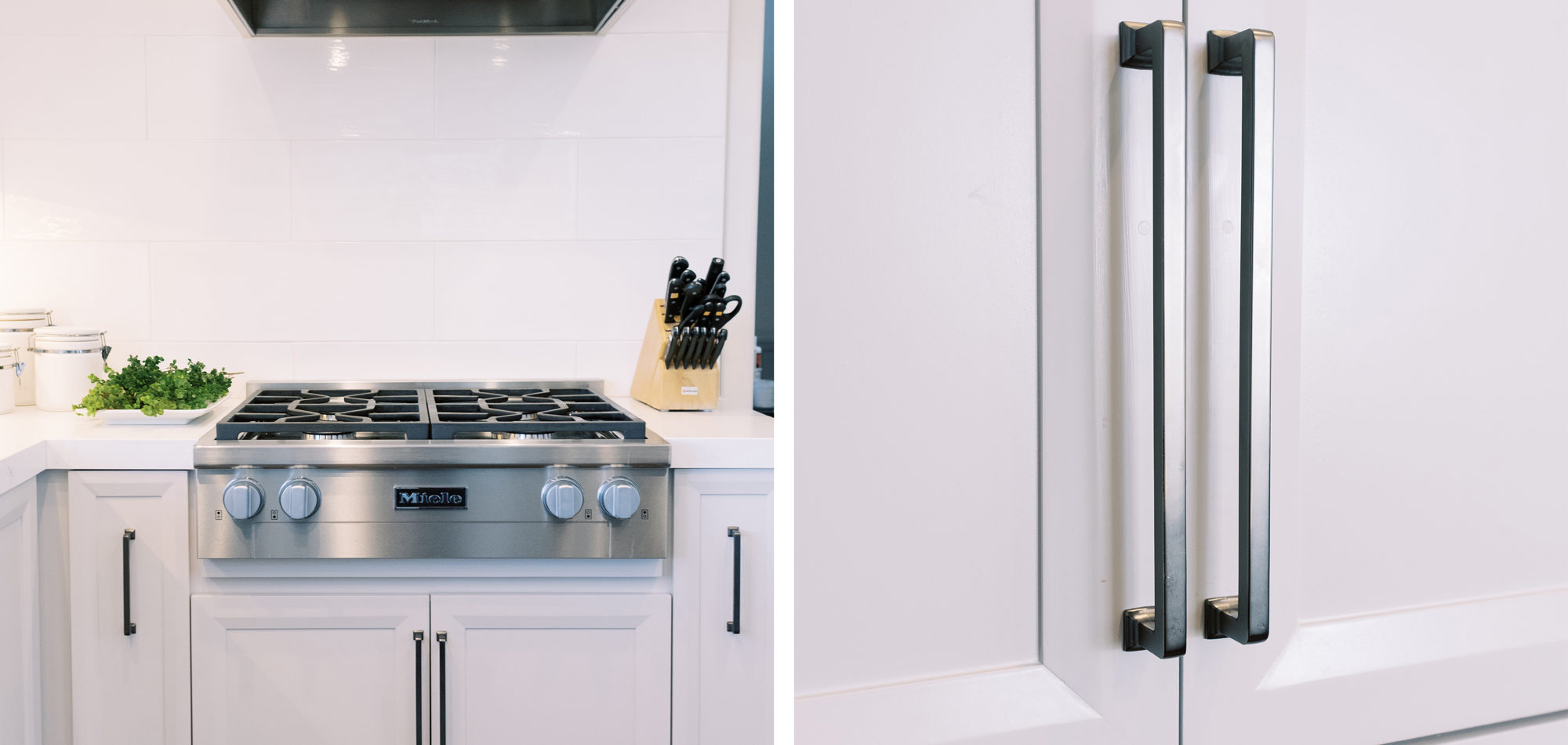
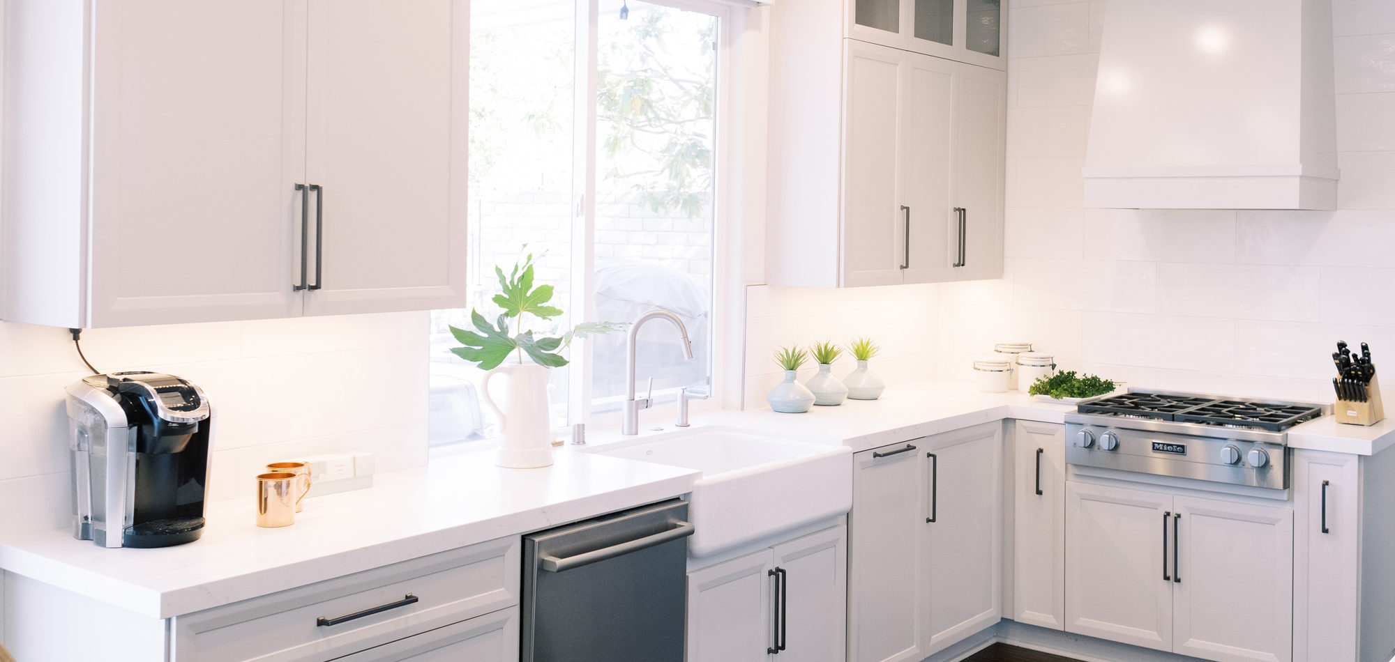
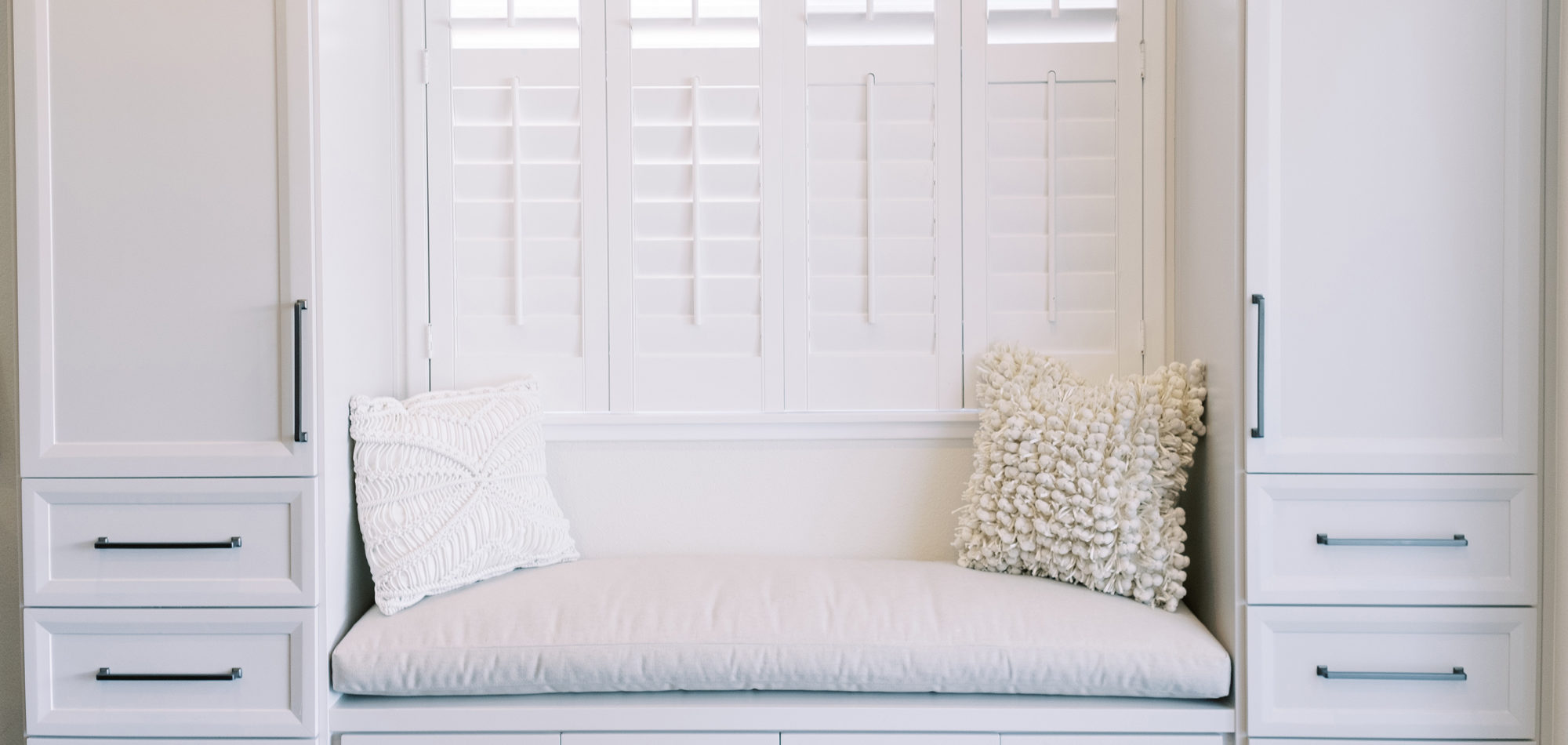
This was a phase 2 project for this fun-loving couple who wanted to update and modernize their kitchen. Our clients love white and an uncluttered design. We wanted to deliver a look that would support their young family. We began by removing the bulkheads and taking the cabinets to the ceiling, then installed stacked cabinets with glass inserts on the top portion to make the kitchen appear larger and more open. Large cabinet pulls were added as a little modern jewelry. A custom built-in hood was designed to create a striking feature on a somewhat small wall area. There was formerly an underused cabinet in the breakfast area which we redesigned to include a window seat with flanking cabinets on either side and storage below. These cabinets now house toys and items for crafts projects for the girls. The space is now functional and feels fresh and current.
Photography by Jenny Quicksall Photography
Influenced by Modern Farmhouse Design
Our clients purchased a home needing renovation. They wanted to take down a wall and redesign the kitchen and bathrooms. They had many pieces of their own furniture that they were brought from a previous home and requested assistance in planning which ones to keep and where to put them. They were empty nesters and entertained a good deal.
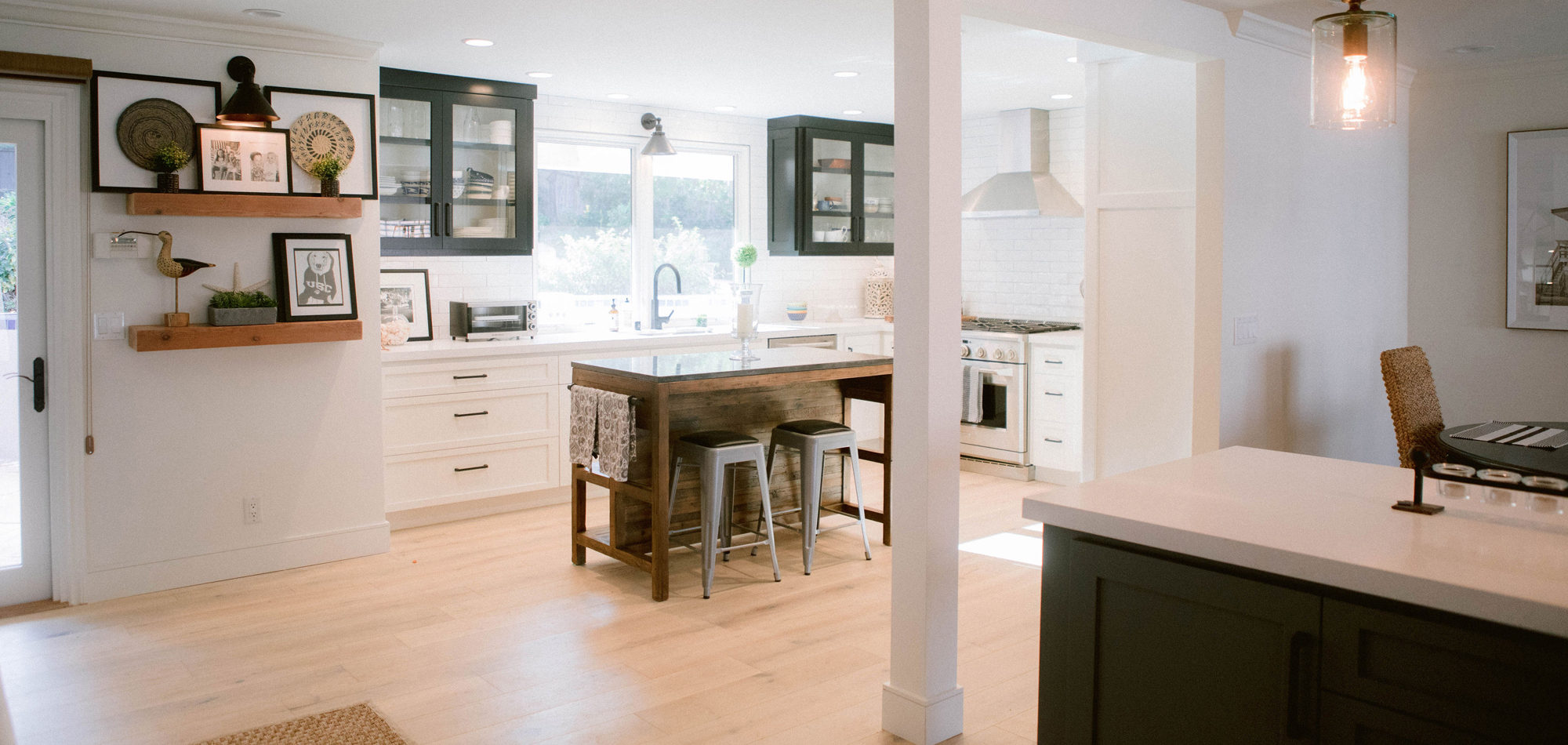
As with most of our projects, we began laying out the space and created a furniture plan. We planned to take down one wall and a portion of another. As some supports were structural and could not be moved, we needed to be creative in our approach. We used a wood furniture piece as an island in the kitchen and combined a classic white and black color scheme. In the area that separated the dining and living room, we designed a large built-in bar island that worked well for entertaining. All the living areas were now open to one another creating a fresh, bright look that makes you feel happy when you enter the home.
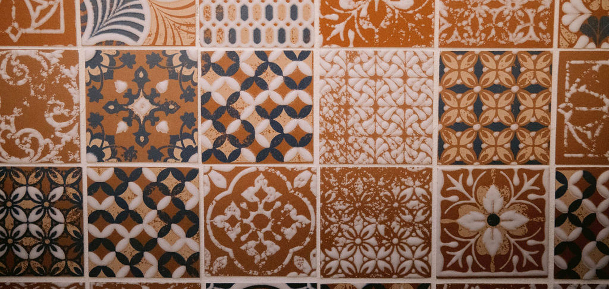
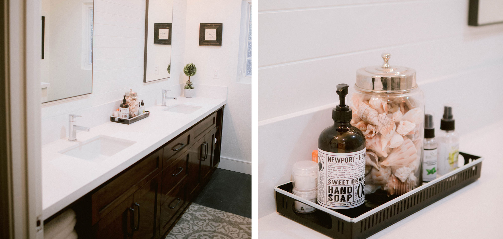
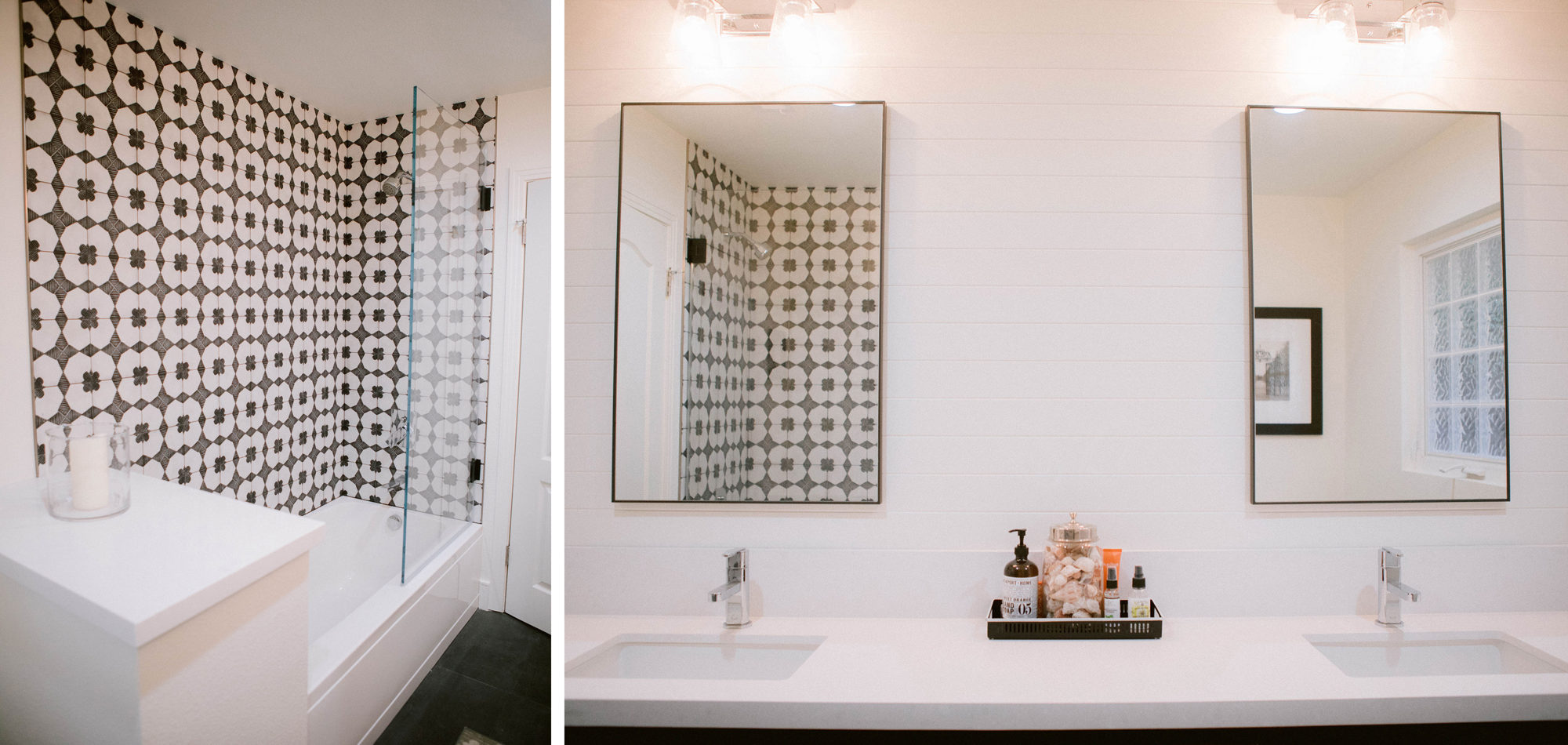
The primary bathroom originally consisted of two small rooms and was poorly laid out. We took down a wall and designed an expansive walk-in shower with a bench. For the guest bathroom, we used a statement patterned tile on the wall and kept the other finishes neutral. Clean lines and neutral tones transformed this home into a Modern Farmhouse-inspired gem.
Photography by Jenny Quicksall Photography
Influenced by Transitional Design
This professional couple wanted to modernize their home and keep many of the existing finishes, paint throughout, purchase new furniture, and window treatments and accessorize. They were considering selling their home in the not-to-distant future and therefore wanted to be mindful of the costs to change existing finishes. They wanted a timeless traditional style and a home that they could enjoy entertaining in.
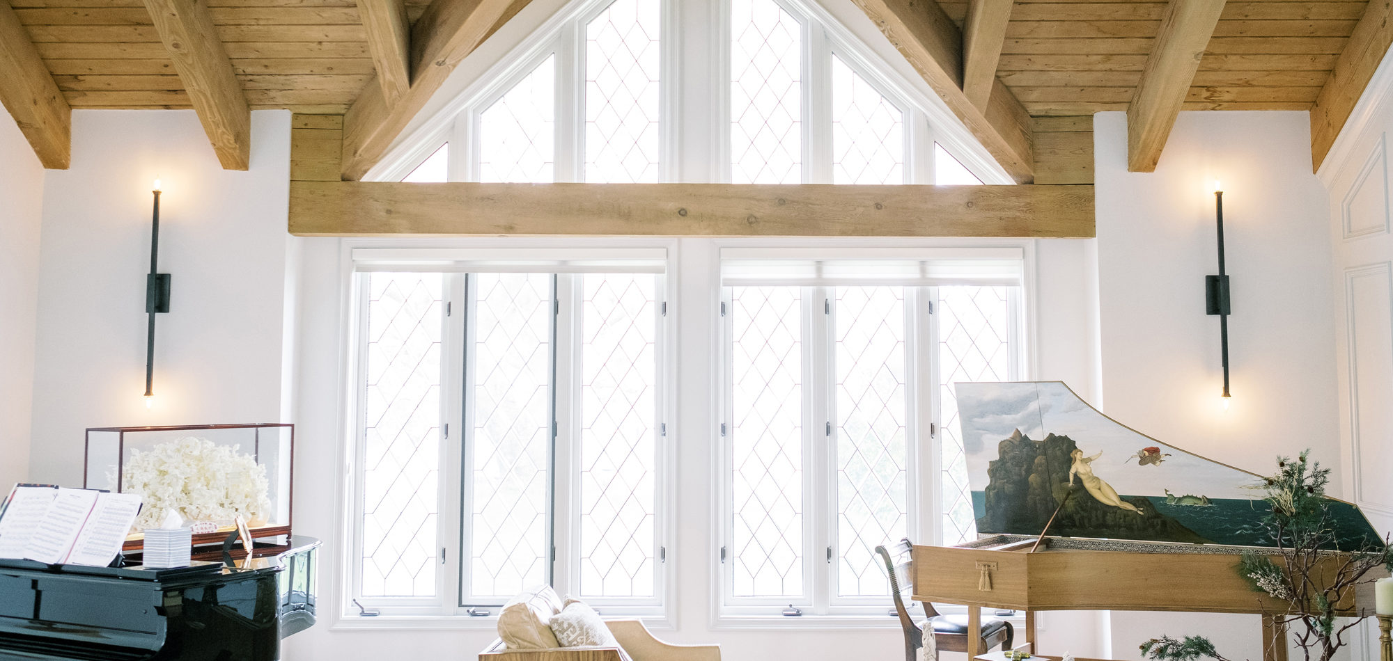
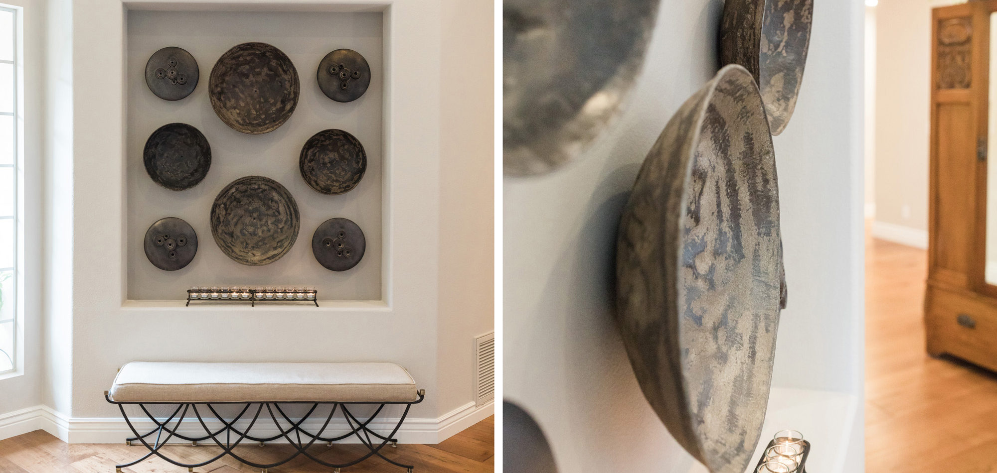
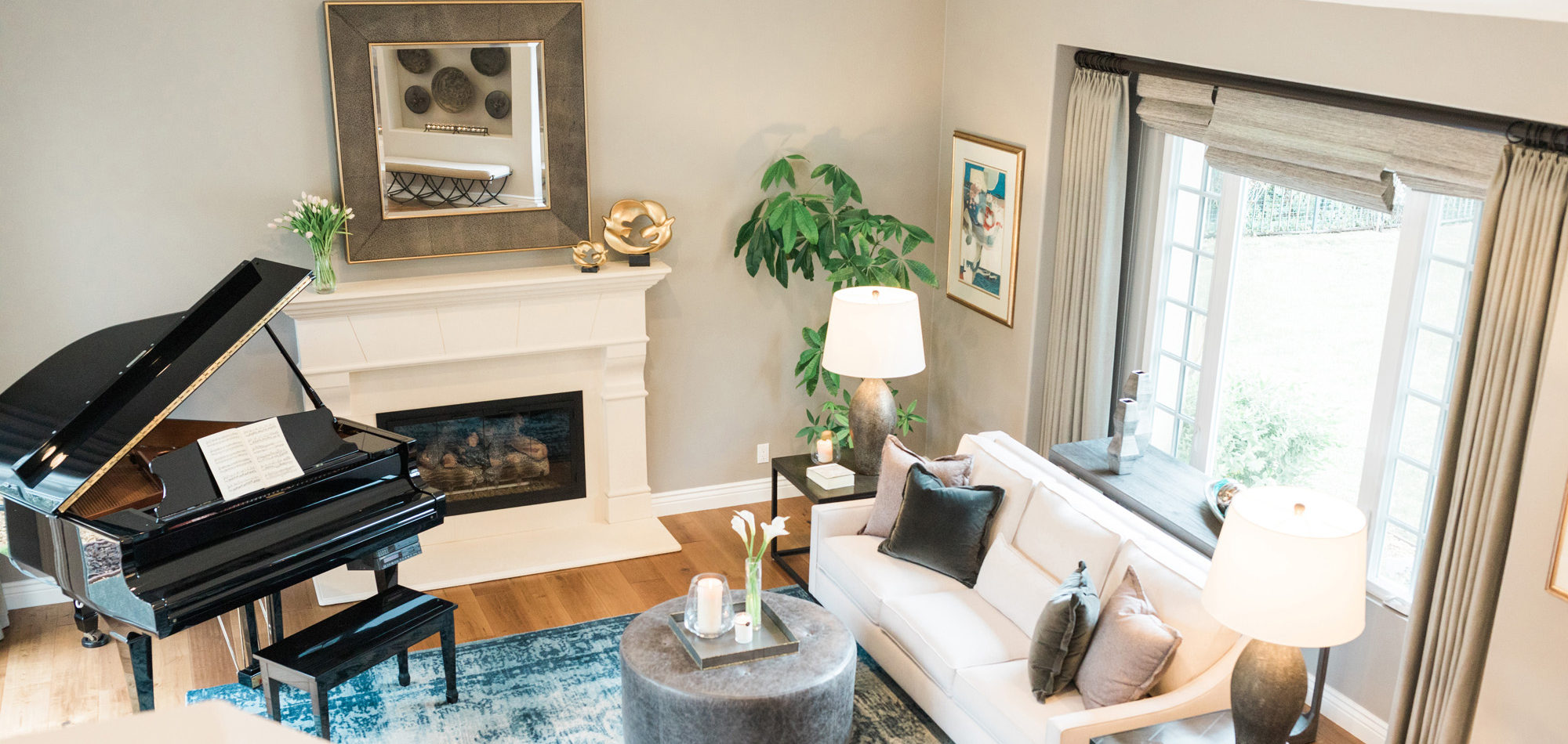
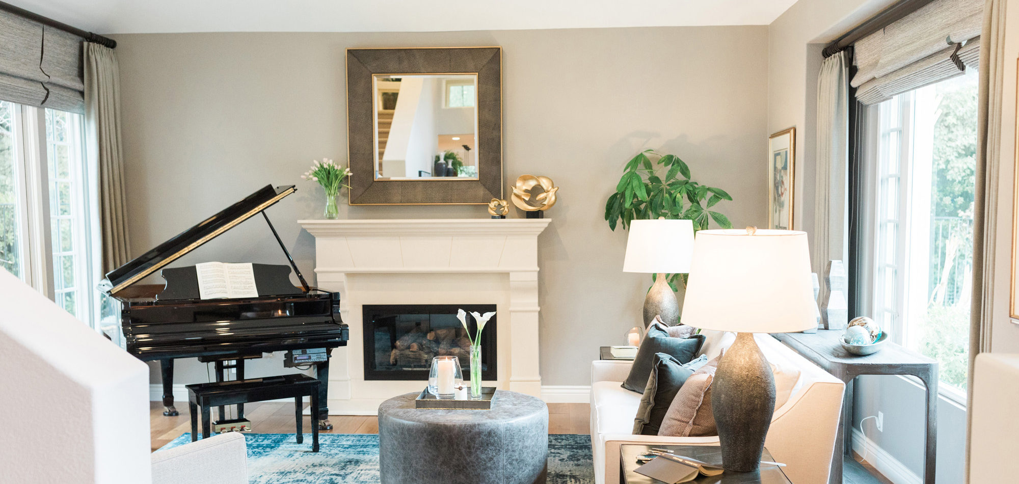
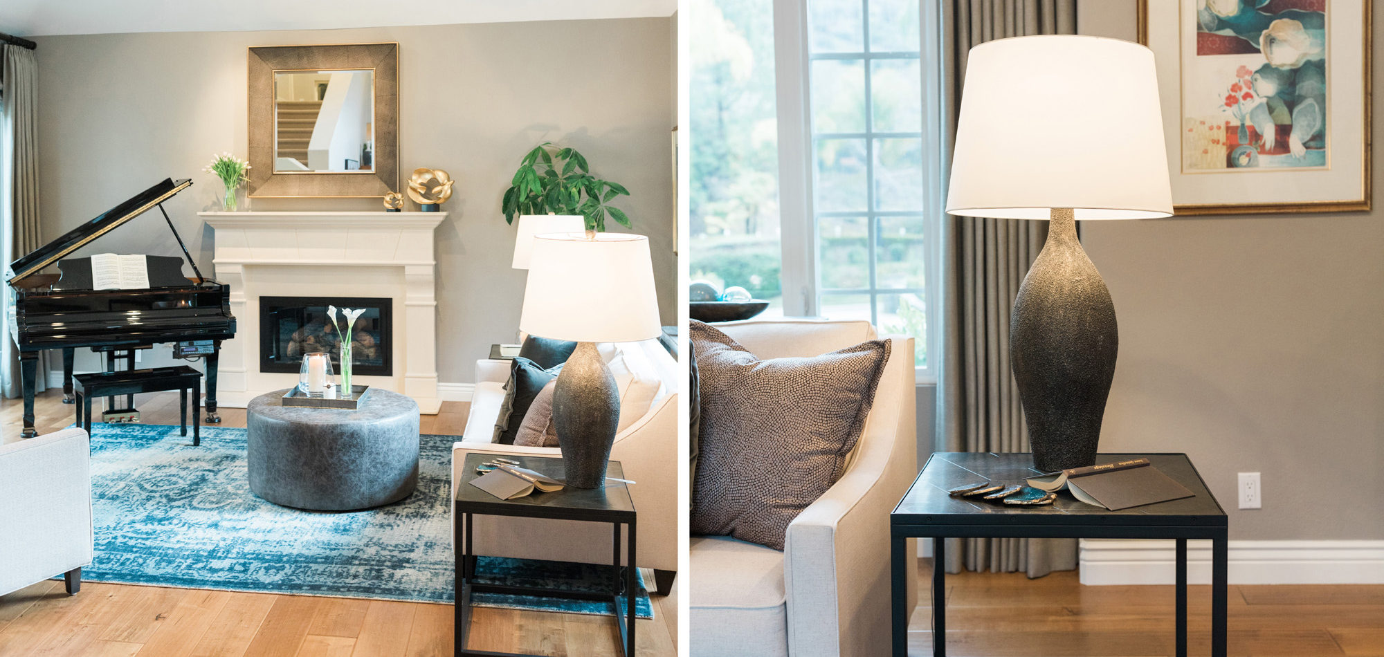
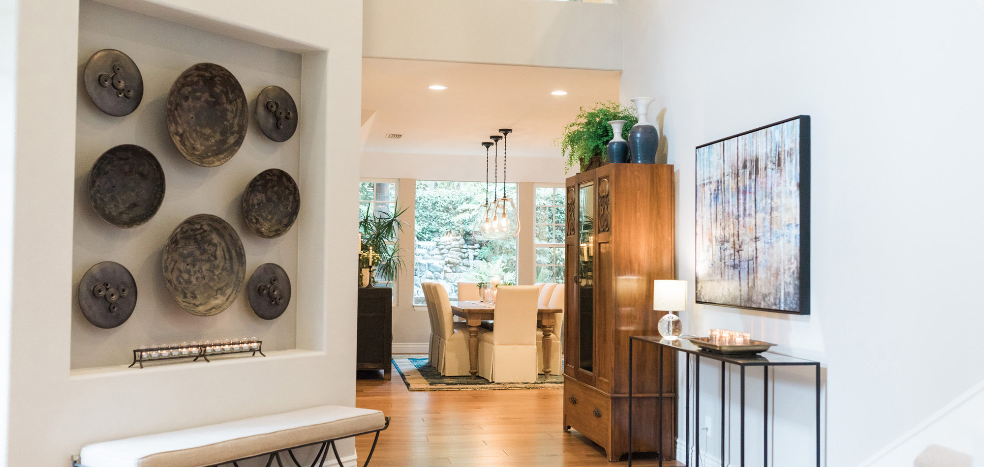
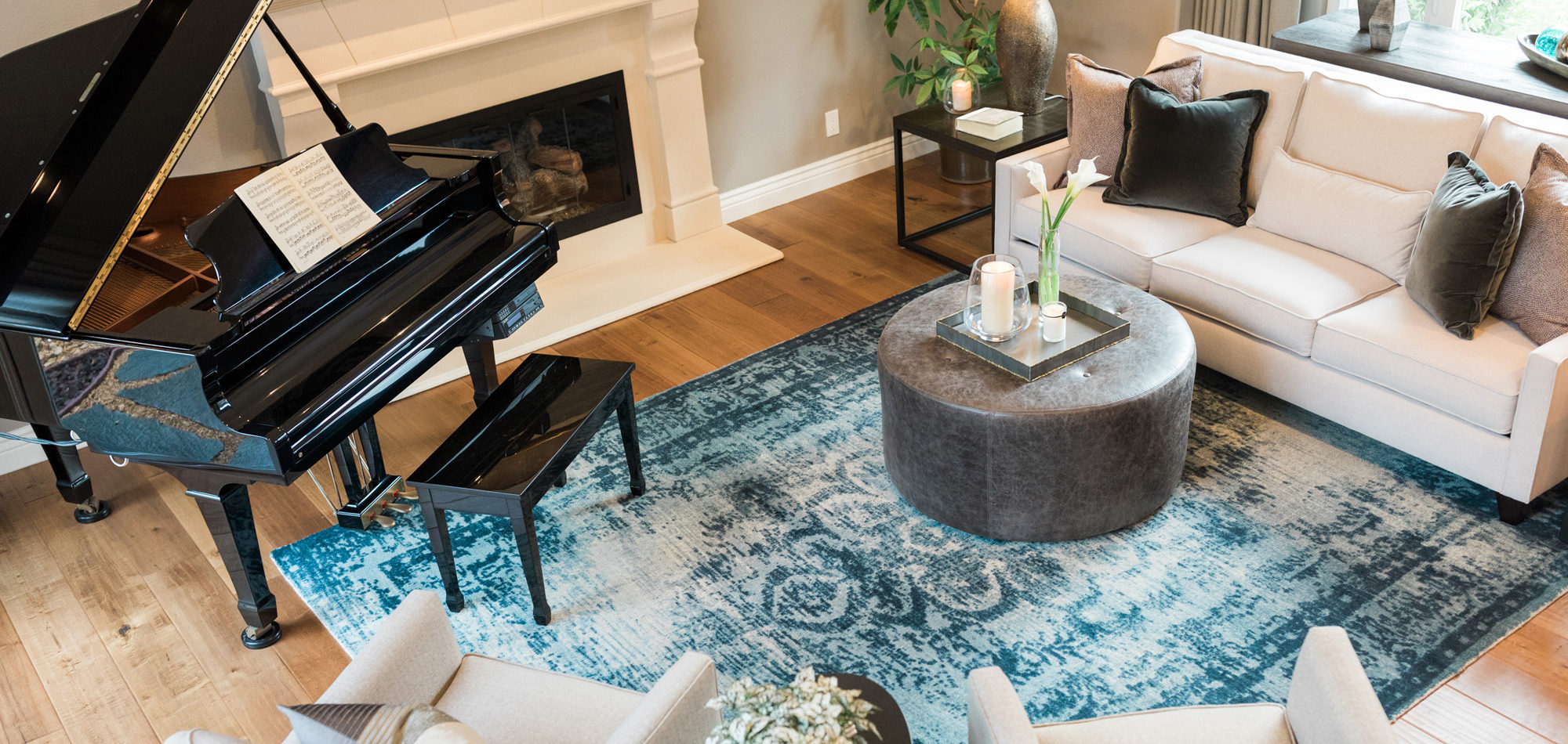
There was a large niche in the foyer that required a point of interest. A piece of art seemed too predictable, so we recommended a collection of handmade bowls. The couple agreed it felt like treasured pieces from their travels. The living room housed a baby grand piano, and it was important to consider the location to protect it from light and a furniture arrangement to compliment and provide ample seating. The room is now elegant yet welcoming.
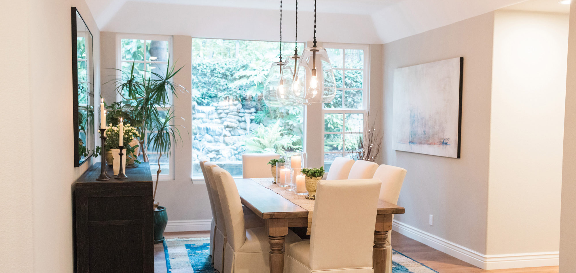
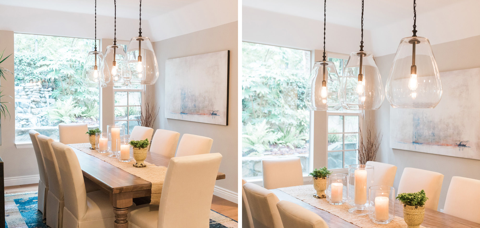
The dining room featured a window that overlooked a beautiful water feature. We wanted the room to feel like it was part of the outdoors by day and night. Light bounced off multiple glass pendants and a large-scale beveled mirror while allowing an unobstructed view of the outdoors.
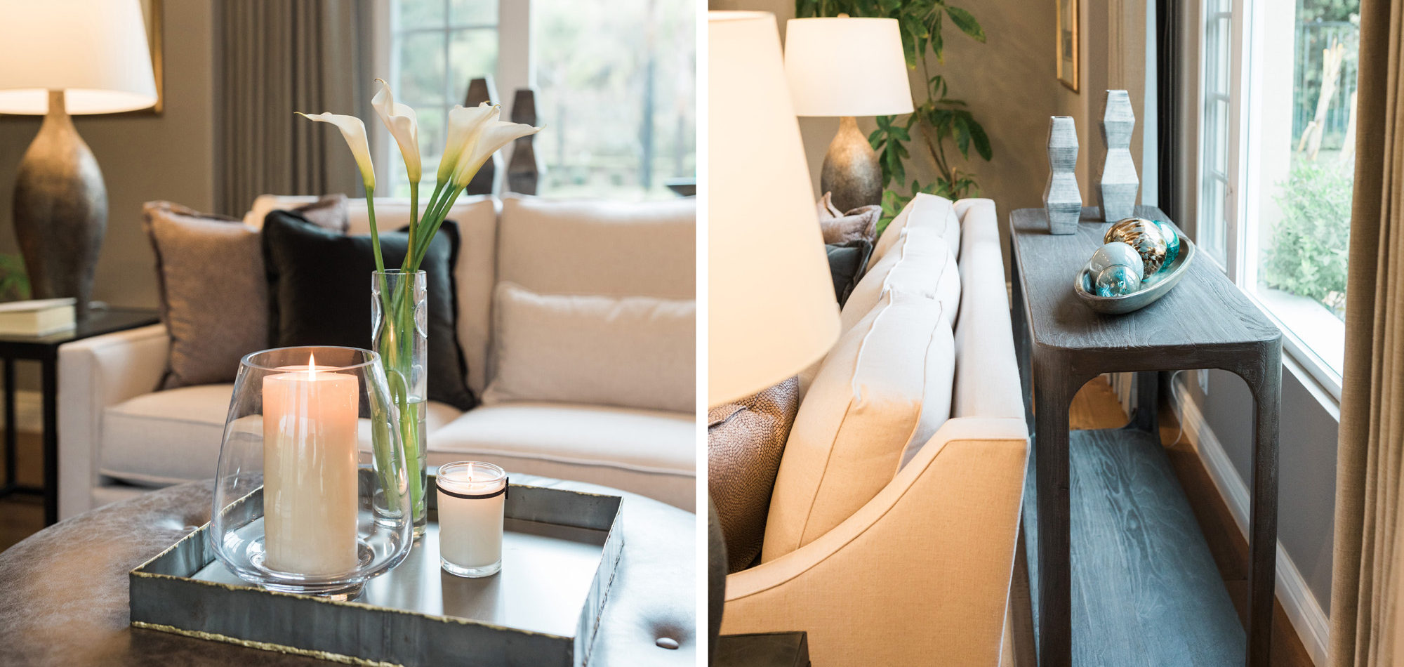
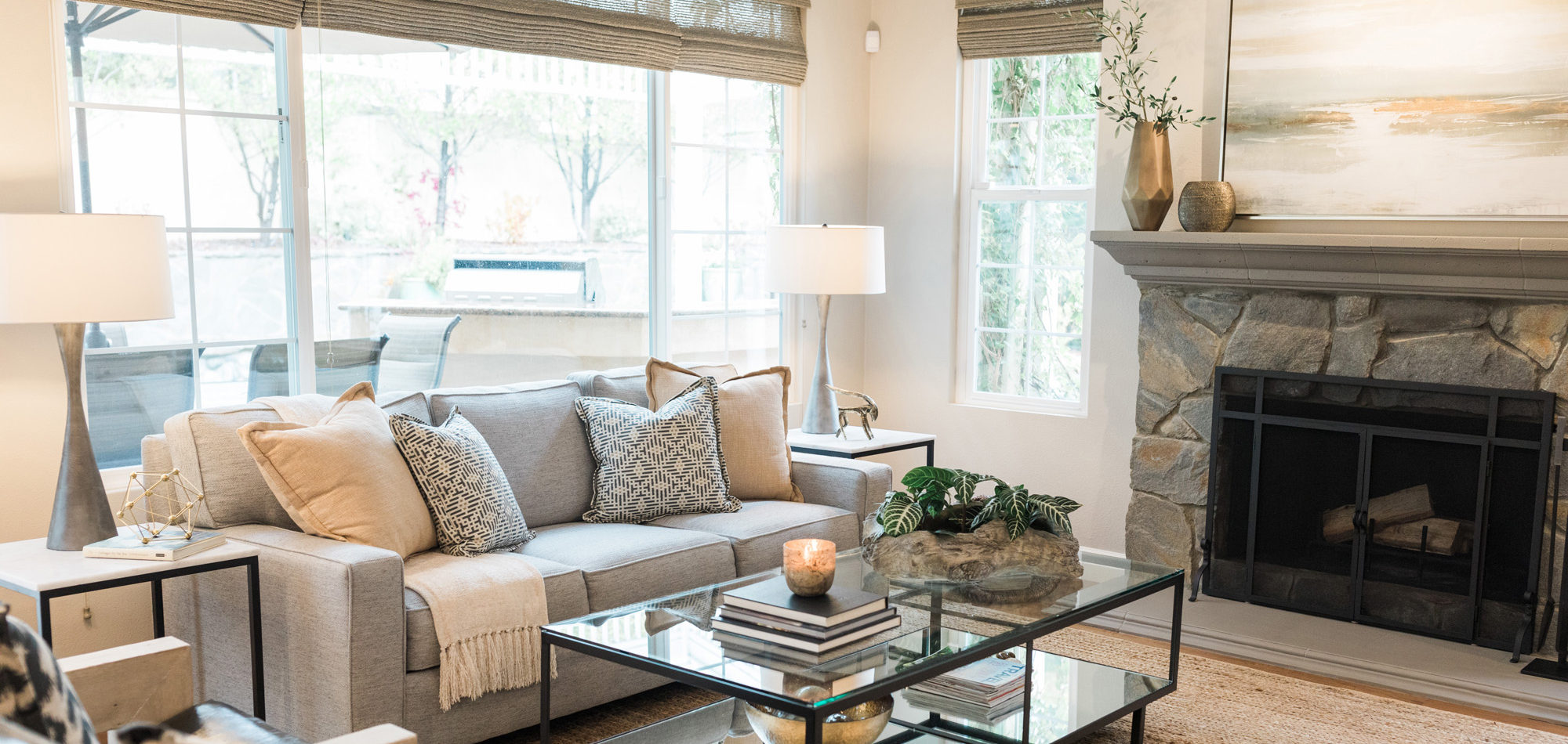
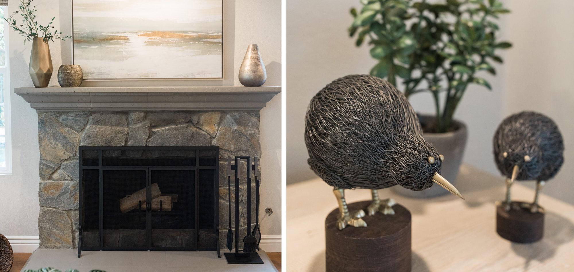
The family room also had a view of the wonderfully landscaped yard and we wanted to capture the outdoor comfort and feeling. The existing fireplace mantle was painted to bring in the stone. Furniture pieces and accessories were chosen to give a serene, organic appearance. The room was designed to have a feeling of calm with neutrally coordinated and comfortable selections.
This home now has an updated look with minimal changes to the existing finishes. It suits our client’s preferences and will also appeal to many buyers should they decide to move. Although it now seems that they love their home so much they will likely stay!
Photography by Jenny Quicksall Photography
Influenced by New Traditional Design
Our clients were a referral who wanted to give their homes an updated look. They asked us to be mindful of cost and requested we keep the existing kitchen cabinets and stone flooring where laid. We selected a new carpet, paint throughout, a new countertop, and cabinet hardware. As with all our clients, we listened carefully to how they like to use the rooms. We worked to understand their design preferences while guiding them to choose the best pieces suited to their tastes and budget. New furniture was required and a do away with pieces from early in their marriage. They wanted a grown-up feel that was still family-friendly. The couple, with two small children, entertain other young families so it was important that the selected pieces be both durable and comfortable.
The Living/Dining room was meant for small adult gatherings and entertaining. We specified pieces to reflect this and included a dry bar area and two comfortable chairs for after-dinner lounging.
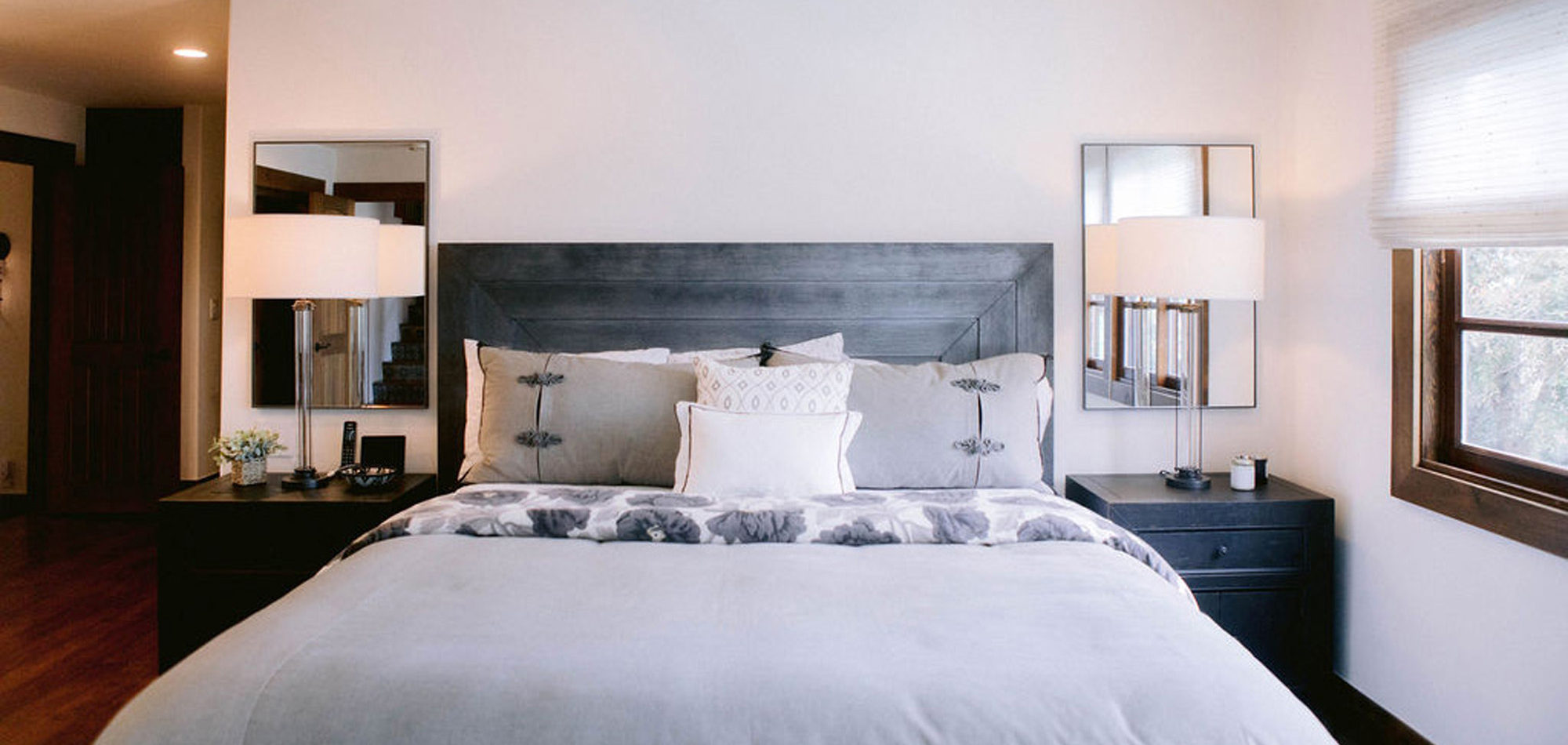
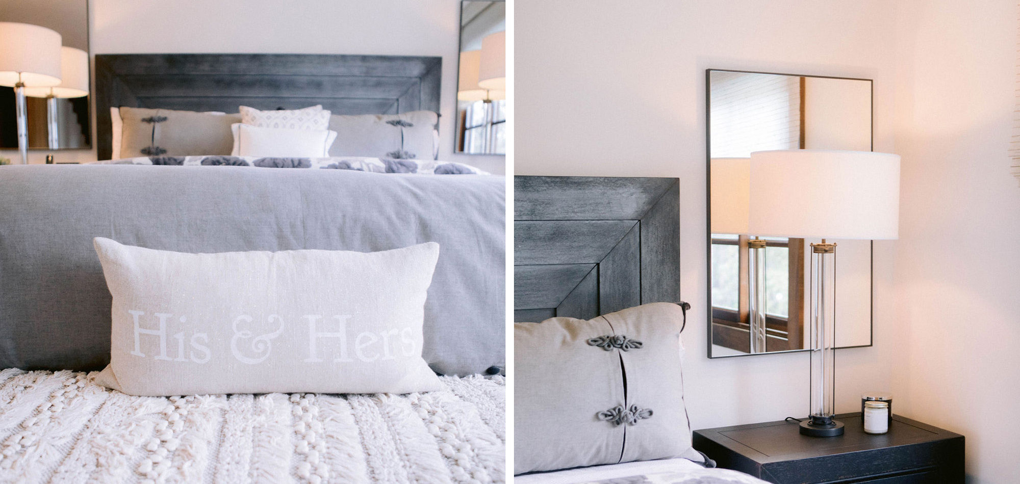
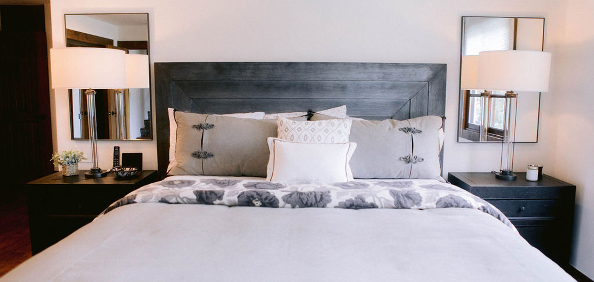
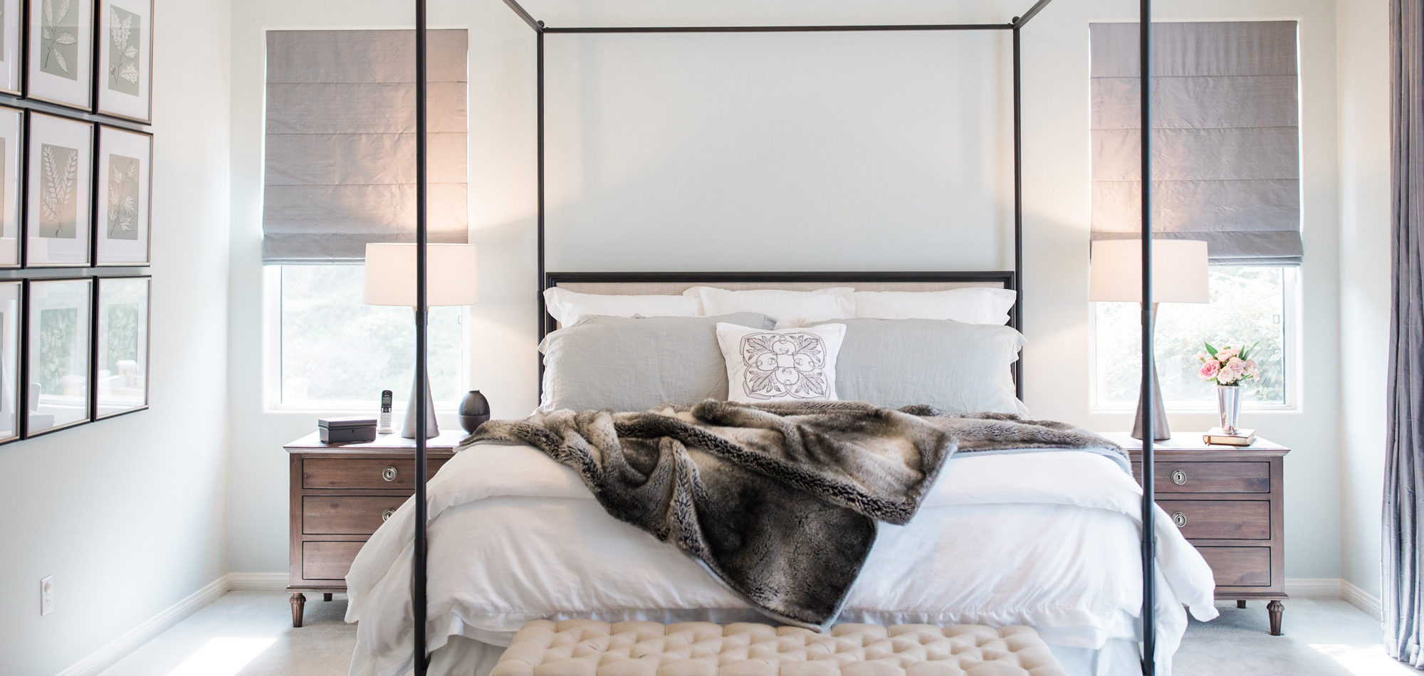
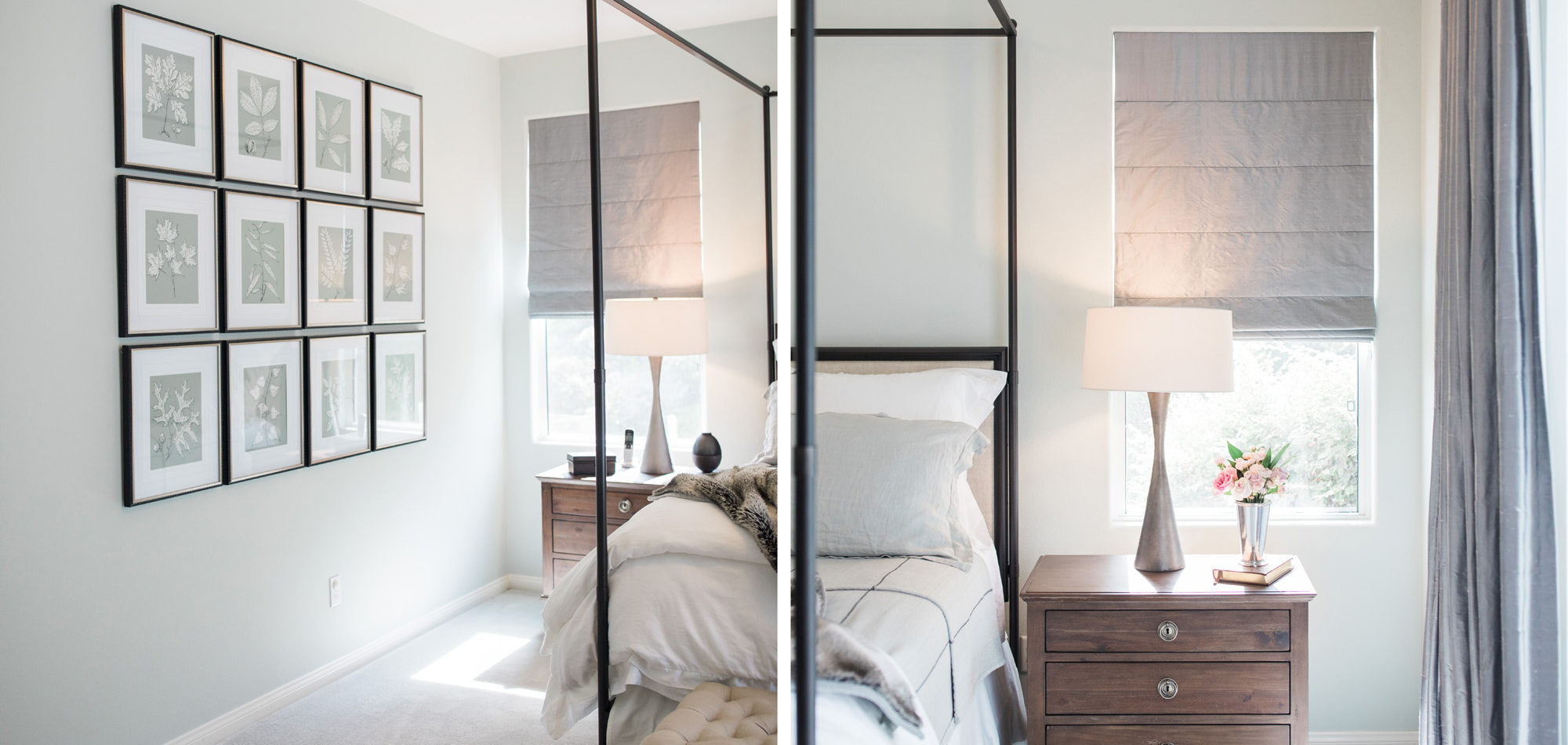
One of our favorite rooms to design was the Master Bedroom. They wanted an adult-style bedroom to indulge in. It now feels like a luxurious retreat. It is tranquil and still easy to maintain for this busy family.
Photography by Jenny Quicksall Photography

